Toronto X The Condominium | ?m | 44s | Great Gulf | a—A

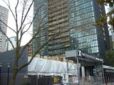
Looking amazing now, I am looking forward to see the final touches on this building. I think the lobby will be impressive but not as impactful as Casa.
 
AMAZING progress on this building.. All construction in Canada SHOULD move this fast...

BUT i guess part of it was because each floor was practically identical and there are no unique design elements on X... A very plain building...
 
Same could be said about a lot of buildings, ie Casa but construction was not as fast. Overall the project is very efficient. All of the kitchens from what I have been told have already been pre-constructed sitting in a warehouse somehere waiting to be installed.
 
I like the coloured panels. This design is much more tidy than Spire, which looks like hell from close up with all of the stuff on balconies and various window shades and drapes.
 
Oct. 24th

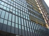
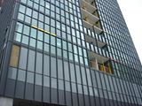
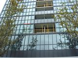
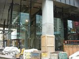
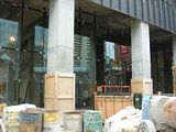
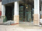
Finally some photos of the lobby glass. Also, the balcony railings/glass installations have picked up.

Click on the thumbnail to enlarge, then click again on the image for full size.

Sorry for the poor quality photos. My camera died so I'm using a borrowed camera for the first time today that I'm not familiar with until I can decide on & purchase a good Canon or Nikon. Suggestions welcome, please PM me.

X residential floors topped off (mechanical yet to go)

Wow, looks great, thanks for the pictures DT! I love the vertical lines the balconies are creating as they rise. I went by the building today and the lobby is really impressive. X2 has a lot to live up to.
 
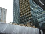
Sales Office

I don't know why they're putting up hoarding on the sales office, perhaps more advertising for X2?

I'm really going to miss this house.

Click on the thumbnail to enlarge, then click again on the image for full size.

 
For many years I used to live a couple of blocks from where X is now rising and I love almost everything about the building. The one feature I don't think lives up to the rest of the vision is the silly use of random, primary-colour, stripes.

Firstly, primary colours visually appeal to children under the age of 3. Which is not the age group of the purchasers at X. As an homage to Mies it seems an immature and unsophisticated addition.

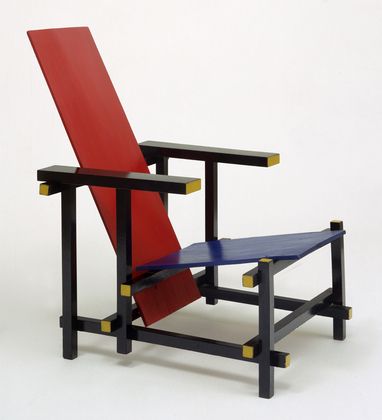
Second: In my opinion, the effect seems rather 90's-ish and poorly executed.

Thirdly, the effect only seems to work if you are directly below the building. Judging from pictures previously posted, at any distance, the only colour that "reads" visually is the yellow component. This gives X the impression that it's under repair or some black panels are missing.

Finally, along the preschool line... What's next on buildings? Giant ABC's? :D

All this is just my opinion and suffice to say I feel the colour-block thing doesn't work, but on the whole, it is a beautiful addition to the neighbourhood.
 
Also visually appealing to three-year-olds:

Mondrian_Broadway_Boogie_Woogie.jpg
 
Firstly, primary colours visually appeal to children under the age of 3.

Is that so? Scandinavia must be populated by 3 year olds.

Your statement is as inaccurate as saying black, beige, and grey are 'colours' that are visually appealing only to senior citizens. People don't stop liking colour when they reach adult hood. What does happen is that many people become conservative to the point of utter blandness when they get older.

It's mind numbing how many people think beige is a colour. When they tire of beige walls they 'spice things up' with grey or some pale cream colour. Finally, we get some real colour on a significant building and people get their nose all out of joint. Honestly!

This building only used colour as an accent too. If the whole thing was red, blue, and yellow, I imagine some Torontonians would have a conniption.
 
Last edited:
Wow! You need to relax. You act as if I attacked you personally and not a building. It was an opinion, of which I am entitled. It was actually meant tongue in cheek.

And as a rebuttal you only countered one of my points: The one on primary colours.

You missed my second point: It was poorly executed. I love vibrant colours, as a matter of fact and perhaps if they were bolder and not an afterthought I might not have minded so much.

And of course from a few blocks away the yellow is still all that stands out. The red and blue are lost and it just looks like the black paint is missing. A design flaw I'm sure a Scandinavian would not have tolerated.
 

Back
Top