AlbertC
Superstar
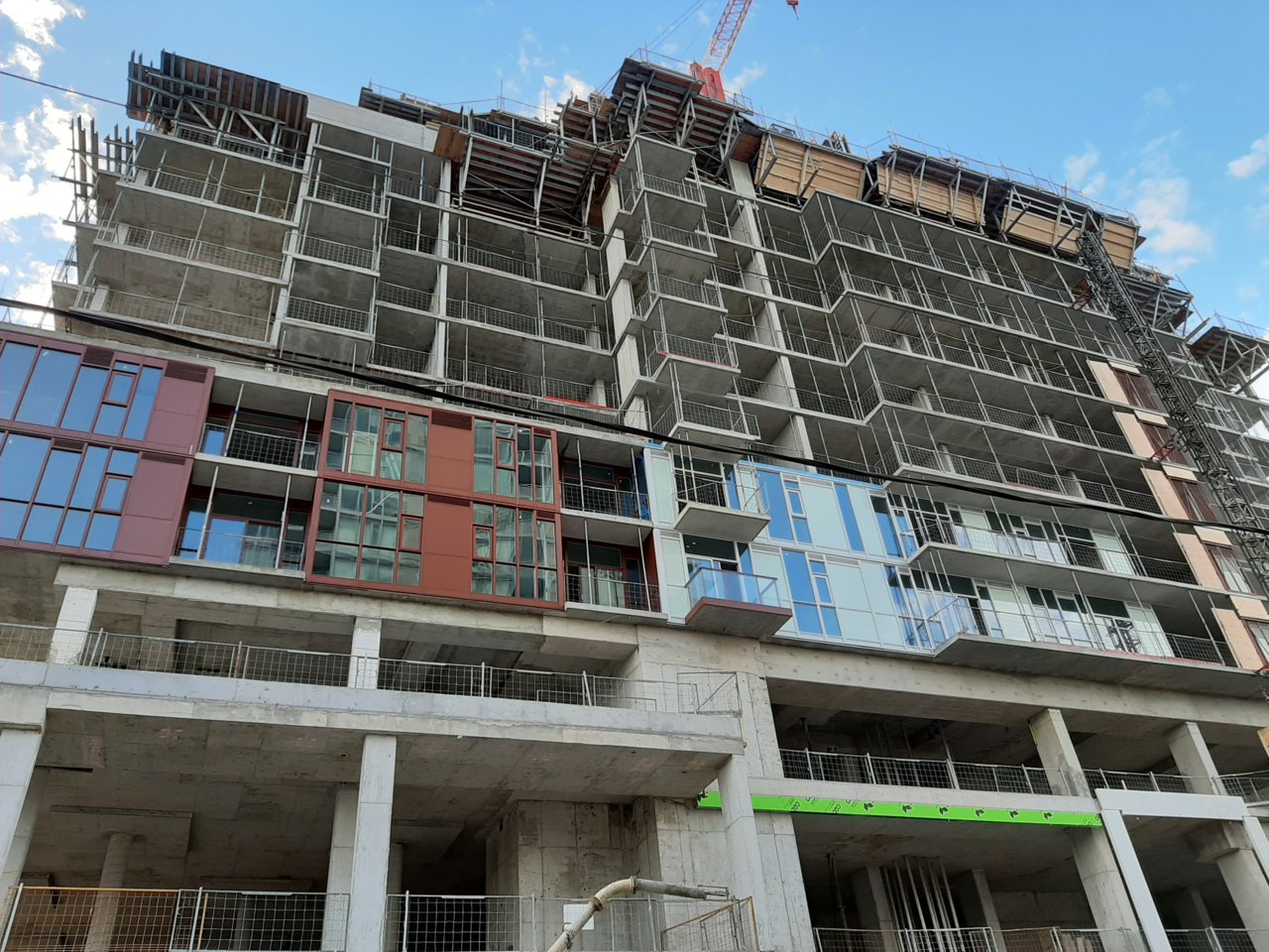
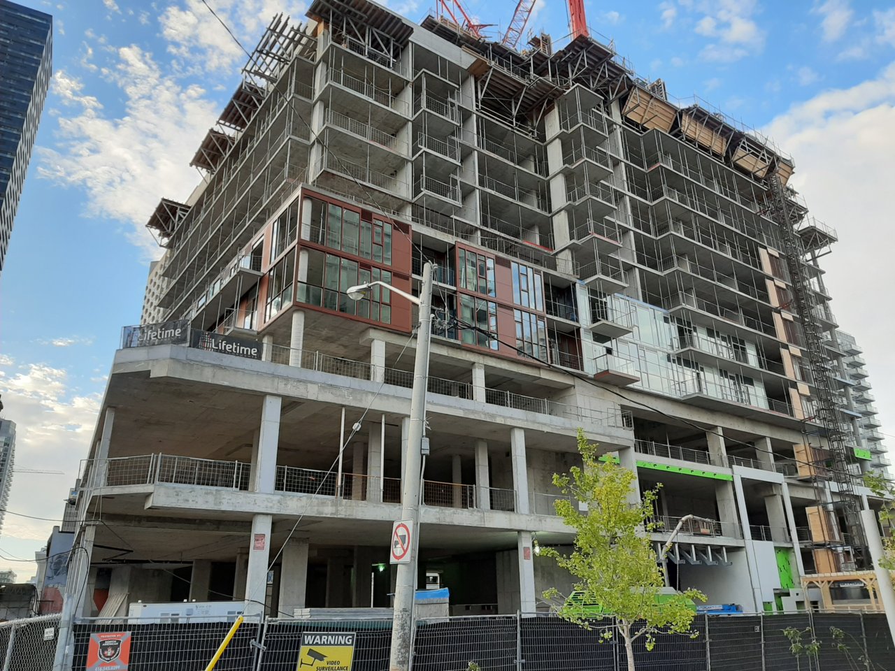
Second level of cladding is now up:


It does. They were. It sure isn't.Wow. That window wall looks sloppy. Disappointing. Wait. Isn't Knightstone the company behind that godawful student res on College, also designed by Diamond Schmitt? This is not a good look for DSI.
Yeah, not a good look.The worst part is that the brown cladding isn't being extended all the way up the podium. The cladding as shown above is as high as it will go before switching to the messier white
Transit City is turning out very well. As always, the blame likely has more to do with the developer than the architect.Diamond Schmitt are good with designing academic buildings and should not design offices or condos. plus the facade is horrible, shame on lifetime.
Diamond Schmitt designed those Transit City condo buildings though, so… care to run around in circles a little while longer on this one?^exactly. design of transit city is decent it's the quality/material thats amazing. that is the reason it's turning out very well.
I also find the ‘white’ spandrels look very similar (maybe even identical) to the mint green spandrels at the Loblaws towers at Bathurst & Lake Shore.Now that a pattern is emerging with the spandrel/window wall, it looks better. It's not great but it's better. Unfortunately, I'm still seeing Minttoothpastegreenhaus rather than Whitehaus. Maybe it's just me...