Toronto Waterfront Innovation Centre | 53.03m | 11s | Waterfront Toronto | Sweeny &Co

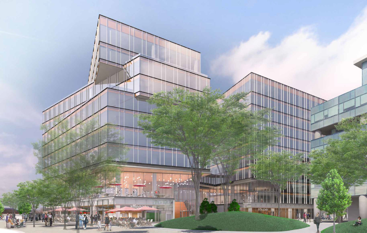
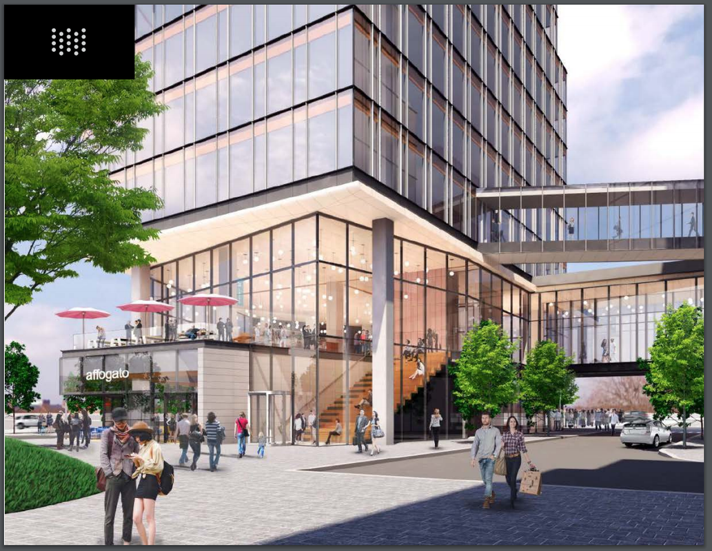
Is it just me, or is there an extra corner pillar on the southwest where the upper section was supposed to cantilever? Pretty disappointing if true. That corner would look so much cleaner without the pole in the way.
You mean in front of the stairs leading down to the grassy knoll? I think that has always been there, or at least for the last few years.
 
Is it just me, or is there an extra corner pillar on the southwest where the upper section was supposed to cantilever? Pretty disappointing if true. That corner would look so much cleaner without the pole in the way.
14870-97392.jpeg

Source

48e6739c-45f8-4dff-b537-7481f9bd494b-jpeg.298006

Source: ProjectEnd

I think you're right. There's no way that pillar is going behind the glazing. Very unfortunate.


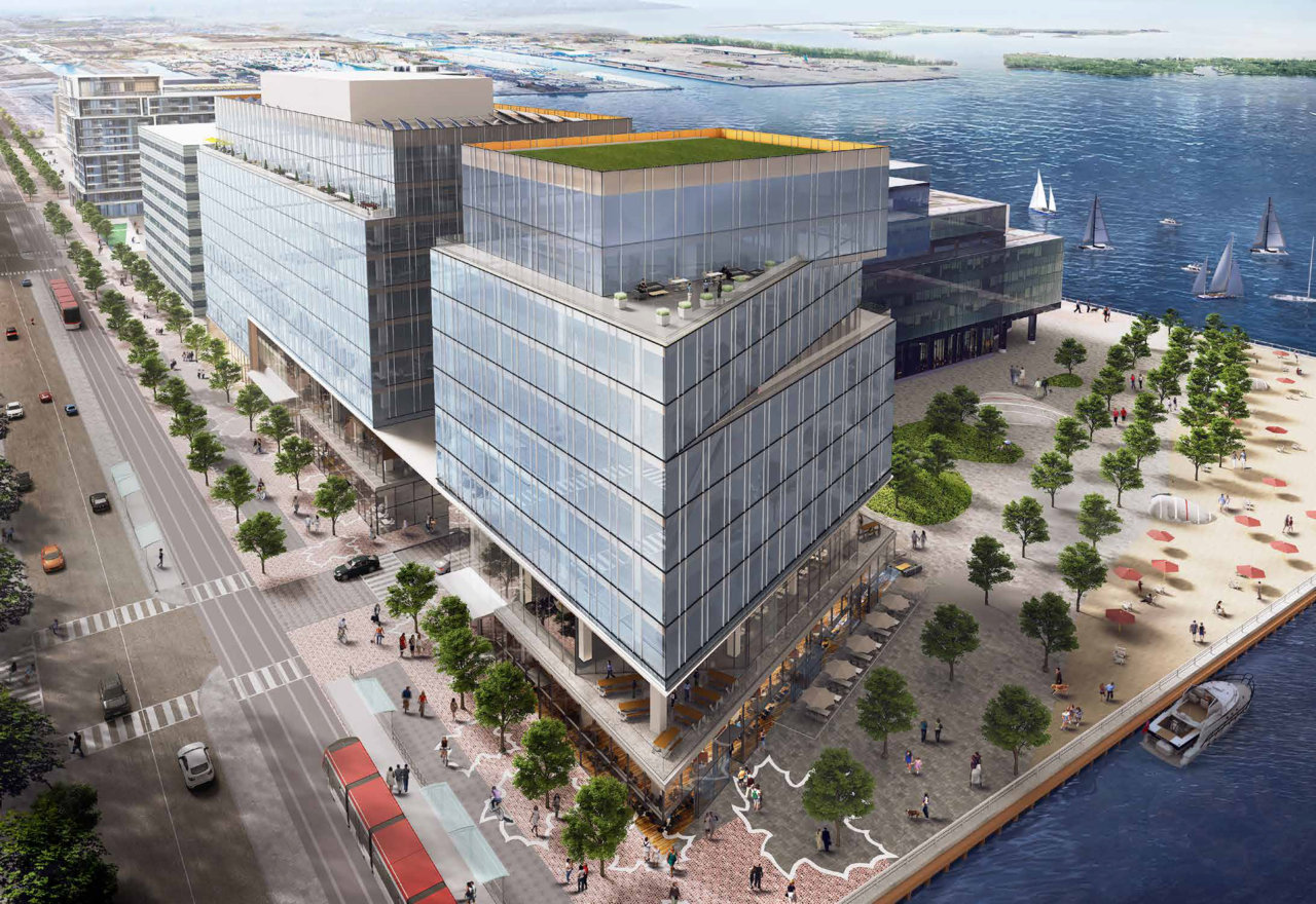
And very unfortunate from this angle too. The visible column is going ruin the visual effect of the cantilever. Sucks.

14870-97395.jpeg

Source
 
Last edited:
Remember how the Design panel criticized this for being "too much" like the Ryerson student centre? So they went back to the drawing board, and made it look like every building in a suburban office park. 😡

False choice - besides does one really believe that a proponent that produced this final product with all the corner-cutting had it in them to build what was proposed originally?

AoD
 
A building admittedly to which Menkes didn't need to be so cheap-assed about it.
 

Back
Top