67Cup
Active Member
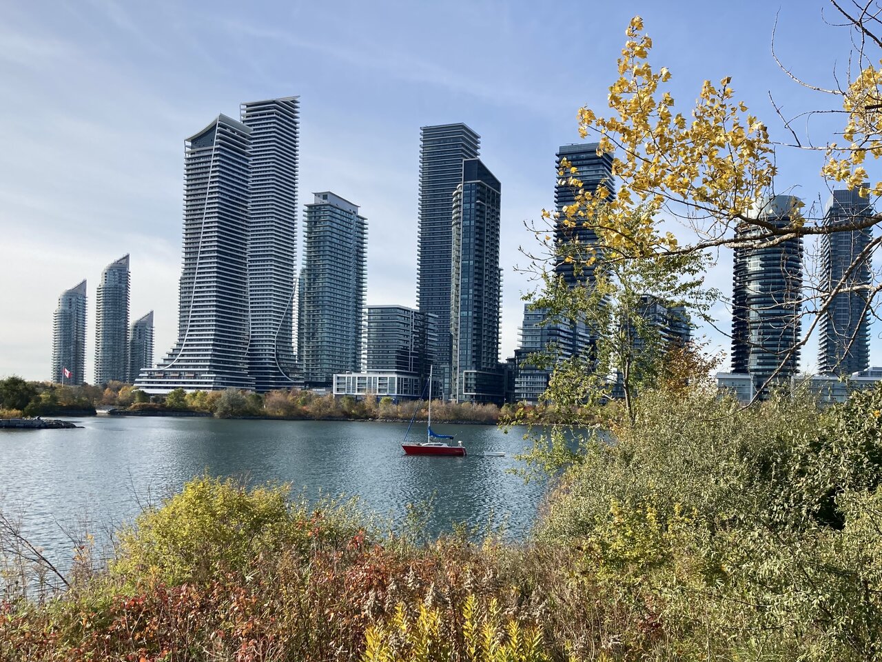
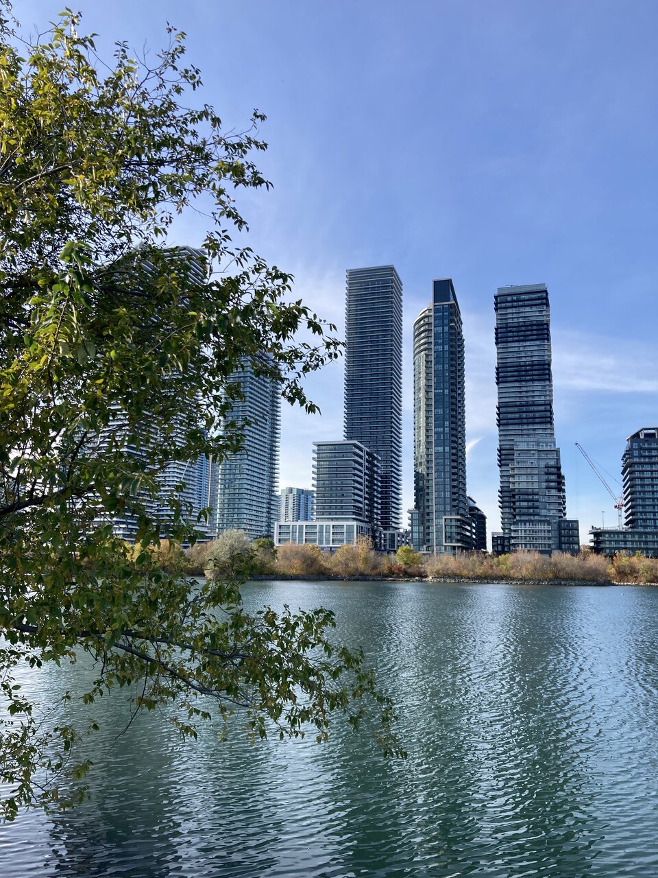
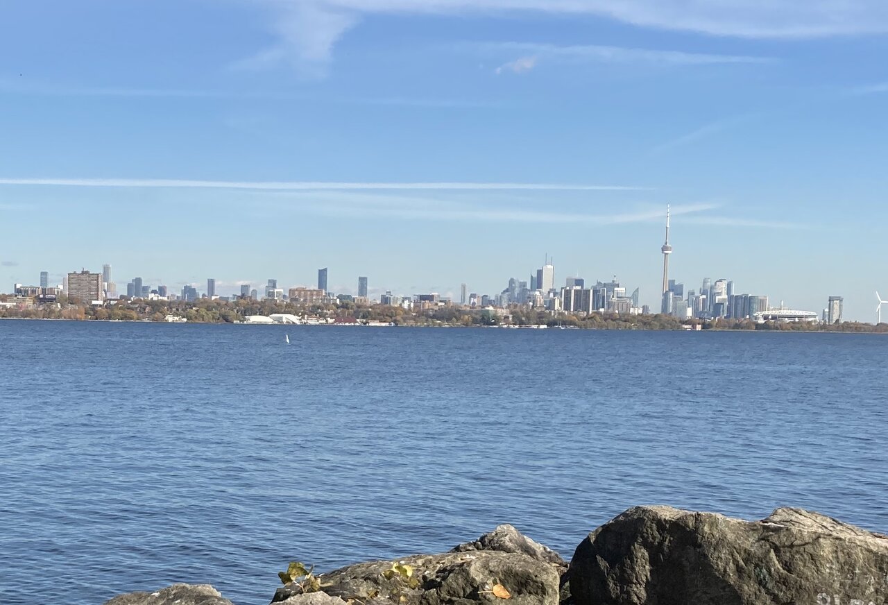
Three more shots from today’s walk in the park. In the first and second shots, Vita is in the centre, but lower down to the right in the second you will see the crane for the Conservatory project, Water’s Edge. That project is not quite at grade yet but when completed will be taller than Vita or Lago. I wonder what a view from this angle will look like when the Mr. Christie development is complete.
The red sailboat has been moored in the cove the last couple of winters, avoiding dock rental, I suppose. I like the splash of colour it provides. A dog was resting on its deck so it appears the boat is inhabited. It would be rather cool in the depths of winter, I expect.
An aside: I am doing a virtual walk on an app that transfers my kilometres walked to the course of El Camino, the ancient pilgrimage to Santiago de Compostella in Northwestern Spain. It’s just a way of keeping track of my exercise walking. On my virtual walk I have just crossed into Spain and am in the heart of the Pyrenees. The geography is rather different between the real walk and the virtual one! But, curiously, in both realities, I am just a few kilometres from Roncesvalles.
Last edited: