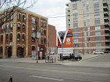
Toronto Victory Condos | ?m | 12s | Lifetime | Wallman Architects

The king street elevation was previously all balconies with a black industrial steel skeleton. It did have some originality.

Now, the developer has suddenly found a whole bunch of extra sq.ft. to sell by taking away 50% of the balconies while still getting the City to give them the variance for height. It's all about the square footage and greed.:mad:

They also showed for >6 months the same original rendering as the "sell" for allowing more height and that they were a developer who cared about the integrity of the King West. Then, on day one they start selling the units, the design is changed and no ones knows anything except behind-closed doors City staff, thereby circumventing of all Adam Vaughan's community meetings for consultation and feedback.

BLVD Developments should be called out for being bait and switchers indeed and then adding insult by selling those ridiculous floor plans to unsuspecting and giddy owners. I hope that buyers stay away and they don't end up building this thing.
 
I don't like bait-and-switch tactics, which we see now and again in Toronto unfortunately. On the other hand I think the design of this buiding was improved. I like brick, especially in this neighbourhood of old brick buildings. It fits into its context more nicely now. The previous design, IMO, was unattractive and reminded me of a line of steel racking to stack pallets on, in an industrial warehouse.
 
The design has been modified (and in my opinion, worsened) from THIS:

2425629997_c2f9459875_o.jpg


to THIS:

2425632065_22b468cae7_o.png


I think it looks cheaper, adding black brick to the front, it's just not as nice in my opinion

Wait a sec, is the "new" rendering real, or a mockup? It looks like a new front was copied & pasted over the old one and they didn't go to the trouble of removing the old steel frame from the top (clone too, people!).

In fact it looks like someone started removing frame on the upper right, but then got tired and stopped.
 
Wait a sec, is the "new" rendering real, or a mockup? It looks like a new front was copied & pasted over the old one and they didn't go to the trouble of removing the old steel frame from the top (clone too, people!).

No, it looks like they re-did it. The steel frame has gone from four bays to three.
 
No, it looks like they re-did it. The steel frame has gone from four bays to three.
Yeah, I see it now. I wonder why they even bother with the steel frame anymore? It doesn't stand out at all now that the suites have been pushed forward.

It's still a handsome building, but that steel exoskeleton was a really cool redeeming feature. It looks really generic now. I guess we'll have to leave it up to that fashion building by Freed down the street and hope those pink windows aren't actually pink curtains.

The new rendering looks way better IMO.
Yeah, yeah.. Give the original rendering a glowing lobby and more happy renderpeople and everyone will say the original looks 10 times better.
 
It isn't the lobby that makes the second rendering look so much better.
I think with the context of King West, with the its strong historical street wall, the more opaque facade works better. Afterall, who wants to see those huge baloconies littered with stupid white plastic lawn furniture and bikes? That part of King is too nice for that.
The bonus is that masonry will hide all the crap that people leave on their baloconies.
 
I think the original is better looking from an architectural point of view, but I agree that the revised building will be more effective at protecting the street from messy balconies (although I think the cost of units here would preclude anyone who would own cheap, tacky balcony furniture in the first place, and hopefully strict condo board rules will prevent bicycle storage).

I really hope they use high quality materials for the masonry.
 
the original rendering was incomplete, the balconies did not show any glass or brick, you cannot leave the balconies like this, so what is the point on this discussion where you are talking about an incomplete rendering. the developer never showed floorplans for that rendering. I think the final model is a beautiful rendering, which will fit nicely in the area. I do not know if you have gone to the sales centre, but the model suite shows great, the standard finishes are nice, just the fridge (Liebherr 24") and dishwasher will be fully integrated, which I have not seen in any downtown project, and there will be backpainted glass (full panel) for the backsplash.
 
the original rendering was incomplete, the balconies did not show any glass or brick, you cannot leave the balconies like this, so what is the point on this discussion where you are talking about an incomplete rendering. the developer never showed floorplans for that rendering. I think the final model is a beautiful rendering, which will fit nicely in the area. I do not know if you have gone to the sales centre, but the model suite shows great, the standard finishes are nice, just the fridge (Liebherr 24") and dishwasher will be fully integrated, which I have not seen in any downtown project, and there will be backpainted glass (full panel) for the backsplash.
In fact, the original rendering was most certainly NOT incomplete. Here is a larger version of the original rendering posted by SpadinaBus on page 1 of this thread:

478kingue3.jpg


I've been to the sales centre. Nice model suite, but pretty standard. All that stuff about interior finishes and appliances doesn't really have anything to do with the building's construction, though.


Edit: Now that I look at the larger copy myself, I think the original building actually does more to respect the heritage buildings beside it by not drawing attention away from them and not trying to mimic them with masory.
 
Edit: Now that I look at the larger copy myself, I think the original building actually does more to respect the heritage buildings beside it by not drawing attention away from them and not trying to mimic them with masory.

Completely agree; the original design was much better. The masonry will never look like that of the neighbouring buildings, and will inevitable stick out like a sore thumb. I believe the developer was prohibited from using a clear glass on the balconies. I guess this was solution.
 
So that's what happened. Understandable requirement -- prevents this part of the street from looking like an apartment block in Havana. Thanks for clearing that up!
 
No, the masonry won't look like the neighbouring buildings, I don't think that's the intention. The horizontal bands of brick can only be read as a modern surface treatment, not like the vertical load-bearing piers of the older structures. What's similar is the facade that is more solid than the pure glass of the earlier one. I still think the steel frame looks more like a backyard face than a front one...on this street at least.
 

Back
Top