You are using an out of date browser. It may not display this or other websites correctly.
You should upgrade or use an alternative browser.
You should upgrade or use an alternative browser.
Vaughan Vaughan Centre PwC Tower/YMCA/Library | 49.98m | 9s | SmartCentres | Diamond Schmitt
- Thread starter innsertnamehere
- Start date
ProjectEnd
Superstar
marcus_a_j
Senior Member
Leo_Chan
Senior Member
Does this building have access to the underground walkway connecting the bus terminal to the subway station?
Solaris
Senior Member
yes it does
mikejb
Active Member
It is going to be a great building when it is completed.


PMT
Senior Member
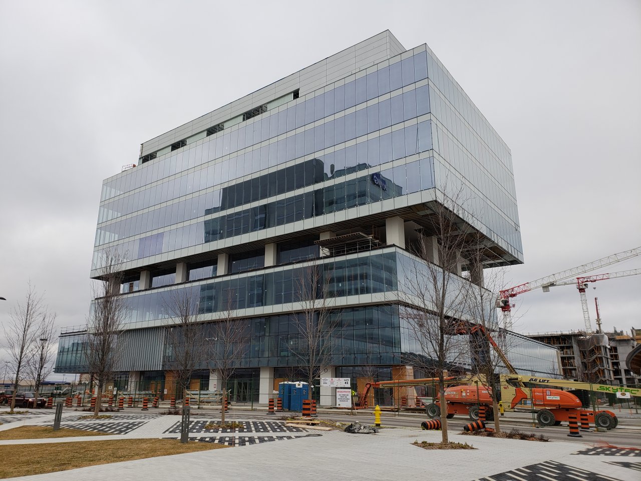
Yesterday:
innsertnamehere
Superstar
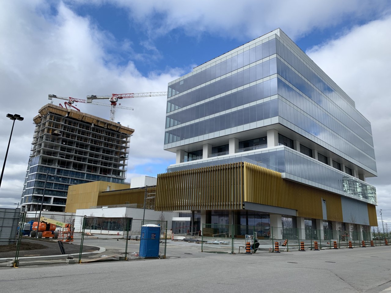
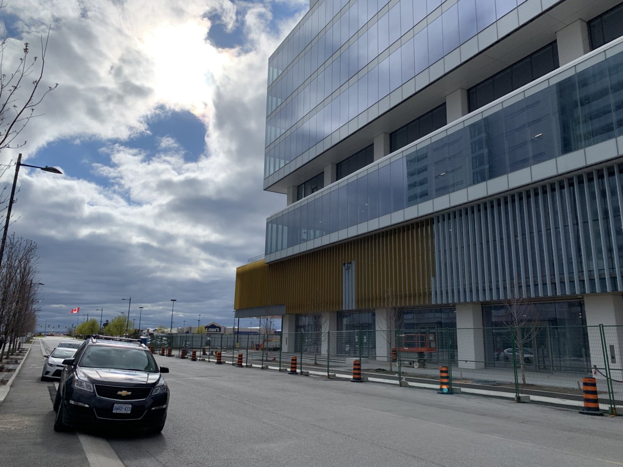
The gold accents are looking really good. This building is turning out great. It’s good to see the architecture actually turning out pretty well around the subway station:
MafaldaBoy
Senior Member
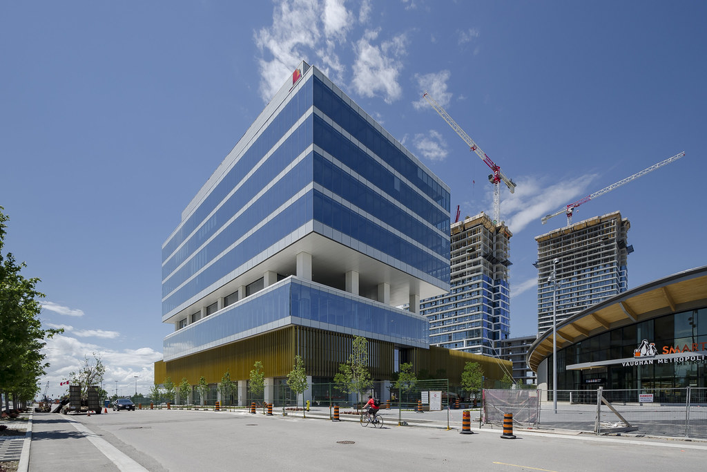
21 June 2019:

Vaughan PwC / YMCA by Jimmy Wu, on Flickr

Vaughan PwC / YMCA by Jimmy Wu, on Flickr

Vaughan PwC / YMCA by Jimmy Wu, on Flickr
Vaughan PwC / YMCA by Jimmy Wu, on Flickr

Vaughan PwC / YMCA by Jimmy Wu, on Flickr

Vaughan PwC / YMCA by Jimmy Wu, on Flickr

Vaughan PwC / YMCA by Jimmy Wu, on Flickr

Vaughan PwC / YMCA by Jimmy Wu, on Flickr

Vaughan PwC / YMCA by Jimmy Wu, on Flickr

Vaughan PwC / YMCA by Jimmy Wu, on Flickr

Vaughan PwC / YMCA by Jimmy Wu, on Flickr

Vaughan PwC / YMCA by Jimmy Wu, on Flickr
Midtown Urbanist
Superstar
This is a very nice public space.
But it is surrounded by roadways. That is not a recipe for vibrancy.
But it is surrounded by roadways. That is not a recipe for vibrancy.
Argent
New Member
When will this building be officially complete? I've been looking forward for the YMCA opening and I'm getting desperate for a gym close by for a while lol
AlexBozikovic
Active Member
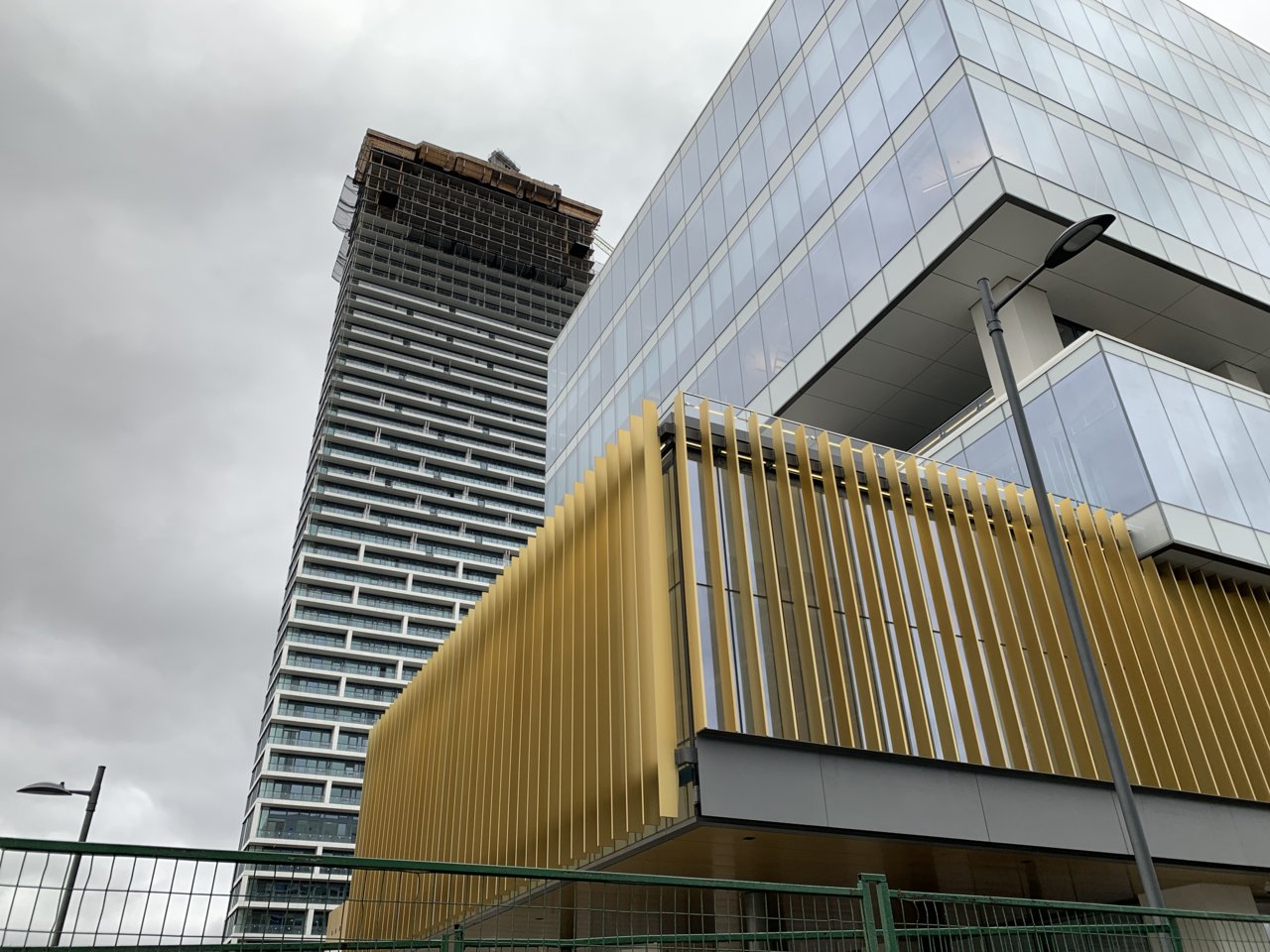
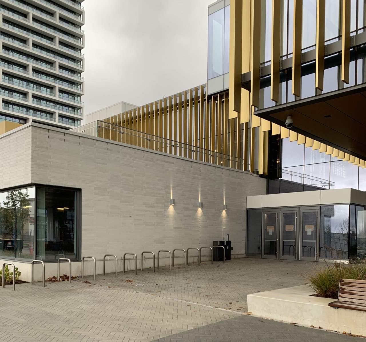
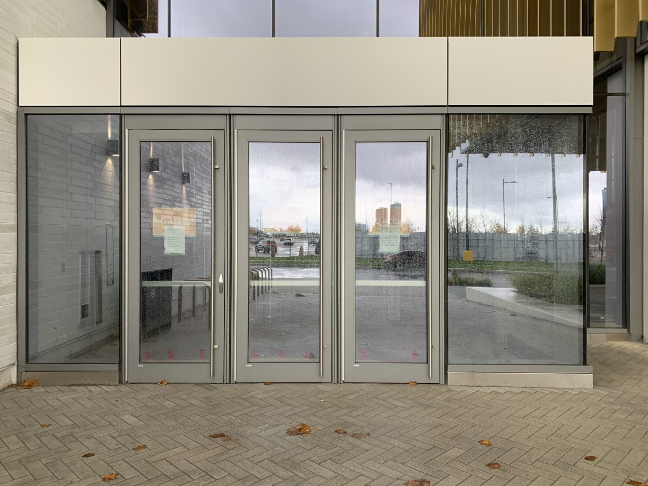
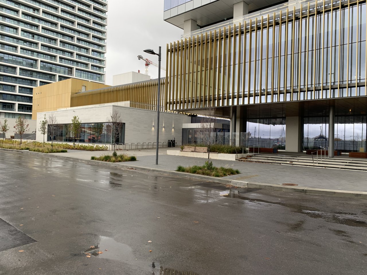
Today. As with everything at VMC, it looks better from a distance.
Last edited:
innsertnamehere
Superstar
Really? what's weak about it up close and personal? I quite like it. the detailing isn't exactly lacking.Today. As with everything at VMC, it looks better from a distance.View attachment 211773View attachment 211774View attachment 211775View attachment 211776
condovo
Senior Member
I'd also like to know what's wrong up close. Based on those pix, it looks far better than most projects we see here on UT. The detailing is excellent.
I'm wondering if what's at issue for AlexBozikovic is ideological rather than design-related, ie, what VMC stands for along the suburban/urban divide as opposed to how it looks.
I'm wondering if what's at issue for AlexBozikovic is ideological rather than design-related, ie, what VMC stands for along the suburban/urban divide as opposed to how it looks.
Last edited:
AlexBozikovic
Active Member
Really? what's weak about it up close and personal? I quite like it. the detailing isn't exactly lacking.
The detailing actually is not great, particularly on the condos. But the bigger problem is a failing common to new neighbourhoods. In short: the architecture good in pictures but feels unpleasant to walk around. The blocks are uncomfortably large. The ground levels of the buildings aren't broken up. The materials are unfriendly: lots of fully glazed walls, many of them double-height; lots of aluminum panel and what looks like cement board. Almost everything is grey.
This YMCA building is the best so far - I like the gold aluminum and the masonry - but those elements of colour and texture are totally absent in the rest of the block.
Basically, Jan Gehl would hate all of this.

![IMG_9464[1].JPG](http://cdn.skyrisecities.com/forum/data/attachments/140/140133-956ea9242028092376ed28551cb232d5.jpg)


