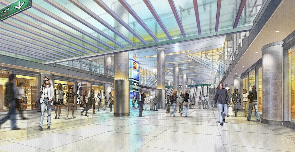
Toronto Union Station Revitalization | ?m | ?s | City of Toronto | NORR

It will be interesting how retail in general fares in there once things open back up. The shopping mall model was tenuous to begin with, minus the fast food joints (McD's, Tims, Starbucks, etc) and newstands/convenience stores.

The majority of the remaining retail will be food or adjunct to same.
The fresh market is a big component.
There are more quick-serve food places coming, the LCBO will return.

There will be some additional retail, but Osmington has a pretty good idea what they are doing, i would expect to target local residents and tourists, I wouldn't expect a Yorkdale store-assortment.

It's true that the spaces in the Front Street promenade haven't done as well; but they haven't even painted the ceiling; the area was also very closed off from much of the rest of the station; those things should improve.
But it will probably remain the most challenging spot, because GO is the high-volume traffic generator, and that isn't GO's spot.
That said, I can tell you the The Danish Pastry House has done quite well in that area, notwithstanding all those challenges.
 
Last edited:
Does anyone know where there are photos of the passenger concourse from pre-1960? All the pictures I can find of Union Station from the past are focused on the arrivals hall and great hall. The reason I'm asking is that compared to the great hall and arrivals hall the passenger concourse looks like it is from a different era or different architect. How was the space envisioned to function and flow? Every time I go into the "revitalized" VIA concourse I think "surely this isn't what was envisioned". In 1927 what lighting would have been there? Before the advent of video monitors what would have guided people to the correct track? Was there more seating? Was there queue ropes all over? It seems the lighting chosen mimics fluorescent tube lighting but that wouldn't have even existed in 1927.

In summary, the VIA concourse is completely underwhelming. If this is how it was in 1927 it was like the architect said "welcome to the great hall and prepare for a grand voyage, welcome to ticketing we are here to serve, and now that we have your money we will send you to the dingy basement." I don't get it.
 
I could be mis remembering but werent there store fronts in the via concourse (now glassed off and used as displays)?

Best place to search for a photo like that would probably be the city of Toronto archives, transit Toronto, or one of the rail historical societies. However I suspect it will be one of those things that no one thought to take a photo of until it was gone.
 
Does anyone know where there are photos of the passenger concourse from pre-1960? All the pictures I can find of Union Station from the past are focused on the arrivals hall and great hall. The reason I'm asking is that compared to the great hall and arrivals hall the passenger concourse looks like it is from a different era or different architect. How was the space envisioned to function and flow? Every time I go into the "revitalized" VIA concourse I think "surely this isn't what was envisioned". In 1927 what lighting would have been there? Before the advent of video monitors what would have guided people to the correct track? Was there more seating? Was there queue ropes all over? It seems the lighting chosen mimics fluorescent tube lighting but that wouldn't have even existed in 1927.

In summary, the VIA concourse is completely underwhelming. If this is how it was in 1927 it was like the architect said "welcome to the great hall and prepare for a grand voyage, welcome to ticketing we are here to serve, and now that we have your money we will send you to the dingy basement." I don't get it.

As per @Woodbridge_Heights excellent suggestion above, I went perusing Transit Toronto's photos.......

I found one from 1966 (obviously, 4 decades or so after the opening....)

1627558565216.png

from: https://transittoronto.ca/photos/images/union-station-strike-1966.jpg - additional credit Toronto Public Library
 
I could be mis remembering but werent there store fronts in the via concourse (now glassed off and used as displays)?

Best place to search for a photo like that would probably be the city of Toronto archives, transit Toronto, or one of the rail historical societies. However I suspect it will be one of those things that no one thought to take a photo of until it was gone.
Yes, there were some photo displays of "Toronto stuff" and some were basically ads for local places, like Hotel Victoria, if I remember right.
 
There will be some additional retail, but Osmington has a pretty good idea what they are doing, i would expect to target local residents and tourists, I wouldn't expect a Yorkdale store-assortment.

It is a safe bet that there will be a cannabis retailer in Union Station ;)
 
Does anyone know where there are photos of the passenger concourse from pre-1960? All the pictures I can find of Union Station from the past are focused on the arrivals hall and great hall. The reason I'm asking is that compared to the great hall and arrivals hall the passenger concourse looks like it is from a different era or different architect. How was the space envisioned to function and flow? Every time I go into the "revitalized" VIA concourse I think "surely this isn't what was envisioned". In 1927 what lighting would have been there? Before the advent of video monitors what would have guided people to the correct track? Was there more seating? Was there queue ropes all over? It seems the lighting chosen mimics fluorescent tube lighting but that wouldn't have even existed in 1927.

In summary, the VIA concourse is completely underwhelming. If this is how it was in 1927 it was like the architect said "welcome to the great hall and prepare for a grand voyage, welcome to ticketing we are here to serve, and now that we have your money we will send you to the dingy basement." I don't get it.
Google Union Station 1950’s and The Globe and Mail has an archive of in the station and others.
 
CN went to the practice of using Daylight Savings time before CP did. So yes, two clocks in summer.

- Paul

That's Paul for you, helpful as always, in part because he remembers 1966 like it was yesterday........... LOL
 
Does anyone know where there are photos of the passenger concourse from pre-1960? All the pictures I can find of Union Station from the past are focused on the arrivals hall and great hall. The reason I'm asking is that compared to the great hall and arrivals hall the passenger concourse looks like it is from a different era or different architect. How was the space envisioned to function and flow? Every time I go into the "revitalized" VIA concourse I think "surely this isn't what was envisioned". In 1927 what lighting would have been there? Before the advent of video monitors what would have guided people to the correct track? Was there more seating? Was there queue ropes all over? It seems the lighting chosen mimics fluorescent tube lighting but that wouldn't have even existed in 1927.

In summary, the VIA concourse is completely underwhelming. If this is how it was in 1927 it was like the architect said "welcome to the great hall and prepare for a grand voyage, welcome to ticketing we are here to serve, and now that we have your money we will send you to the dingy basement." I don't get it.

Having been reminded of my childhood - here are some specifics from the early 60's.

There was a chalk board on the Arrivals level for arriving trains. Departures were shown on a board in the center carousel in the Great Hall. There was a fancy analog writing machine (the fancy name escapes me at the moment) between John Street and a couple of locations in the station to announce platforms etc - staff had to know where the machines were and check the paper roller for updates. PA system was anemic, echoed badly, virtually impossible to understand. The CN da-da-da-dah announcements came around 1970 when 8-tracks came in vogue - the announcements each had their own 8-track tape to be shoved in to the player as needed (it pains me to think how many readers are asking "what's an 8-track?")

The only "wayfinding" was at the gates - signage was as per the recently- restored pillars. Rollers inserted for each train as required (think bus/streetcar type destination rollers). The gates had a brass railing to funnel people past the gateman (they were all men). No walkie talkies back then, so a bit of a ritual so the gatekeeper knew when the train was ready to accept passengers. Gates were sliding glass with mesh, kept closed until ready to board.

Coffee shop (with counter service) was on the east side of thedepartures area at the north end. Other stores were where the seating areas are now - those areas were expanded circa 67 to provide more space. Later moved the main store to the far end of the departures area.

Pre-Rapido, premier trains used to depart from Track 1 which was the two gates on the ramp. That kept the biggest lines out of the lower concourse. CN moved the Track 1 entrance into the Great Hall (east of the ramp) after the Rapido was introduced. VIA moved it to the west side where it has been more recently (that was an arrivals portal previously). In the sleeping car era, there was always a desk by every gate where sleeping car passengers checked in.

Arrivals level was downstairs, the two passageways leading to arrivials was kept virtually "off limits" to the public. Or maybe I just got shooed out when I tried tosneak in to read the teletype thingy, there was one back there). Lots of brass railings to keep the greeters from the travellers.

In the busier era (ie WW2) old photos show the place shoulder to shoulder with people. I certainly recall queues but not crowds.

- Paul
(feeling younger every day)

PS - bilingual lettering added to the original (which was black) in the seventies.

20170110 TUS Remnant b.jpg
 
Last edited:
Having been reminded of my childhood - here are some specifics from the early 60's.

There was a chalk board on the Arrivals level for arriving trains. Departures were shown on a board in the center carousel in the Great Hall. There was a fancy analog writing machine (the fancy name escapes me at the moment) between John Street and a couple of locations in the station to announce platforms etc - staff had to know where the machines were and check the paper roller for updates. PA system was anemic, echoed badly, virtually impossible to understand. The CN da-da-da-dah announcements came around 1970 when 8-tracks came in vogue - the announcements each had their own 8-track tape to be shoved in to the player as needed (it pains me to think how many readers are asking "what's an 8-track?")

In respect of the bolded............I'm just old enough to remember these.

My grandmother had an 8-track player; part of a rather large stereo system, as it would have to be to have a record player, 2 tape decks, an 8-track, an AM/FM radio and speakers. (for the youngin's, no CDs were not yet a thing)

I don't know that the music collection she had was overly large for that format.........I have the oddest memory of something that was accordion based.
 
Does anyone know where there are photos of the passenger concourse from pre-1960? All the pictures I can find of Union Station from the past are focused on the arrivals hall and great hall. The reason I'm asking is that compared to the great hall and arrivals hall the passenger concourse looks like it is from a different era or different architect. How was the space envisioned to function and flow? Every time I go into the "revitalized" VIA concourse I think "surely this isn't what was envisioned". In 1927 what lighting would have been there? Before the advent of video monitors what would have guided people to the correct track? Was there more seating? Was there queue ropes all over? It seems the lighting chosen mimics fluorescent tube lighting but that wouldn't have even existed in 1927.

In summary, the VIA concourse is completely underwhelming. If this is how it was in 1927 it was like the architect said "welcome to the great hall and prepare for a grand voyage, welcome to ticketing we are here to serve, and now that we have your money we will send you to the dingy basement." I don't get it.
Ontario Archives of Toronto Union Station are available and a nice one of the train shed.and many others.
 

Back
Top