Toronto U of T: Lawson Centre for Sustainability | 16.52m | 4s | U of T | Mecanoo Architecten

Of course one can reject historicism, regardless of its quality, and still respect architecture generally. A historicist building may be a fine example of its type, but that does not mean that the impulse behind creating something out of another age must be accepted as of right. While you may believe it somehow tarnishes architecture to require that it be reflective of its era, others would understand that the time an object was created in to be an intrinsic part of the design, and that it would cheapen architecture not reflect it.

I'm not bothered that you feel the way you do about architecture, but I don't see where you get off requiring others to tow your same line: there is a value judgement regarding the role of time here, so there is more than one way to write the laws of what constitutes respectability.

42

Three thoughts here:

First, I will leave it to the poster to speak for themselves, but surely theirs is partly a reaction to an extreme hostility to the more historical architectural style by one other poster............

Second, why must architectural elements from the past remain in the past?

Fashion recycles all the time.......skirts change lengths, shoulder pads are in/out, bow ties are back, blah blah..

If there is an intrinsic reason for change, utility, ecology, accessibility, etc. that's fine, by all means we should respect the changing times, but otherwise.....

Finally,

But on matters purely aesthetic, I see nothing inherently of the moment in square or rectangular windows as opposed to arched; nor any great virtue in glass, vs brick or stone.

In point of fact I can show (as I think most recognize) that an all-glass building cladding is very poor from an energy-efficiency stand point and in many cases has a questionable lifespan.

That's not said to oppose modern architecture for which I often have a great appreciation; though I confess I dislike the terminology in as much as modern should presumably be a moving target......

But rather to say each of these styles have their place.

I for one would love to see Med. Sci at U of T torn down and replaced with something Stern that fits King College Circle instead of that eyesore trying to break the character that evolved over a century before it.
 
There are lots of successful examples of newly built architecture done in a traditional style that I'm a fan of - it just comes down to the details for me and how they're executed. I think RAMSA's buildings are just over the top and more about flourishes and a fantasyland depiction of the past vs real and thoughtful interpretation of materials or craft into a new building. It's a kind of Pottery Barn traditionalism that I just can't get behind, but I can see the demographic that it appeals to. I'm by no means of the opinion that it must be modern or bust - quite the opposite, but I do think a building should reflect the time it was built. Even a traditionally styled building built today is just precast or stone on a clip system with aluminum detailing. Toronto's strength isn't in one particular style but how a bunch of different and contrasting styles play together to create an interesting environment.

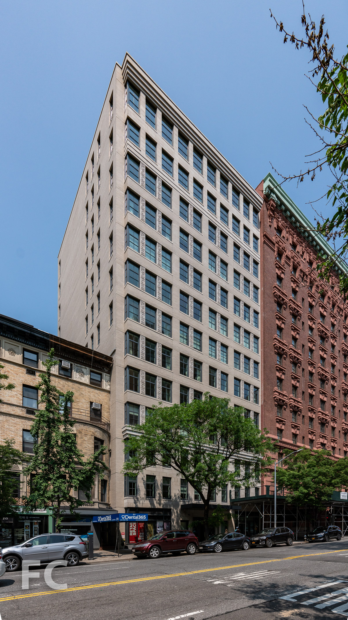
Some examples I think work well include 207 W 79th or 134 Wooster by Morris Adjmi:

20190602-207+W+79-DSC00932.jpg


MorrisAdjmiArchitect_134Wooster-1180x1320.png


The Ramble Hotel by Johnson Nathan Strohe in Denver:

ramble_hotel01-night_web.jpg


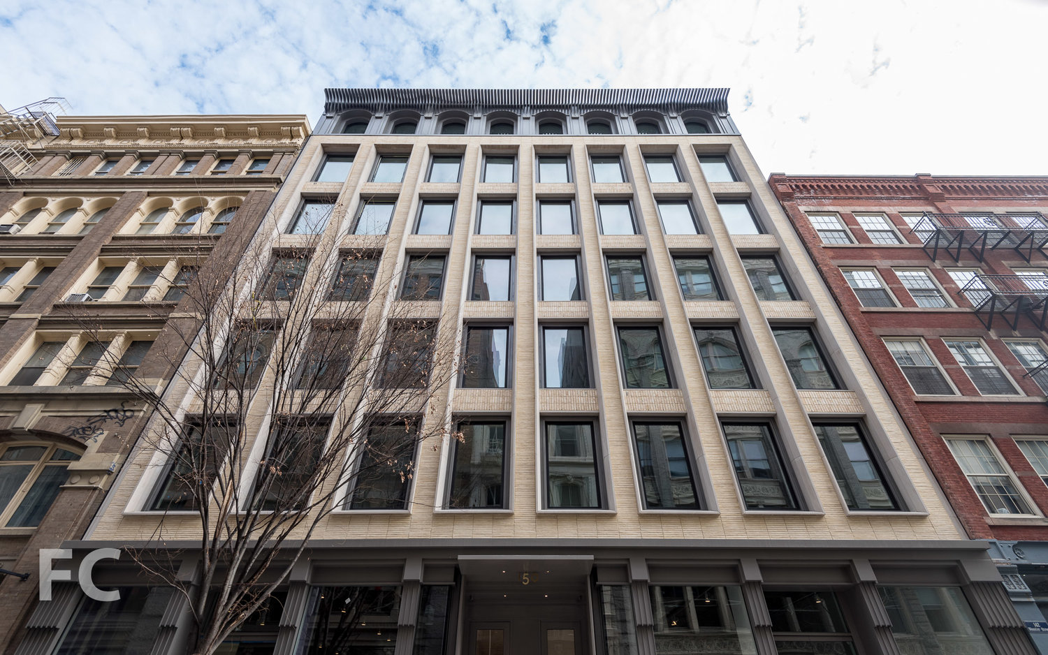
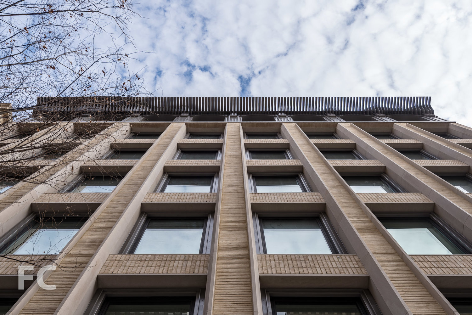
150 Wooster by KUB / HTO

2018_01_27-150+Wooster-DSC_4744.jpg


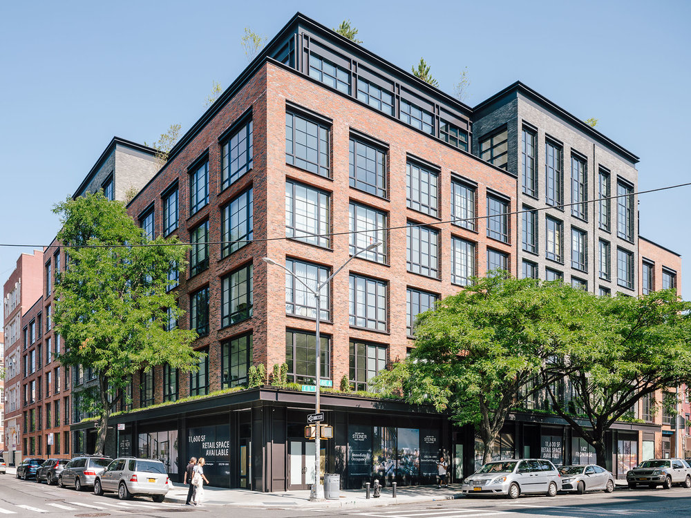
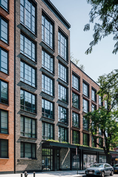
438 East 12th by S9

180815+S9+12th+st+002.jpg

180815+S9+12th+st+017.jpg


At the end of the day I guess it just comes down to taste - I prefer a good dialogue between old and new, including seeing old materials used in new ways, as well as the opposite. Sterns buildings just feel like knock offs instead of interesting works on their own. Even his building on St. Thomas is looking pretty tired.
 
The Ramble Hotel by Johnson Nathan Strohe in Denver:

ramble_hotel01-night_web.jpg


438 East 12th by S9

180815+S9+12th+st+002.jpg
Ooh, can we build these guys in Toronto? Pretty please?
 
I attended the public meeting this evening held at the Trinity College - Seeley Hall. Decent turn out, mostly alumni spanning from different generations, and some students. Francine Houben, creative director of Mecanoo, and a few members of the firm traveled from the Netherlands to attend. Trinity College provost Mayo Moran and Professor Stephen Scharper also introduced a committee consisting of Trinity teaching faculty, current student, and other support staff who are involved in the planning process.

The new building will be called, "The Lawson Centre for Sustainability". U of T alumni, Brian and Joannah Lawson recently made a donation of $10 million to the University for various initiatives including contributions towards funding this building.

Although the final design has yet to be confirmed, Francine Houben introduced the core focus and concepts for the new building. Overall, they've moved away from this being a high-rise proposal. The original zoning application of this at 14 storeys is no longer valid. They're currently looking at a more expansive surface area, with majority of the building at 4 storeys and potentially up to 5 storeys at its highest peak. The concept shows influences of more European based university buildings.

The rough sketch drawing provided when they released the news of Mecanoo being the lead architect actually captures the shape of the new building they're going for. A T-shape beginning on Devonshire, north of the Larkin building and spanning the entire length almost parallel to Varsity Stadium. The goal is to create at least 2 new courtyards within the spaces established with relation to the existing Trinity College. Towards the eastern end, they hope to have a connecting structure that will link together with the historical building.

There's also plans to turn the current service laneway that falls between the Trinity College Chapel and the Munk School, into a proper landscaped walkway. Francine highlighted how in terms of perspective, that walkway is perfectly aligned with the view of the CN Tower to the south.

As the name of the new building suggests, a major emphasis of the planning of the new building is sustainability, which includes environmentally friendly and encouraging of student engagement. They're exploring ideas for landscaping along the planned walkway and courtyard spaces to host a diverse amount of vegetation. Another reasoning for the longer and expansive surface area is to have as much roof space as possible. The plan is to have solar panels covering most of the western tip of the building, a large green roof in the mid section with potential for urban farming, along with greenhouses on the eastern section. The use of timber is expected for large spaces of the interior ground level such as the cafeteria. In total they expect to have around 300 student residence spaces. The new building will also have academic and other social spaces.


1574743148680.png
 
Last edited:
Not related to this project, but an interview with Francine Houben from Mecanoo was just published today by InteriorDesign.net:

 
The split between “traditional” and “modern” is never so neat. north wing of Trinity was completed in 1961, and it looks it, if you pay attention.

You could also argue that modernist buildings are equally a part of the history of this campus.

Definitely so- there's a certain form of architecture from the 40-60s in Toronto that I feel is particularly understudied, and it encompasses Late-Late Deco and other old-style hangovers/contextual projects- almost reminiscent of the Stripped Classicism that was prevalent in the UK and France.

ACO characterizes this style as Modern Classical, and it's usually characterized by stone or brick cladding, punched windows, symmetry, and semi-modernist detailing (with a few 'historicist' stylings where appropriate).

I think it's worthy of study, and in understanding why it seems like Toronto seems to have quite a few of them around at a time when other North American cities seemed to have been embracing the International Style wholeheartedly. And in this case, modernism itself becomes a blurred term- is it the remnants of a older style (partners in architectural firms/conservative power structures reluctant to embrace a Fountainhead-eseque future)? Modernist hybridizations? Architects responding to local tastes and context?

This was also a period when active 'historicism' was also taking place- in cases such as Trinity College North, the UCC replacement, and the Daniel Wilson Residence among others- buildings that are around the same age as the Lever House!

It's a reminder that even older styles were being built into the modern era, and were often hybrids that combined both sensibilities. It shouldn't be considered taboo to utilize or interpret an older style as part of an architectural palette- hence, a Howard Stern building should be considered as equally valid as one by Morris Adjmi- both are contextual, in different ways.

If one thinks about it, there is no era-defining architecture today- and nearly every building in an era utilizes the most widespread construction and technologies inside anyways. So while one might bemoan the fact that a 'historicist' building doesn't reflect the modern technology inside, is a neo-classical building from the 1930s invalid because it was built with a steel frame and built-in air conditioning?

So to recap all this rambling:
1. Modernism is not as clear-cut as one might- as modern classical demonstrates a hybridization of modernism and late deco hangovers. This indicates that modernism is more of a sliding scale in terms of how much it hybridizes. Is Morris Adjmi's architecture different? Though one might argue that the conditions and thought process differed in their creation (hangover vs contexturality), similar hybridizations were produced appearance-wise.
2. Moving towards the other end, buildings were still being built in older styles even into the 60s- showing that even in the era of the Lever House, old styles were not thought exclusively as a bygone past despite MoMA's insistence. This is reminscent of Christopher Wren's Tom Tower in Oxford, or Westminister Abbey's West Front- both examples were built to be contextural, despite Baroque architecture being the rage at the time. Howard Stern sometimes thinks more towards this end, though some of his other pieces are purely stand-alone statements.
3. Every building built reflects the technology of the day, and hence every building is of its era, no matter what style it was built in.

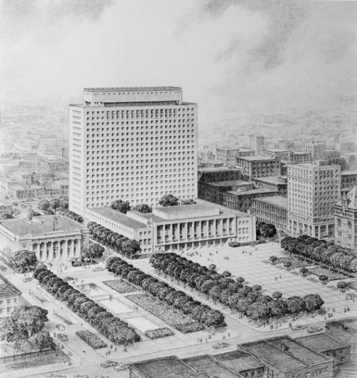
Toronto City Hall Proposal
90fa-pt344_c_5-500x530.jpg


Some other instances (not exhaustive):
- The Imperial Oil Building (city hall proposal recycled)
- The Bank of Nova Scotia building (I know it's technically art deco, but it's interesting that they decided to bring it back post-war stripped of its decorations)
- The old Bank of Montreal building (demolished)
- The Celestica HQ building
- 90 Harbour Street/old OPP building (demolished)
- The Mr. Christie's factory (demolished)
- The current LCBO HQ
- 481 University Ave
- 250 University Ave
- 375 University Ave
- 505 University Ave
- The Ryerson Quad
- Arthur Meighen Building (recently reclad)
- The OISE portion of the University of Toronto Schools building
- Manulife HQ extension
- 333 Bloor St E
- Loretto College Residence
- U of T Department of Materials Science & Engineering building
- U of T Department of Astronomy and Astrophysics
- Original Sick Kids Hospital
- Original Sunnybrook Hospital
- 25 Ontario Street
- 625 Church St
- 120 Bloor St E
 
Last edited:
This is now a five-storey mass timber building. Still 350 beds, but the footprint has been extended east into the area of the North Field.

Screen Shot 2019-12-11 at 9.07.07 AM.png
Screen Shot 2019-12-11 at 9.07.48 AM.png
Screen Shot 2019-12-11 at 9.07.55 AM.png
Screen Shot 2019-12-11 at 9.08.03 AM.png


This is now a five-storey mass timber building. Still 350 beds, but the footprint has been extended east into the area of the North Field.

View attachment 219601View attachment 219602View attachment 219603View attachment 219604


Yes to the scale/massing for the most part.

Minor concern that the southern bump out is awfully close to the windows of Trinity.

I'm fine w/the stone treatment on the base as well., in fact I think I quite like it.

But the other cladding material.....green metal???......not so sure about that.
 
Definitely so- there's a certain form of architecture from the 40-60s in Toronto that I feel is particularly understudied, and it encompasses Late-Late Deco and other old-style hangovers/contextual projects- almost reminiscent of the Stripped Classicism that was prevalent in the UK and France.
There's a very good essay on this transitional period in the book Toronto Modern.
 
It's a shame they're giving up the playing field given the lack of grass pitches at UofT

At least they have the two nice back campus field behind UC still, but I guess Trin is losing their own :(

I walk behind Trinity a fair amount and it's not super frequently in use—get you what you mean about losing playing space though. At least they’re keeping some green space in the courtyards.
 
Community Meeting: 15 Devonshire Place and 6 Hoskin Avenue

The City is holding a Community Consultation meeting where you can learn more about the application at 15 Devonshire Place and 6 Hoskin Avenue, ask questions and share your comments.

Details:

Date:
February 27, 2020
Time: 6:00pm – 7:30 p.m.
Place: 6 Hoskin Avenue, Trinity College Building, First Floor, Combination Room

The City has received an application to amend the Zoning By-law to permit a 5-storey (17.5 metres including mechanical penthouse) institutional building containing a 350-bed student residence as well as classrooms and office space. The existing Larkin Building and George Ignatieff Theatre are proposed to be retained.


Back
Top