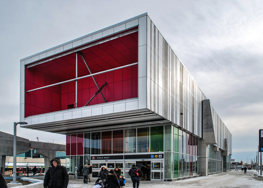
Toronto Finch West LRT and TYSSE: Finch West Station | ?m | ?s | Mosiac TG | Arup

It's still early on and nothing has risen from the ground yet, the underground work is easy, as was said before.

Have you seen the Maintenance facility at Black Creek Drive? It's well into construction; I believe it's opening next year (and I don't have any idea why).
 
Have you seen the Maintenance facility at Black Creek Drive? It's well into construction; I believe it's opening next year (and I don't have any idea why).
Metrolix probably needs it to store all of the LRVs they have on order. What I ment was for stations we have yet to see anything other then a hole in the ground for any of them.
 
Line 1 Extension Open House - Finch West Station, Saturday, December 16, 2017

The Toronto Transit Commission (TTC) cordially invites the public to preview Finch West subway station on the Line 1 extension on Saturday, December 16, from 1 to 5 p.m. The Line 1 extension was jointly funded by the Government of Canada, the Province of Ontario, the City of Toronto and The Regional Municipality of York.

Visitors and future riders will have access to the station, may take a self-guided tour, discover unique facts about the new station, how it was built and how it will operate. Visitors can also talk to project staff, construction and subway systems staff.

For more information about the open houses please visit our website here.
 
lol, 1 day before the official opening. what's the point of that?

1) Every other station had an open house, and this was the only day that fit in the schedule.
2) This is geared more towards transit nerds, while the opening day festivities are probably more of a family event for the local community (I expect to see stuff like face painting, refreshments, and performances by local community groups).
 
Today:
IMG_8416.jpg
IMG_8422.jpg
IMG_8429.jpg
IMG_8436.jpg
IMG_8438.jpg
IMG_8447.jpg
IMG_8452.jpg
IMG_8462.jpg
 

Attachments

  • IMG_8416.jpg
    IMG_8416.jpg
    414.3 KB · Views: 781
  • IMG_8422.jpg
    IMG_8422.jpg
    370.5 KB · Views: 764
  • IMG_8427.jpg
    IMG_8427.jpg
    440.3 KB · Views: 449
  • IMG_8429.jpg
    IMG_8429.jpg
    931.4 KB · Views: 723
  • IMG_8436.jpg
    IMG_8436.jpg
    297.1 KB · Views: 709
  • IMG_8438.jpg
    IMG_8438.jpg
    378.9 KB · Views: 710
  • IMG_8447.jpg
    IMG_8447.jpg
    307.4 KB · Views: 741
  • IMG_8452.jpg
    IMG_8452.jpg
    361 KB · Views: 720
  • IMG_8462.jpg
    IMG_8462.jpg
    358.4 KB · Views: 732
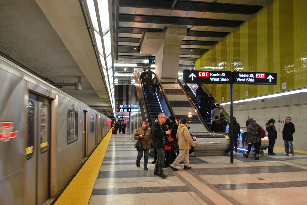
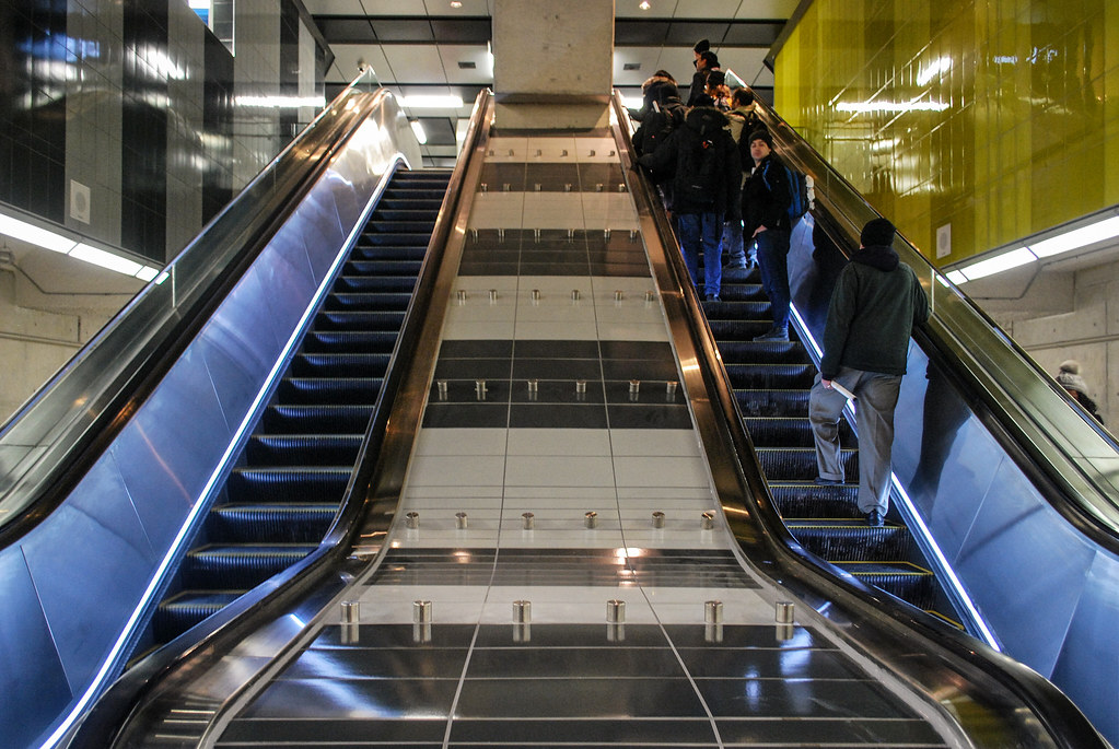
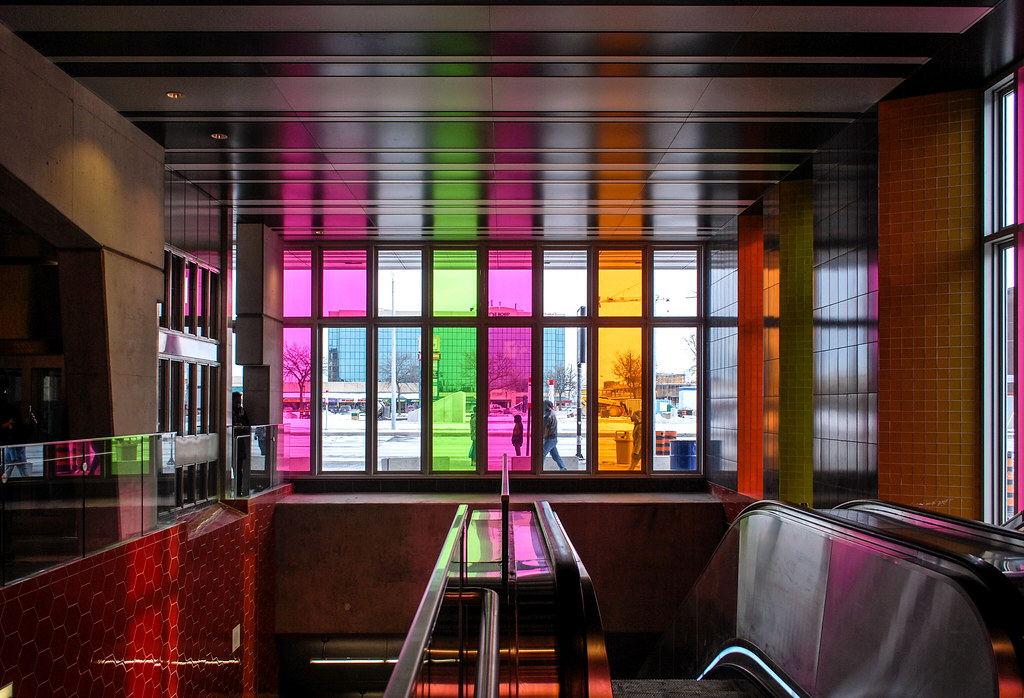
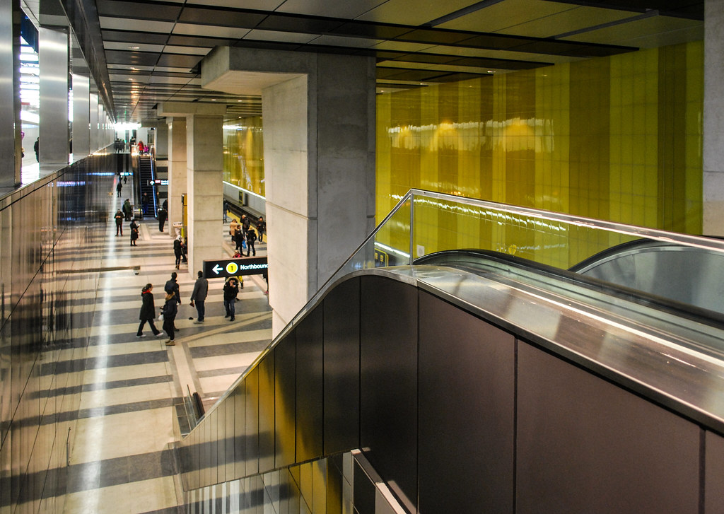
I love the red--but the mustard yellow isn't working, in my view. Sure, the gloss is nice, and taken in the context of a new, clean station, it passes. But there are so many other colours schemes...
 
The sins in this station are myriad!

As I discussed w/several at the UT meet-up today..........

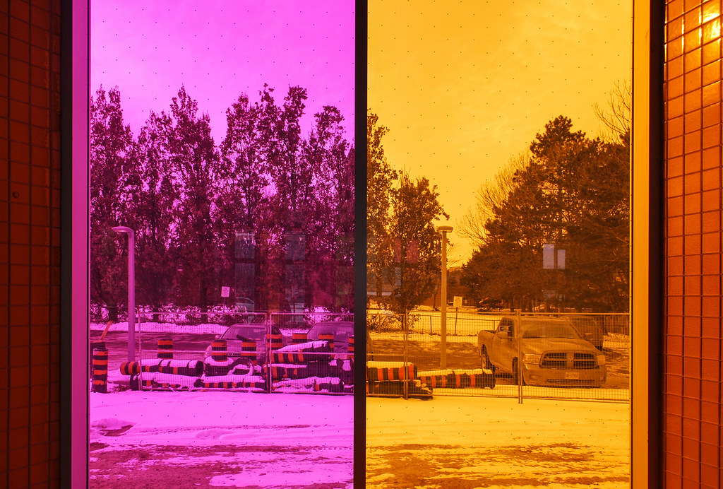
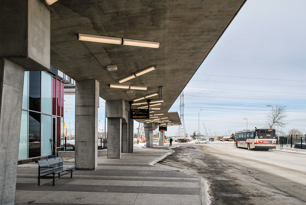
On the surface level, west side of Keele the ceiling is all a uniform finish, and 95% pot-hole style lighting.

With a single fluorescent fixture, for no obvious logical reason, looking completely incongruous, roughly in the middle.

While the mezzanine level features a nice ceiling finish and pothole lights over the platform and escalators.......that transition for no obvious reason to fluorescent lighting at the top of the escalators, lighting which isn't particularly attractive, but also doesn't even run consistently in the same direction (again w/o obvious reason).

In other locations there is no drop ceiling.

In portions of those....the light fixtures are not all suspended at the same height, the differences obvious to the naked eye.

Either that is an egregious design flaw or someone doesn't know what a measuring stick is..........

Other than that..............fine station!

LOL

Psssst......... For 200M I could have done better.
 
Last edited:
Why do all these brand new stations look like they've been in operation for a decade? Everything is stained and dirty and some tiles and other items look poorly repaired or installed after the fact, like they were patched up after several years. Terrible workmanship on this project. This is what we get for $3 Billion these days?
 
Last edited:
The sins in this station are myriad!

As I discussed w/several at the UT meet-up today..........

On the surface level, west side of Keele the ceiling is all a uniform finish, and 95% pot-hole style lighting.

With a single fluorescent fixture, for no obvious logical reason, looking completely incongruous, roughly in the middle.

While the mezzanine level features a nice ceiling finish and pothole lights over the platform and escalators.......that transition for no obvious reason to fluorescent lighting at the top of the escalators, lighting which isn't particularly attractive, but also doesn't even run consistently in the same direction (again w/o obvious reason).

In other locations there is no drop ceiling.

In portions of those....the light fixtures are not all suspended at the same height, the differences obvious to the naked eye.

Either that is an egregious design flaw or someone doesn't know what a measuring stick is..........

Other than that..............fine station!

LOL

Psssst......... For 200M I could have done better.

Of all the new stations, I feel that this one is the least well executed compared to the others. The same architects also worked on Pioneer Village and (for the most part) it turned out much better.
 

Back
Top