Toronto Toronto City Hall and Nathan Phillips Square | ?m | ?s | City of Toronto | Perkins&Will

I made them turn the sign around for a quick photo today. No biggie.
by Jack Landau, on Flickr

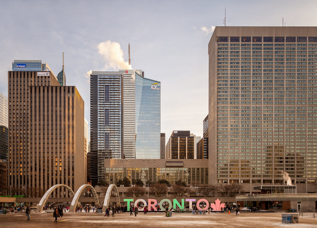
INDX looks second rate next to EY and its neighbours. It detracts from the view. The dozens of differently coloured balcony doors all over the facade make it look messy and unpolished.

With that said, the EY logo detracts from that tower's striking profile. The yellow sloped line of the logo is at odds with the direction of the sloped roof. It competes with the architecture for your attention, even though it's just a logo.
 
It's the I'll advised addition of the truncated maple leaf on the TORONTO sign that makes me crazy. Why o why would the city mess with what was such a successful, simple, powerful sculpture.
 
I have no idea, but I doubt it. Council refused to pay for upkeep last year and City Staff were clearly out hunting for 'sponsors' with $$. Maybe Council will add $$ for upkeep in 2018.
 
I have no idea, but I doubt it. Council refused to pay for upkeep last year and City Staff were clearly out hunting for 'sponsors' with $$. Maybe Council will add $$ for upkeep in 2018.
Yup, it makes perfect sense lets keep it but not pay for the upkeep of it ourselves and find someone else to do it.
 
I know I sound like a whining graphic designer (because I am) but I'm undeterred in my effort to have the Toronto sign maintained - without the maple leaf. I'm on a letter writing campaign and hope to get other designers and design instructors in the GTA involved.
 
I really dislike how half of financial district is blocked off by the big Sheraton slab on the right side. Look at how much of the view it takes up compared to the other buildings. Often times I’ve sat in the park infront of osgood hall and thought to myself how much better would it be if the Sheraton was torn down..

 
Given Kotsy’s amazing photos - thanks, K - it’s clear he has a wonderful eye and an educated design sensibility. So we ought to take his opinion on NPS more seriously than, say, mine. I’ve been unhappy with the maple leaf addition because I think it clutters a powerful design, and in the process renders it less beautiful and reduces its impact. But now I’m wondering if my dislike is less about the leaf itself and more about the City’s general propensity to clutter up NPS with a mishmash of clashing installations of dubious quality that conflict with the square’s clean, modernist aesthetic.
 

Back
Top