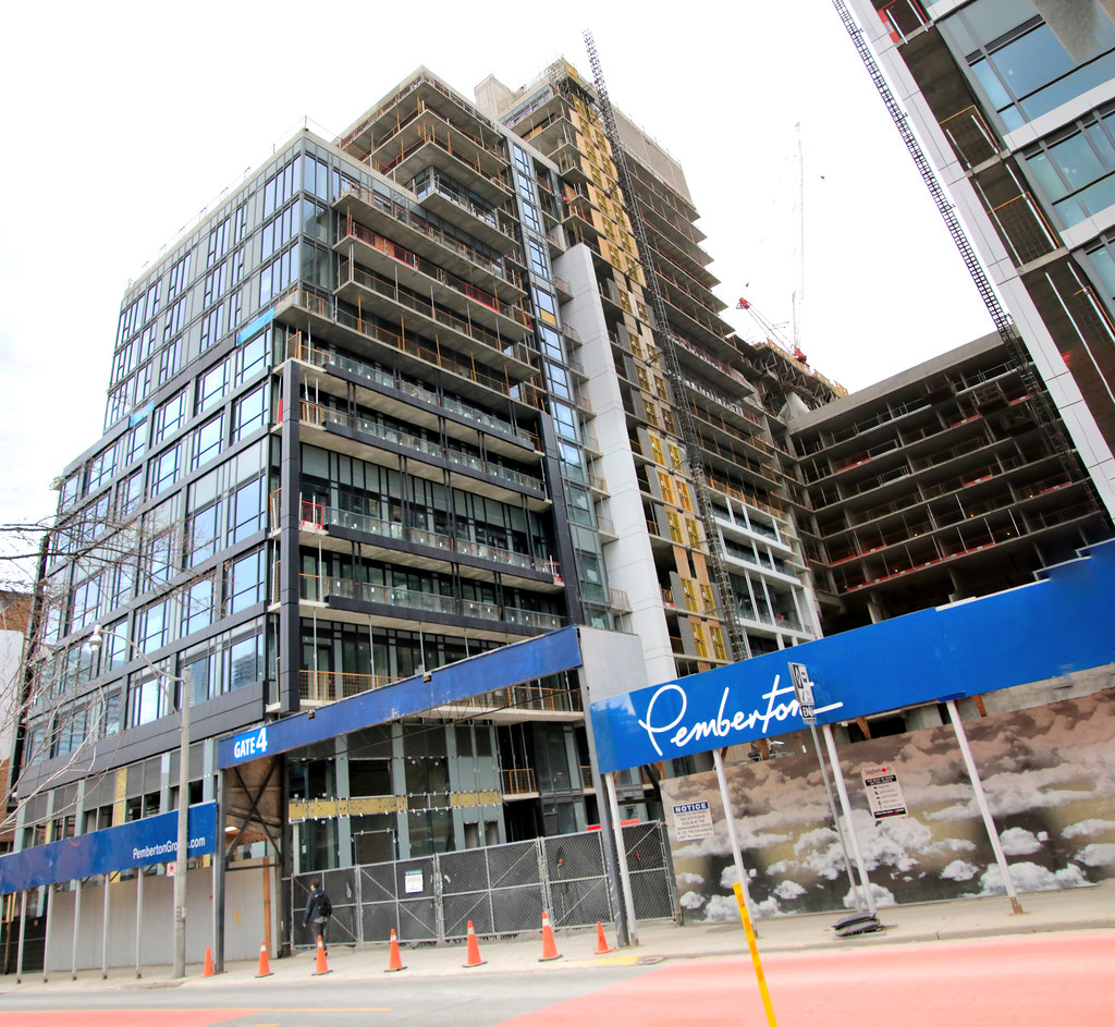
Toronto Time and Space Condos | 101.8m | 29s | Pemberton | Wallman Architects

I like it, and I can see the other side of people that don't too but I like it more than I don't like it.
Perhaps you can elaborate? As one who REALLY finds it a poorly designed and ill-fitting eyesore I am trying to understand why others see any redeeming features (apart from the fact that it IS better than a surface parking lot and provides housing - both of which could have been addressed by a 'better' building.)
 
Perhaps you can elaborate? As one who REALLY finds it a poorly designed and ill-fitting eyesore I am trying to understand why others see any redeeming features (apart from the fact that it IS better than a surface parking lot and provides housing - both of which could have been addressed by a 'better' building.)
It's because those who like it are simply owners in the building trying to justify/protect their investment. Just an observation from seeing the UT commenters in this thread, and those talking about their investment in the Real Estate thread.
 
It's because those who like it are simply owners in the building trying to justify/protect their investment. Just an observation from seeing the UT commenters in this thread, and those talking about their investment in the Real Estate thread.
Exactly my opinion too. One may feel sorry for unwary purchasers and it will be interesting to hear from those who actually move into the building. The Units and common areas could be amazing, but then the exterior could have been SO much better too so .......
 
It's because those who like it are simply owners in the building trying to justify/protect their investment. Just an observation from seeing the UT commenters in this thread, and those talking about their investment in the Real Estate thread.


I like it and don't own a unit.
 
Last edited:
Perhaps you can elaborate? As one who REALLY finds it a poorly designed and ill-fitting eyesore I am trying to understand why others see any redeeming features (apart from the fact that it IS better than a surface parking lot and provides housing - both of which could have been addressed by a 'better' building.)
It's shiny and black. I'm a simple man.

More like I don't hate it than like it. I also used to work on site for a month last year.
 
Perhaps you can elaborate? As one who REALLY finds it a poorly designed and ill-fitting eyesore I am trying to understand why others see any redeeming features (apart from the fact that it IS better than a surface parking lot and provides housing - both of which could have been addressed by a 'better' building.)
I also like it because it's a different from than all the thin tower + podium concepts, and even though the massing is bulky and the materials of average quality, it is different. I would hate to have a neighborhood of these, but one or two won't kill us.
 
April 16
Lot more up on my site
52015720377_9dfb22e761_b.jpg

52016795413_1ca8c3b2bc_b.jpg

52016795573_05df6697f2_b.jpg

52016832358_56ec998f65_b.jpg

52017307330_897b1e746c_b.jpg

52015756612_92fdccd75e_b.jpg

52016795838_34d5f49ef2_b.jpg

52015721387_9a223aaf05_b.jpg

52016755591_c444aabc80_b.jpg

52016755716_3e50512d6e_b.jpg

52015722097_aaa0cc27d2_b.jpg

52016797108_811bf062ee_b.jpg

52016756646_2d73a67733_b.jpg

52017272540_0f64237768_b.jpg

52017009259_f6779be741_b.jpg

52015723197_1490ef0b76_b.jpg
 
I mean, the building is ugly. I don't know why that upsets some people unless they have invested here. Frankly some of the best buildings I lived in were hideous.
 
...and if folks want to look at this on the brighter side, it does look better than Pemberton's other project on the go, the unfortunate Social. I'll least give it that! >.<
 
Ugh, I know this building has been expressed as one of the worst buildings to rise in recent years, but part of me keeps hoping it gets better.


Yet it doesn't.


The mismatched design, the poorly executed massing, and the extremely cheap materials, really makes it an eye sore for such a loved area of the city. I can only imagine the craftsmanship on the interior. If anything, all this has done was cement my distaste for Pemberton.

Imagine if this was replaced with a danish inspired building, like the current projects under development to the south east of here. Something with warmth, depth and consideration for its surroundings would have really elevated the area, instead of taking it down.

I'll join yet again in expressing my extreme disappointment.
 
I just absolutely love the design and architecture of this development. The esplanade area is old and needs to be revitalized. I'm not saying knock this entire neighborhood down like Regent Park because you still want that culture and heritage vibe from this area so seeing a mixture of new high rises being integrated with these old low rise buildings is a site that I just absolutely love to see! #hatersgonnahate
 
Last edited by a moderator:

Back
Top