Benito
Senior Member
Today’s update.
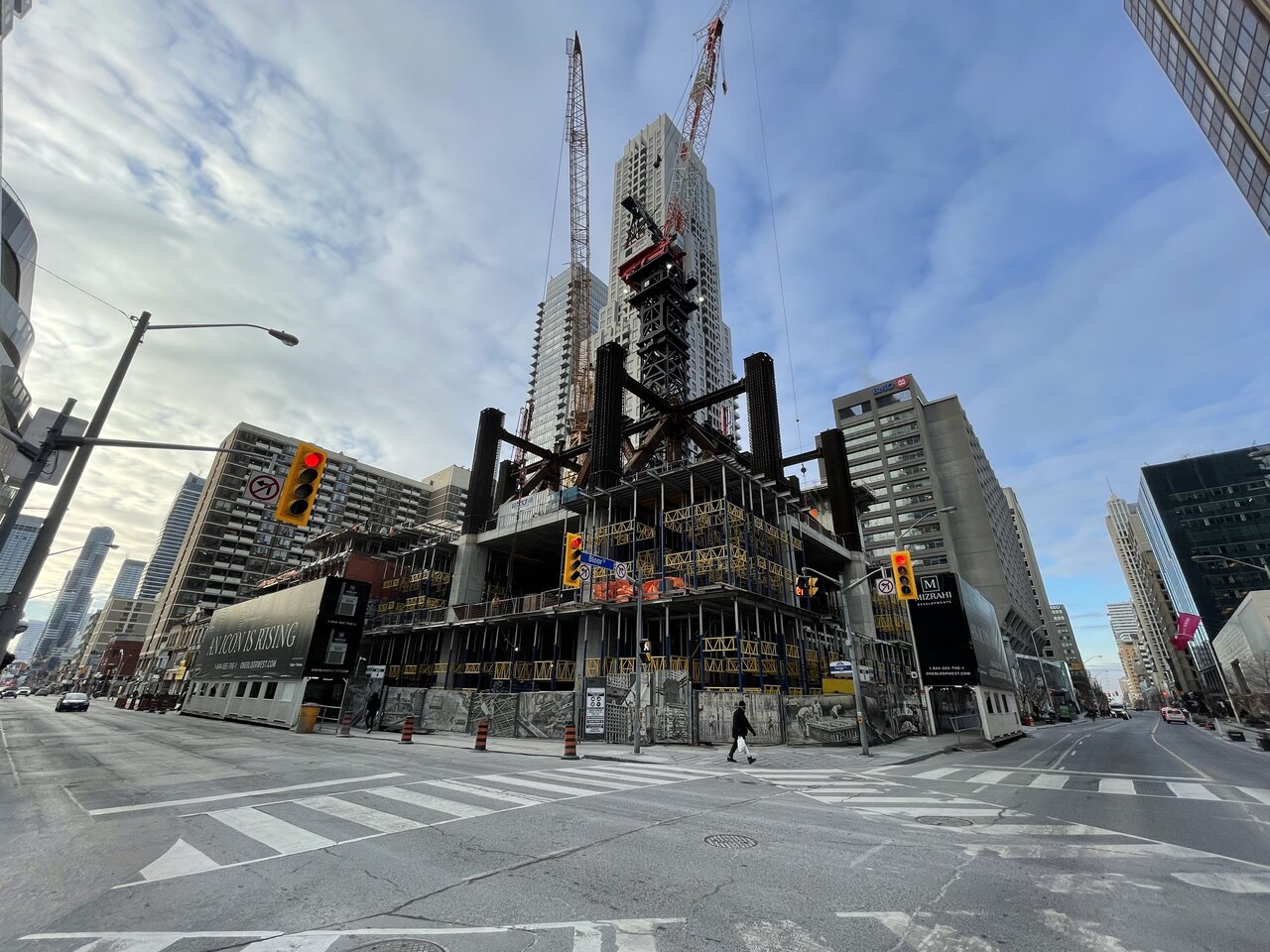
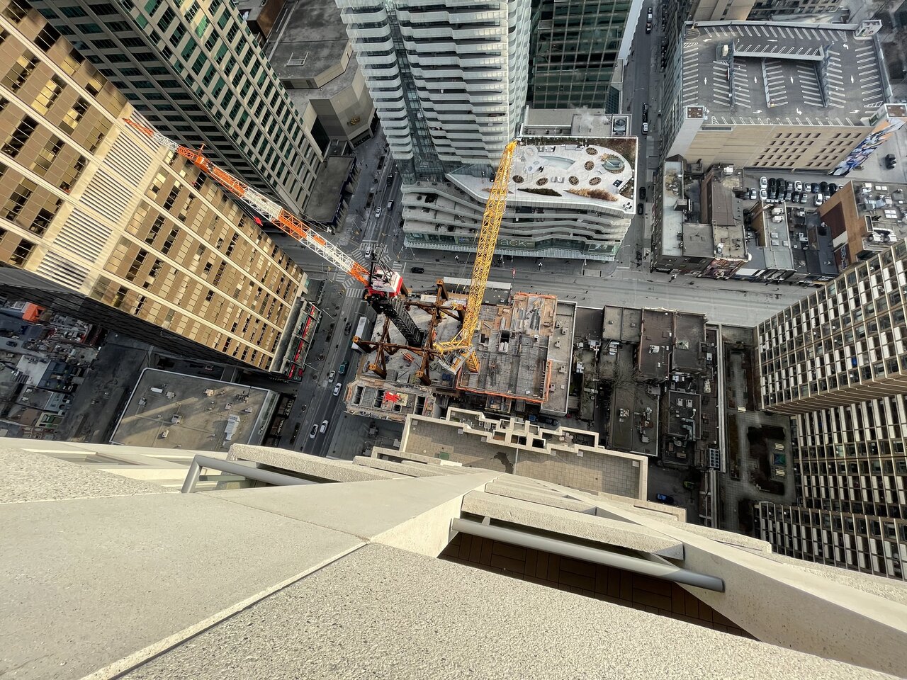
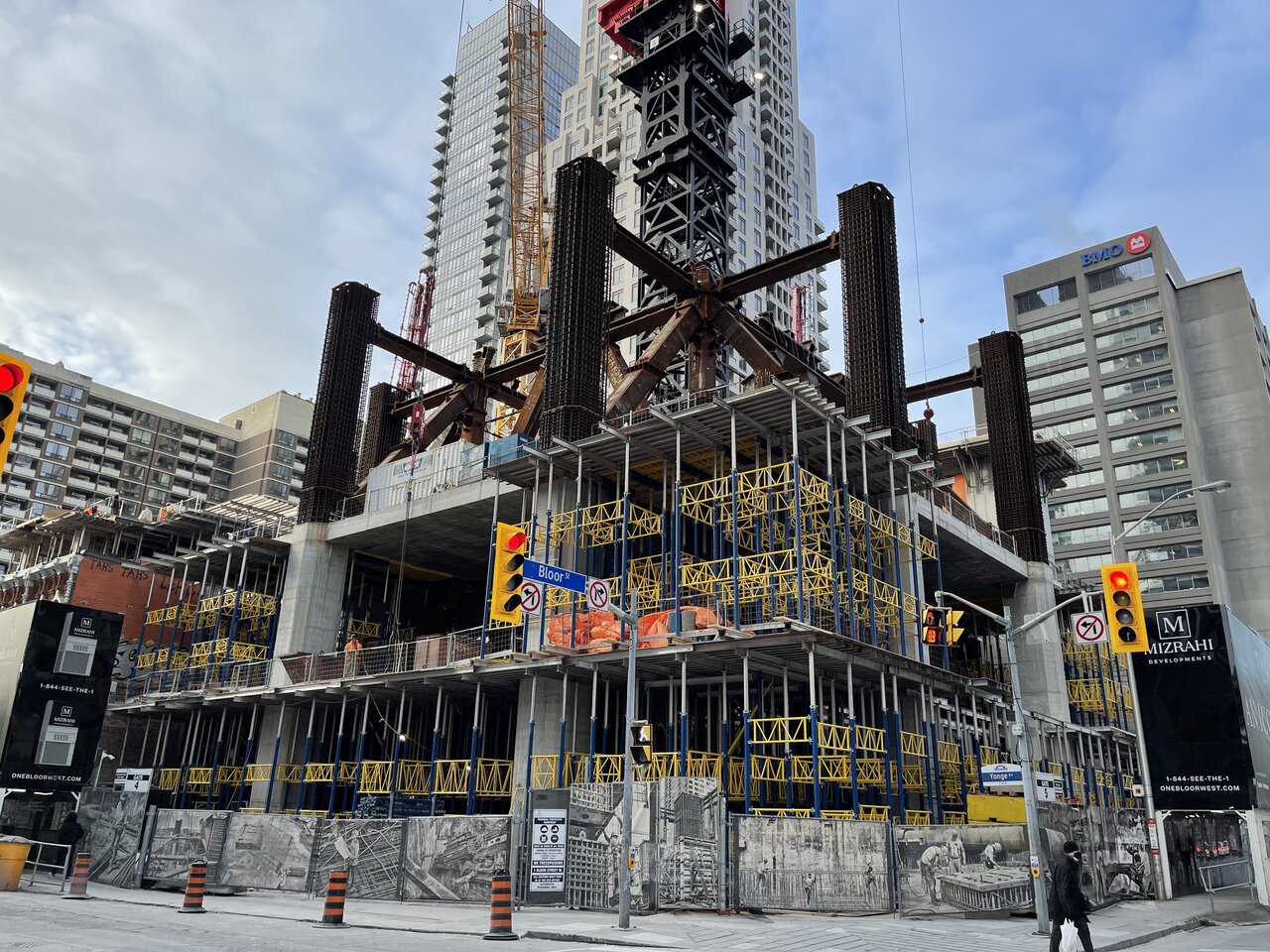
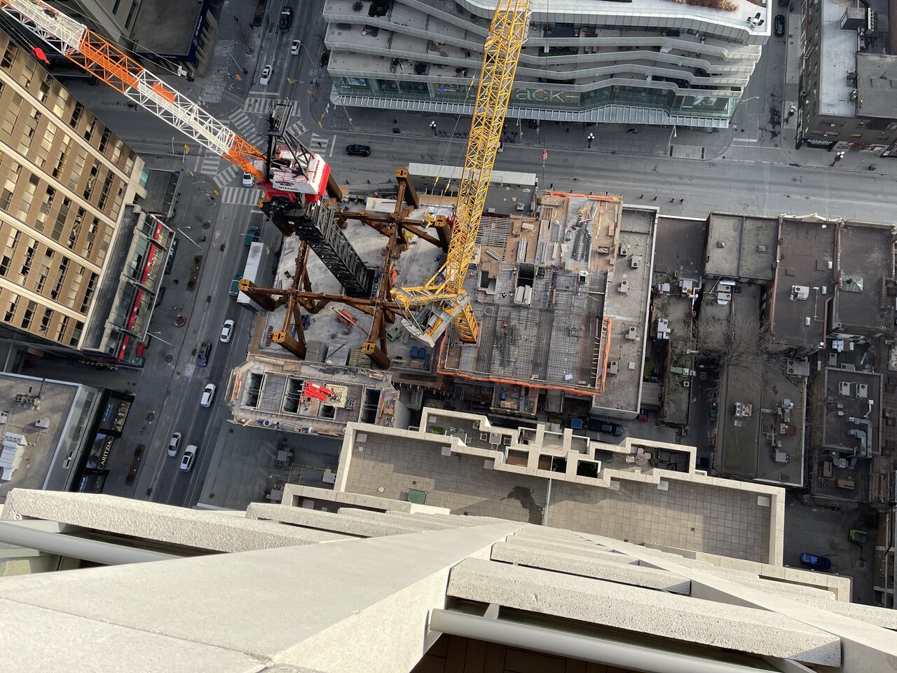
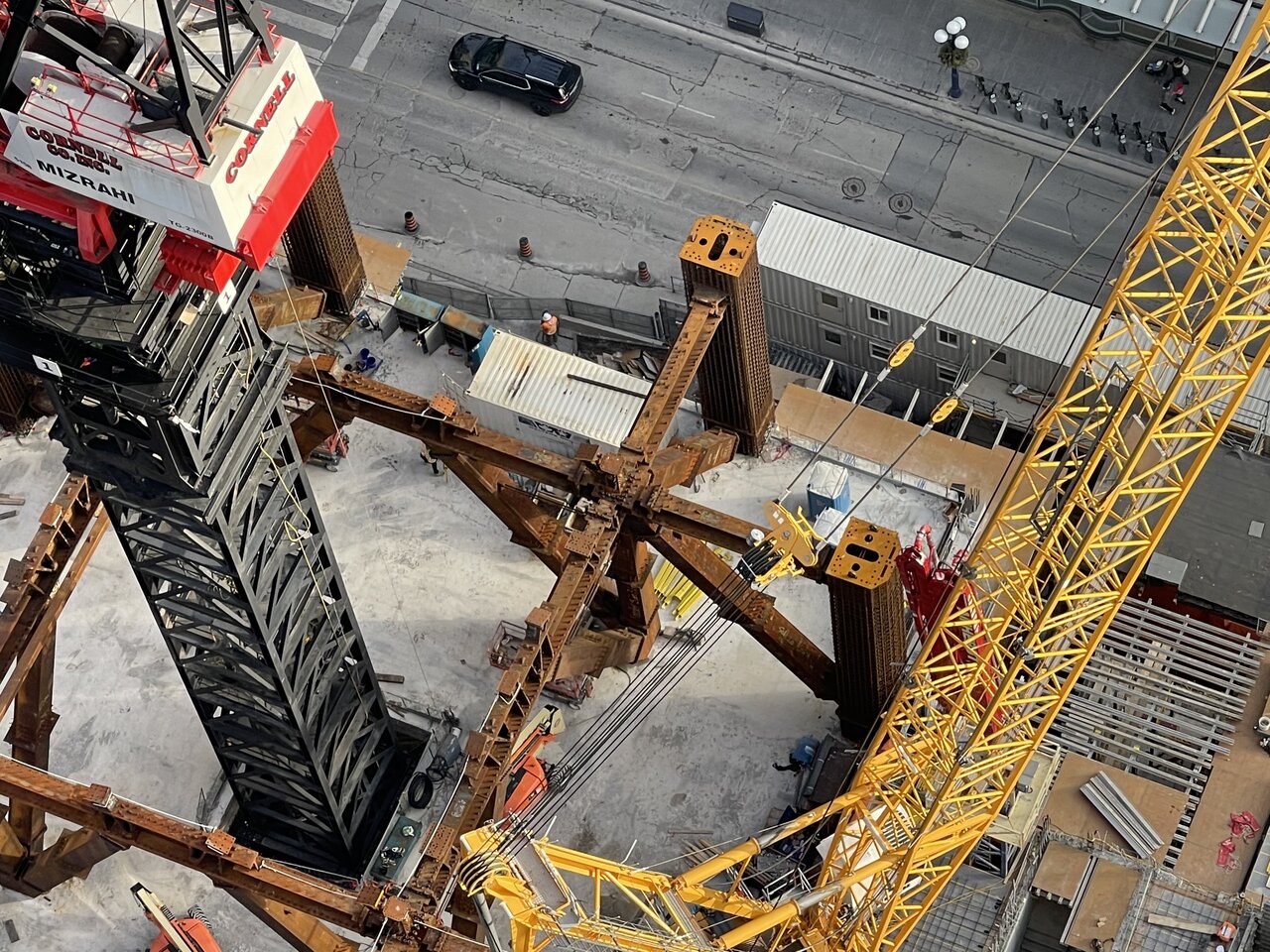
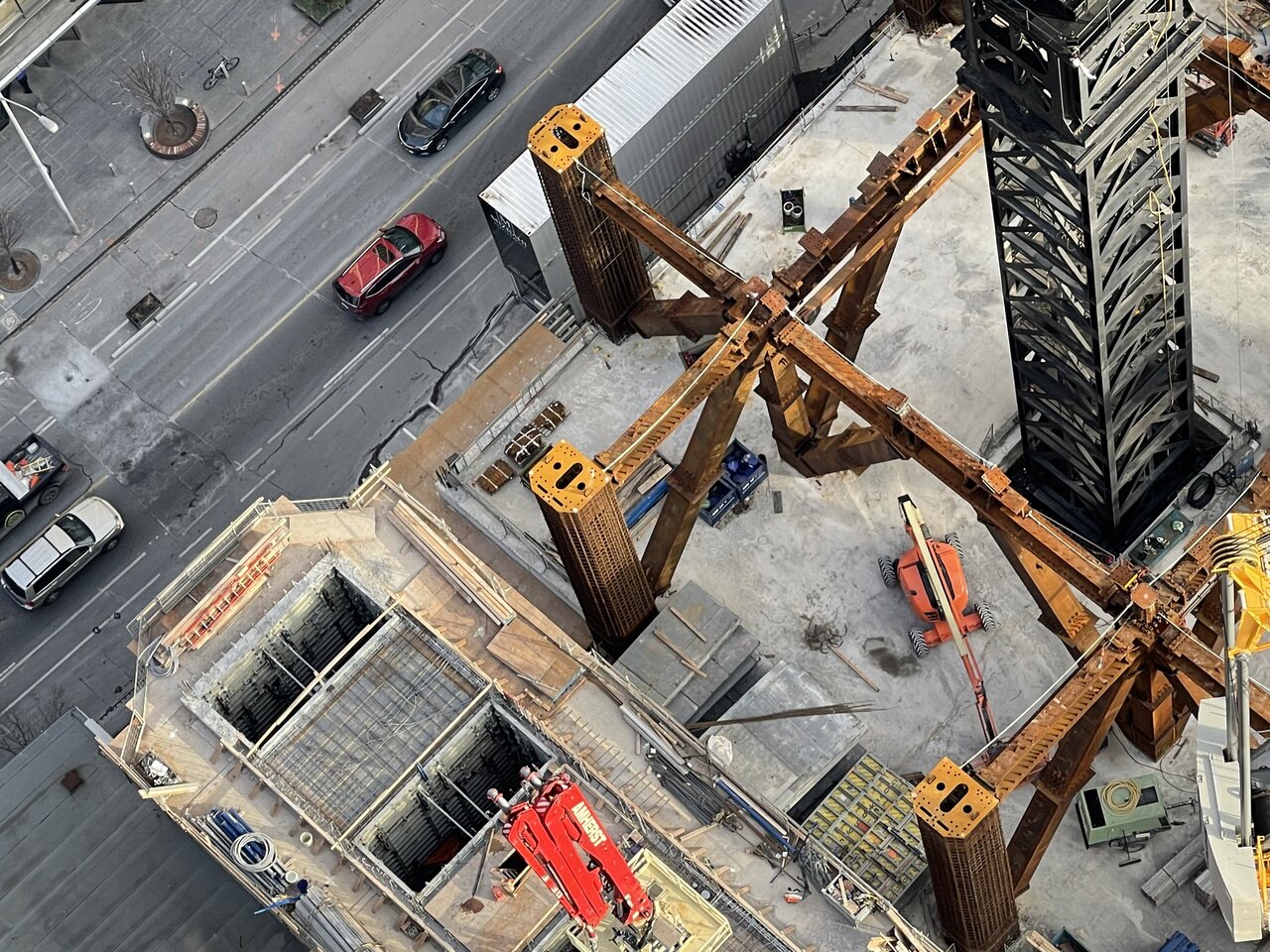
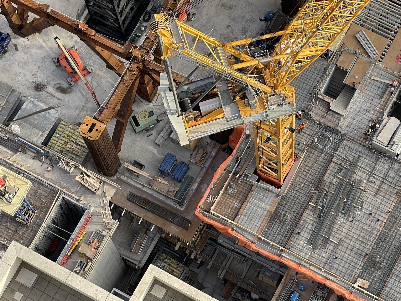
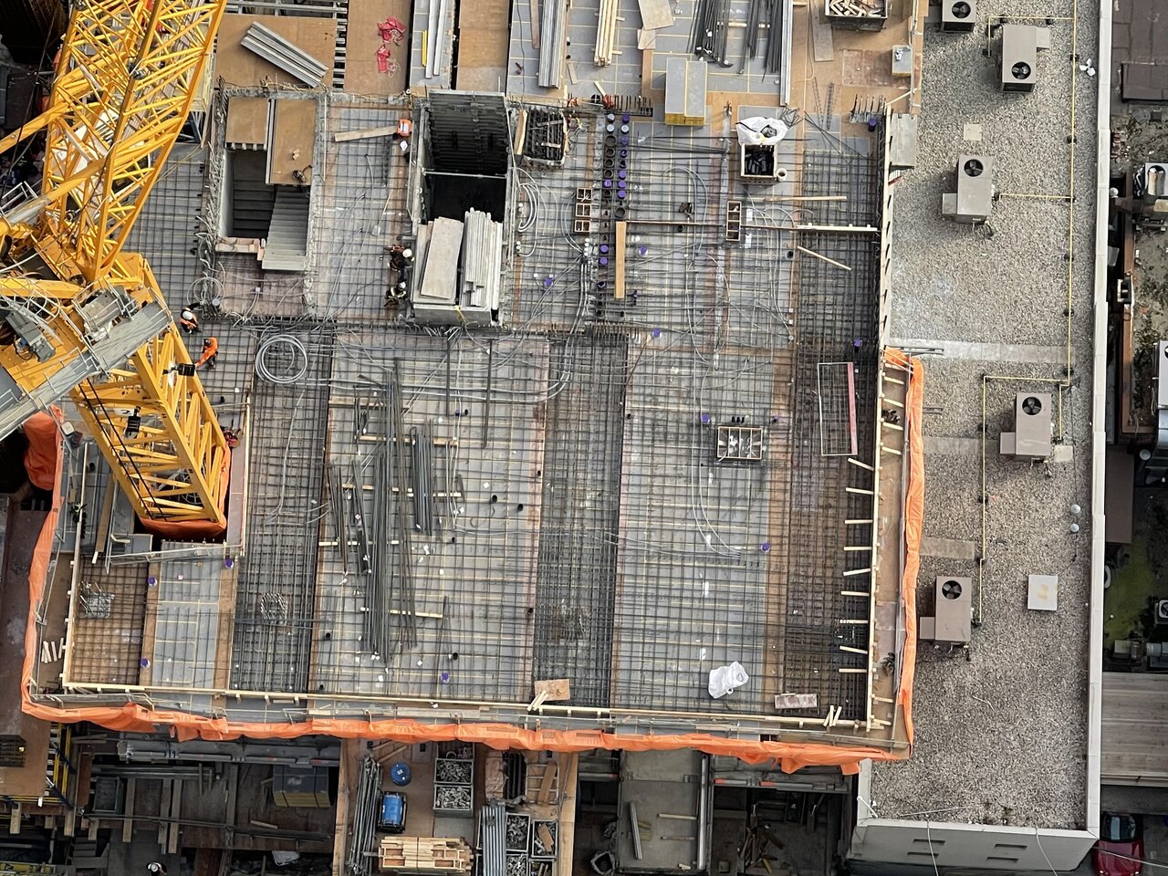
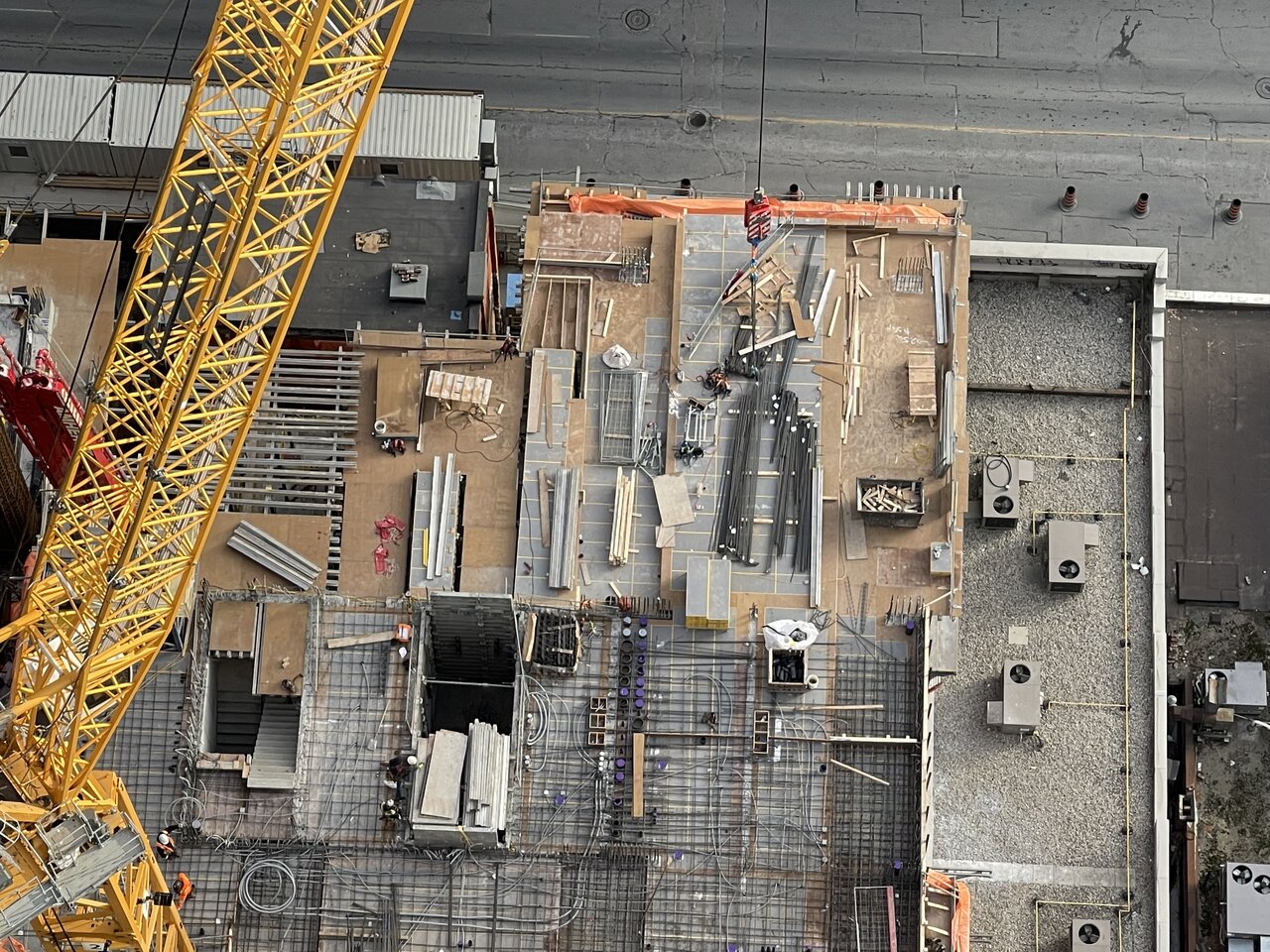
Looks like a baby who will outgrow his parents soon...
Like a waltzing pairI'm proud to see this building become a supertall too. I've also wanted it to climb a little taller. And have a revolving dining area on top in the Yorkville area etc. But standing next to the 1 Bloor East tower's creamy white balconies seen in the photos up above . It would have been nice to see a much darker shade of white on this building's cladding to create a colour difference between the two towers .
Levels 0, 1, and 2 are all covered in that massive ground floor. And the ceiling is a solid 12 meters above the ground. Above that are the 2 levels for Restaurant (Event Space), followed by the Hotel lobby and then the residential lobby at Level 6. The common floorplans raise above this.How many floors is the podium? 6?
It's interesting to note that the first 2 pics from Thompsky's contribution in that Gif is a year apart. The last pic is about 2 months after the fact. For those who keep reminding how "slow" this project is progressing needs to be reminded how fast this is going when there is no work stoppage is involved by looking at the last 2 pics used in this Gif. So I look forward to this project growing expeditiously at this click until it's done. Naysayers may have other opinions on this though...GIFified!
View attachment 296092
They are the ones responsible for Louis Louix over at St. Regis - the style is a giveaway (not a bad thing).I apologize if these have been posted upthread, but it appears DesignAgency is doing the Andaz's interiors... and they look swish. They've only shared the following three photos of the restaurant and bar so far, but so far so good.
Classy. One to look forward to in 2023.
khabah
View attachment 296367
View attachment 296368
View attachment 296369
I don’t think those images could be from the one. Why would they have that image in the background when it clearly isn’t from the area? Must be from another project. I doubt they are that unaware of what the view would be. It’s also considered false advertising if it is the one...no?
You definitely have a point that this seems to be a blatant lack of knowledge about the project, but I'm inclined to believe that this is from The One. The last picture with the Shangri-La clearly shows the hanger structure meeting up with the outer super-column in 2 locations, one straight ahead behind the seating, and the second behind the bar on the left side of the image.I don’t think those images could be from the one. Why would they have that image in the background when it clearly isn’t from the area? Must be from another project. I doubt they are that unaware of what the view would be. It’s also considered false advertising if it is the one...no?