Toronto The Modern | ?m | 17s | Empire | DTAH

300 Front St. is also using grey but they are using a lighter shade, as well as mixing it with a creamy white. The effect is MUCH better. If you are going to use grey, it has to be done right (with some imagination) but my question is, why must we always use a safe colour like grey on practically every new building? Right now, lucky us, we are getting a whole lot of new buildings and I'd bet that 90% are mainly grey or at least partially grey. PLEASE, developers, start a new colour trend for god's sake. Yes, in 30 years time people will ask themselves "What the hell were these dull people thinking".

I ask myself that RIGHT NOW! (and I know I'm not the only one)
 
Some like it...

Hume: New Toronto condo does its bit for urbanity
March 15, 2012
Comments on this story(0)
Christopher Hume
STAR COLUMNIST


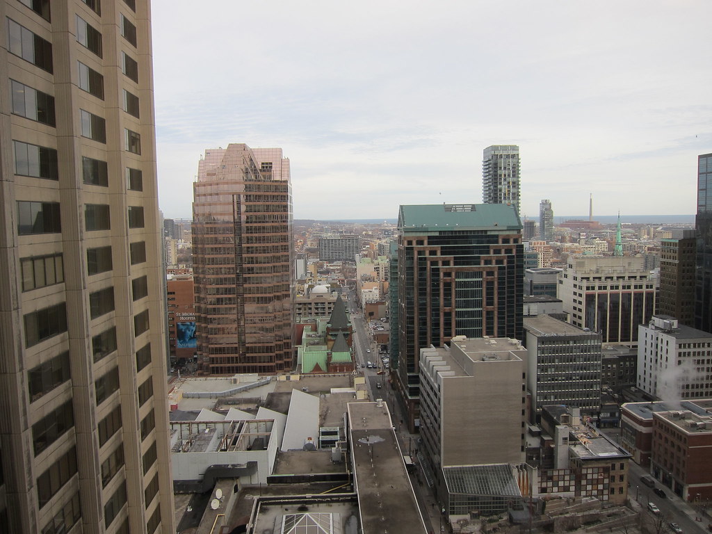
Sherbourne St., the street that time forgot, is now the road to the future.

Though neglected for decades, in recent years it has become a hot bed of condo activity. That should come as no surprise; but it’s still a shock to see just how the fortunes of this once-grand-but-much-reduced thoroughfare have changed. Stretches of misery remain, especially around Queen St. E., yet the forces of gentrification will not be denied. And with the badly conceived interventions of the mid-20th century slowly disappearing from the landscape, Sherbourne’s many urban qualities are once again being revealed. Not much heritage remains, but enough to remind us that this was one of the streets of choice in 19th-century Toronto.

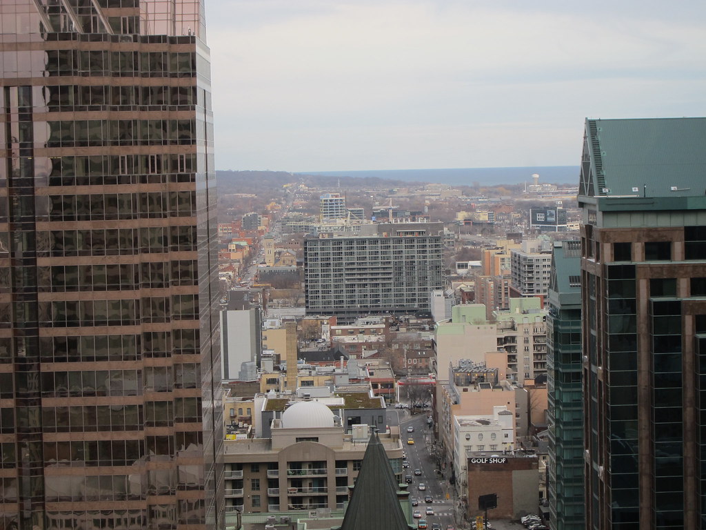
The big changes now are happening at the bottom end of Sherbourne, south of Queen. Sherbourne Common, which opened in 2010, anchors the street and reconnects it to Lake Ontario and the waterfront. North of that, Sherborune is in the process of being remade by residential towers. Much has yet to unfold, but what makes the revitalization so interesting is to see how the infrastructure of today and yesterday can be combined and enhance one another.

Post-war redevelopment, by contrast, tended to ignore the past. These days we have learned to work with it instead. Most obviously, that means contemporary buildings once again seek a relationship with the street, and by extension, the rest of the city.

chume@thestar.ca

Condo Critic

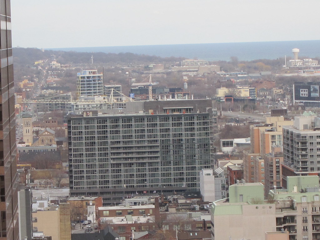
The Modern, 320 Richmond St. E.: Sitting on the east side of Sherbourne Ave. at Richmond St., this 17-storey condo is less a tower than a slab. There are reasons to be leery of such a form, but here it works well enough. The main facade, which faces west onto Sherbourne, is enlivened by the interaction of planes, one running parallel to the street, the other at an angle. Finished in glass and dark masonry, the building has a vaguely industrial appearance. That aesthetic is enhanced by the bank of windows and recessed balconies that give this project a gritty yet urban quality. No one would call it handsome, but it’s hard not to pay attention.

Grade: B+
 
The podium, with the shadowy recesses and horizontal lines, looks rather oppressive.

Hopefully once some signage and lights go in, it won't feel quite the same way.
 
It does indeed look oppressive, but I find it appealing in a way. It has a fortress-like quality. Given the somewhat sketchy area in which it sits, and forces of gentrification living within, the fortress imagery seems kind of fitting.
 
I think it looks better up close than from afar. The juilet balconies work here. The podium and its angle to the high rise portion feels very comfortable witheach other and the street.
 
The Modern gets a prominent view from this elevated vantage point looking east along Richmond:

8250507365_e79faf1a50_b.jpg


8250508543_a7a63fa28e_b.jpg


8251576498_26e1a94340_b.jpg
 
The ground floor ceiling is indeed too low, and the retail is just a wall of glass along the sidewalk.

Otherwise the building has some attractive features, but it's very disappointing when an opportunity as important and obvious as the entire ground level is botched.
 
I'd like to see minimum standards for ground floor heights established in the city based on the types of streets buildings are located on.

42
 
This building is a big, grey slab and I don't think it adds much to the neighbourhood. Even the retail spaces bring nothing of value, so it's pretty much a write off for me. If you are anywhere east of the building, it blocks out the whole CBD view and just darkens the street. My last hope was that good retail would liven this up but that hope faded once it got leased to dental offices and medical uses. There is not one single decent store, restaurant, bar, cafe or service in this whole complex, that's of use to me. Like I said, for me it's a write off and a huge disappointment.
 
The interiors aren't bad, but the exterior is terrible to me. If you're going to go with that dreary grey brick, you have to have to have better contrasting features IMO. There's no color. The framing is grey. The spandrel is grey. The window color is grey. Blech!
 

Back
Top