Toronto The Carlaw | ?m | 12s | Streetcar | TACT Architecture

Not in the tower portion, but there is a row of stacked townhouse condo units in the rear that will have units on the ground floor.

Thanks..
reason is I recently purchased a unit on the north side and wasn't sure which floor is mine. Are they counting the ground floor as the first floor. they said balcony's start on the 3rd floor but by the looks of it balconies start on the 2nd floor on the north side. Guess I'll wait it out and see it come together more.
 
They're now pouring the 10th floor, and windows are going up on the 2nd floor.

DgL7jVw.jpg
 
Nice shot. Occupancy is scheduled for May 2015. If they continue at this rate, they may just pull It off.

Also good news for investors who bought into this, the corner of Dundas and carlaw on the north west corner has been bought by the city of Toronto and will be re-developed as a mini park/ community hang out. Should help with value since it's an eye shore now.
 
Last edited by a moderator:
Here are some shots of the window systems going in. Not too fond of the light colour on the tower - though I noticed the areas where there are balconies are use darker mullions and spandrel.

The windows on the townhouse units are nice - curious how it will all come together considering this part was modified drastically from the original proposal.

QgRRwI9.png


tTHCv9q.png


msLRRqI.png
 
Do you know how the new renderings look like? Can't find it anywhere. The way it's shaping looks a lot different. Hope they at least moved away from the brownish brick look they had on the original plan.your right not sure why they have have to shades of glass frames.odd.
 
From the GO Train yesterday:

P1430060.jpg


42
 

Attachments

  • P1430060.jpg
    P1430060.jpg
    183 KB · Views: 1,131
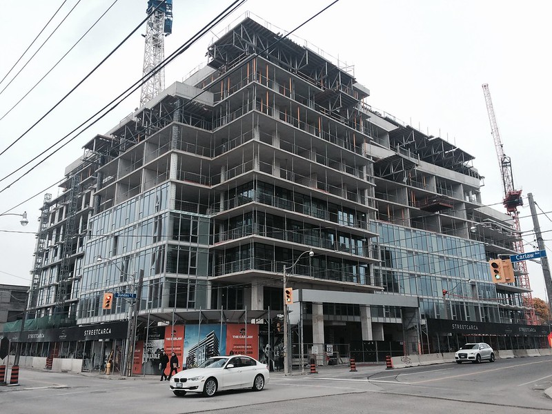
Passed by the site today and was surprised with the progress made on the cladding. I was shocked to see, however, that the developer made the following changes to the building:

1) The red/brown brick that is seen in artist illustrations is now grey/black.
2) Curtain wall a no-go.
3) circular exterior columns are now square.

Here are some pics on a gloomy fall day:

15564668099_f020571ac9_c.jpg


15564668649_cd12f3c095_c.jpg


15750545275_458a707452_c.jpg


15131151173_a4221d8fcf_c.jpg


15752090982_f24ae7de2c_c.jpg


Back of townhomes:

15726832966_80b8de8ee5_c.jpg
 
Last edited:
Should be allowed to sue developers who pull this shit. Lack of integrity by some in this industry is disappointing.
 
Thanks for the pics. Great progress.
Have you got confirmation about the curtain wall being a no go? I didn't hear of any change.
 
Thanks for the pics. Great progress.
Have you got confirmation about the curtain wall being a no go? I didn't hear of any change.

You don't need confirmation.. Just look at the photos. The second last one shows that they've moved away from curtain wall windows. I'm guessing they're cutting corners to keep costs down. I know you should take renderings with a grain of salt, but c'mon! So many aspects of this building have changed.
 
Last edited:

Back
Top