Toronto The Berczy | 41.76m | 13s | Concert | Arcadis

I don't know, I guess I just tend to not over-react while something is still under construction. It's like watching those home reno shows when people flip out and go nuts about how awful their new kitchen is going to turn out while it's undergoing renovations with debris and crap everywhere, then cry happy tears in the end when it all comes together and looks gorgeous.

And I often read people's posts for older, built projects and their changing opinions over the years it was being built and sometimes reading their final opinion which is a complete 180 degree turn from hating something to then loving something. That's all.

(I will now write the same comment in the Aura thread...as people that hate Aura will likely change their opinion once it's complete and looks stunning in our skyline afterall haha :p)
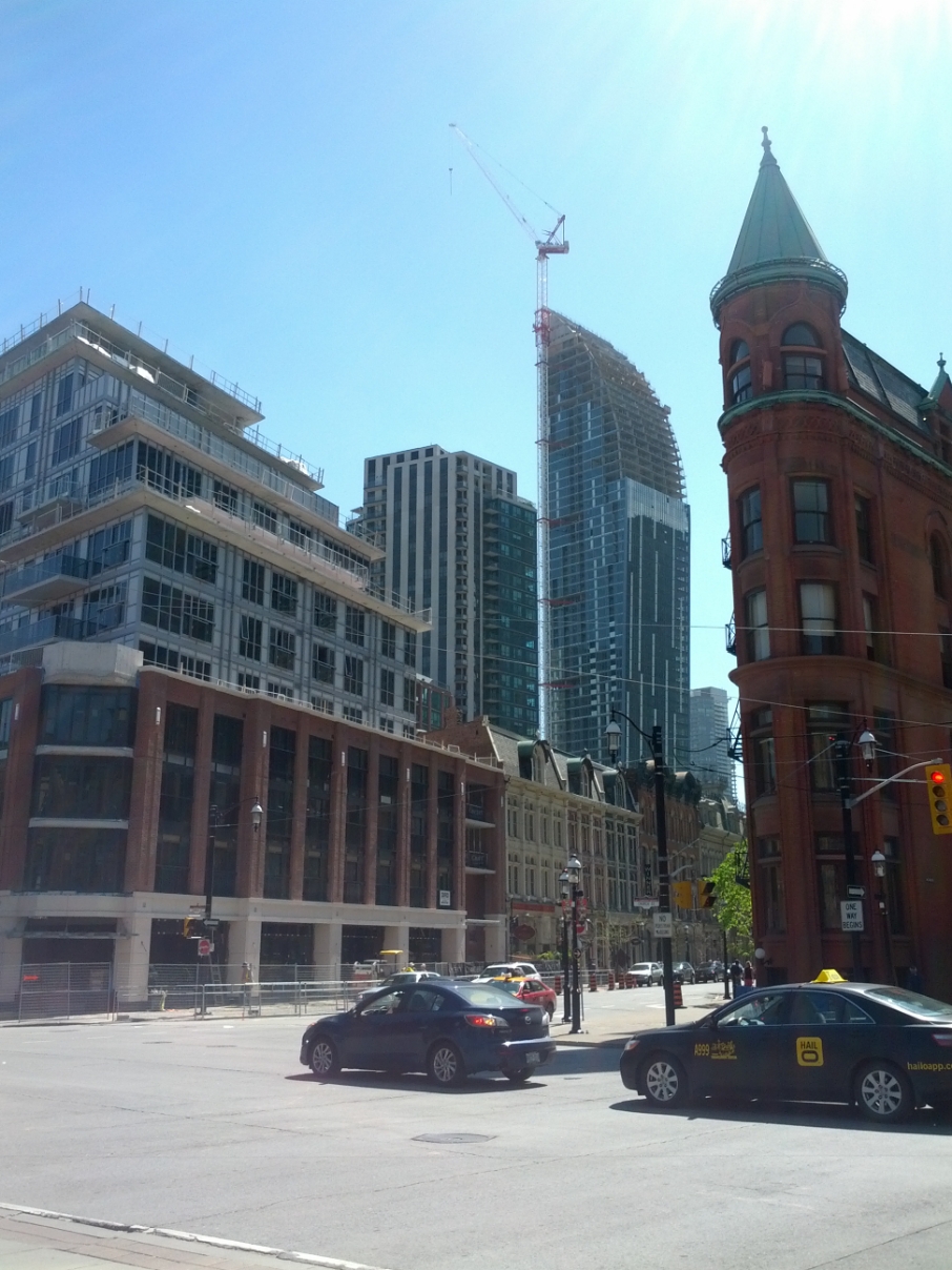
 
The podium certainly isn't going to be featured in Architectural Digest any time soon, but for some reason I really dig it. It reminds me a lot of London on the Esplanade's podium. There's something about the red brick columns, black glass/mullions and railings that feels kind of steampunk-industrial to me. I get the sense that it was inspired more by the Distillery District than by St. Lawrence. It's out of place, but nonetheless properly conveys an interesting theme.

I won't bother beating the dead horse that is the upper portion of this building.
 
Rivercity:

To be fair though, River City is an exercise in calculated design that went through multiple reviews. I can't sincerely call the "podium" level (street perhaps is a better phrase) treatment of Berczy ugly - more like well-executed crowd-pleaser conservative. My personal beef has always been with the more problematic slab portion of the development - and to put it in analogy, someone slapping a RoCP I like tower atop a street level treatment a la 1 St. Thomas.

AoD (not MoD)

I pretty much agree, though I don't think I would characterize the upper portion as either slab-like or 'slapped on'. There are set-backs, after all, which likely were added in an effort to avoid a slab and give some air space to the flat iron building... and, though as of yet seemingly less successful than desired, the change in materials of the upper portion was also likely for the same reason. In the end, if different materials had been used on the upper level it would have been a much more successful outcome all around.
 
And I often read people's posts for older, built projects and their changing opinions over the years it was being built and sometimes reading their final opinion which is a complete 180 degree turn from hating something to then loving something. That's all.

(I will now write the same comment in the Aura thread...as people that hate Aura will likely change their opinion once it's complete and looks stunning in our skyline afterall haha :p)

Hardly. Of the people who hate Trump, Aura, ROCP, CrystalBlah, Couture etc, you will find an extremely high level of consistency, because they are people who can spot a dog right from the beginning. they don't need to "wait until its finished" to know they are substandard projects.

in the case of the deadenders who insist loudly that buildings like Trump or Aura are "iconic", or "classics" or "better than Four Seasons or L Tower" or whatever, mostly what you get is radio silence--while they quietly eat their words and hope no one remembers their posts.
 
a picture from today

IMG_20130515_165709.jpg
 
What stopped the developer from building the entire project like the bottom half?
and why do so many architects in Toronto so uninspiring?
 
kweku:

I think the intent is to make the top lighter, less intrusive visually and separate from the strong, historical streetwall. Clearly it didn't quite work as intended. By itself the top is "forgiveable" in a different context (i.e. in a forgettable, filler role), but in this setting the whole development just look jarring - as separate elements of the overall design and as one element within the cityscape. Instead of disappearing, it just stuck itself in front of your face in a way you least expect it to.

AoD
 
Last edited:
I've only ever wanted this building to be inoffensive (kind of like this one). It's not a great building, but I'm still on the fence as to whether or not it's an offensive one (like this one, or this one).

The base is more or less in line with your first example. The top part however resembles more like this, but with windows.
 
My wife and I went by the Berczy last week on our way to dinner and she asked me when they were going to put the finish material on the upper half of the building. That comment pretty much sums this one up in my view...
 
My wife and I went by the Berczy last week on our way to dinner and she asked me when they were going to put the finish material on the upper half of the building. That comment pretty much sums this one up in my view...

I think that comment applies to any building covered in spandrel.
 
I've always liked the second to last one. Especially from this angle. I especially love the brick-clad balconies.

what's the deal with that project? was it initially designed as a condo? i know it was designed by Moriyama, and it has a massive atrium kind of hidden away in the center.
for some reason i recall the developer or something going bankrupt before it opened. and i definitely remember it was shuttered for a long time in a state of non-completion before it launched as Market Galleria.
 
kweku:

I think the intent is to make the top lighter, less intrusive visually and separate from the strong, historical streetwall. Clearly it didn't quite work as intended.
AoD

Hopefully one day the top half can be re-clad in red brick to match the bottom. The concept of trying to make a building less intrusive by 'disappearing' has always struck me as bizarre.... not to mention it usually results in sterile forgettable architecture (Vancouver condos?). Buildings shouldn't apologize for existing.
 
Last edited:

Back
Top