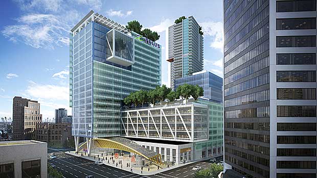
Toronto Telus House - 25 York Street | 136.24m | 30s | Menkes | Sweeny &Co

Thank you for the highly detailed insider's tour. This forum is increasingly recording the details of events like this, and views that most of us would seldom have.

By far the most beautiful, well designed, thoughtful and overall inspiring modern office building in the city. Developers planning future office projects should be forced to tour this amazing structure. ..

Along with Bay Adelaide, it will set the standard for first class space in the financial core. As the TD Centre plans a major reno, this will be held in fromt of them as a standard to strive for. The market will increasingly demand features such as those seen here.
 
Along with Bay Adelaide, it will set the standard for first class space in the financial core. As the TD Centre plans a major reno, this will be held in fromt of them as a standard to strive for. The market will increasingly demand features such as those seen here.

That's scary to say about the TD Centre. You're making me fear some kind of au-courant Telus-esque courtyard add-ons, just as BCE and Calatrava led to Zeidler adding some planewrecks to the Commerce Court plaza...
 
Check out their new development in Vancouver. If it weren't for the stupid trees on the building, I'd like it more.

telusgarden.jpg


Source
 
Check out their new development in Vancouver. If it weren't for the stupid trees on the building, I'd like it more.

telusgarden.jpg


Source

The curved thing at the bottom has potential to be pretty interesting but that's just about it ... I think Telus here doesn't get nearly as much credit as it deserves, it has many many interesting features - I love the podim (the black box so to speak) as seen from MLS ... and the fins on the side!
 
You love the rooftop maintenance box :confused: now im confinced your losing your mind..lol :)

No no, and that's not even black, I wish it was :)

I'm sure there's a picture somewhere, the big box that protrudes out of the building around the 5th floor or so ?
 
Telus Vancouver is interesting and I like it, it has a west coast flair to be sure. That appears to be a rendering so it's hard to really get into details with it but I think Toronto's is far superior and as taal suggests, Telus Toronto definitely doesn't get the credit it deserves beyond this board.
 
Last edited:
Telus Vancouver is a conflicting mess but, it fits in with many other Vancouver developments
 
I love how so many Torontonians (and I am one myself) bash Vancouver's architecture yet that city is clearly more livable than ours.
 
I love how so many Torontonians (and I am one myself) bash Vancouver's architecture yet that city is clearly more livable than ours.

So very true. The way their buildings interact with the street is usually superior to the way we do it here.

Compare the podium on the Pinnacle Complex to podiums in Vancouver, for example.
 
Exactly. Vancouver architecture is very humanist... I love modernism a LOT, don't get me wrong. Toronto's neo-modernism is very sexy. But you cannot fault Vancouver's architecture for its humanism.

And yes, the retail units are designed as if they are expecting and awaiting great, interesting tenants. Here, we seem to think a building is engaging if its podium has a Second Cup in it. Or we ooh and aah at Murano's podium glass and somehow think that it makes the project pedestrian friendly.

Anyways, everyone can go back to their high horse about Toronto architecture, but it's quite foolish in my opinion, as great as our neo-modernist architecture is here, to bash architecture as humane and engaging to pedestrians as that in Vancouver.
 
I love how so many Torontonians (and I am one myself) bash Vancouver's architecture yet that city is clearly more livable than ours.

Livability and architectural design is unrelated don't you think? I also don't find Vancouver more livable either despite every list that says so. It's my preference of course but I'm not that into the resort look for a downtown area. (does every complex need a water feature and garden?) I like the hard urbanism we have here. The alternativel, our greener streetcar suburbs, make everything off the peninsula look like a greener Don Mills..

Vancouver design is based on stringent rules and regulations that simple modernist lines are bad. It's complete forced and usually turns out unnecessarily busy and confused. Too often you see an otherwise exceptional building ruined by fuss and doodads. The Erickson comes to mind with the dozen glass canopies thrown willy nilly. Of course, there are a few around here that would gladly apply this here.

Pinnacle Centre is a poor example as it's sub par for even here. Take away the arcade and insert glass canopies with some townhouses and greener landscaping and it would fit in with the podiums around False Creek.
 
Last edited:

Back
Top