Toronto Stanley Condominiums | 138.37m | 41s | Tribute | Core Architects

Aug 20, 2020

20200820_094407.jpg
20200820_094440.jpg
20200820_094455.jpg
20200820_094516.jpg
20200820_094545.jpg
20200820_094611.jpg
20200820_094615.jpg
20200820_094642.jpg
 
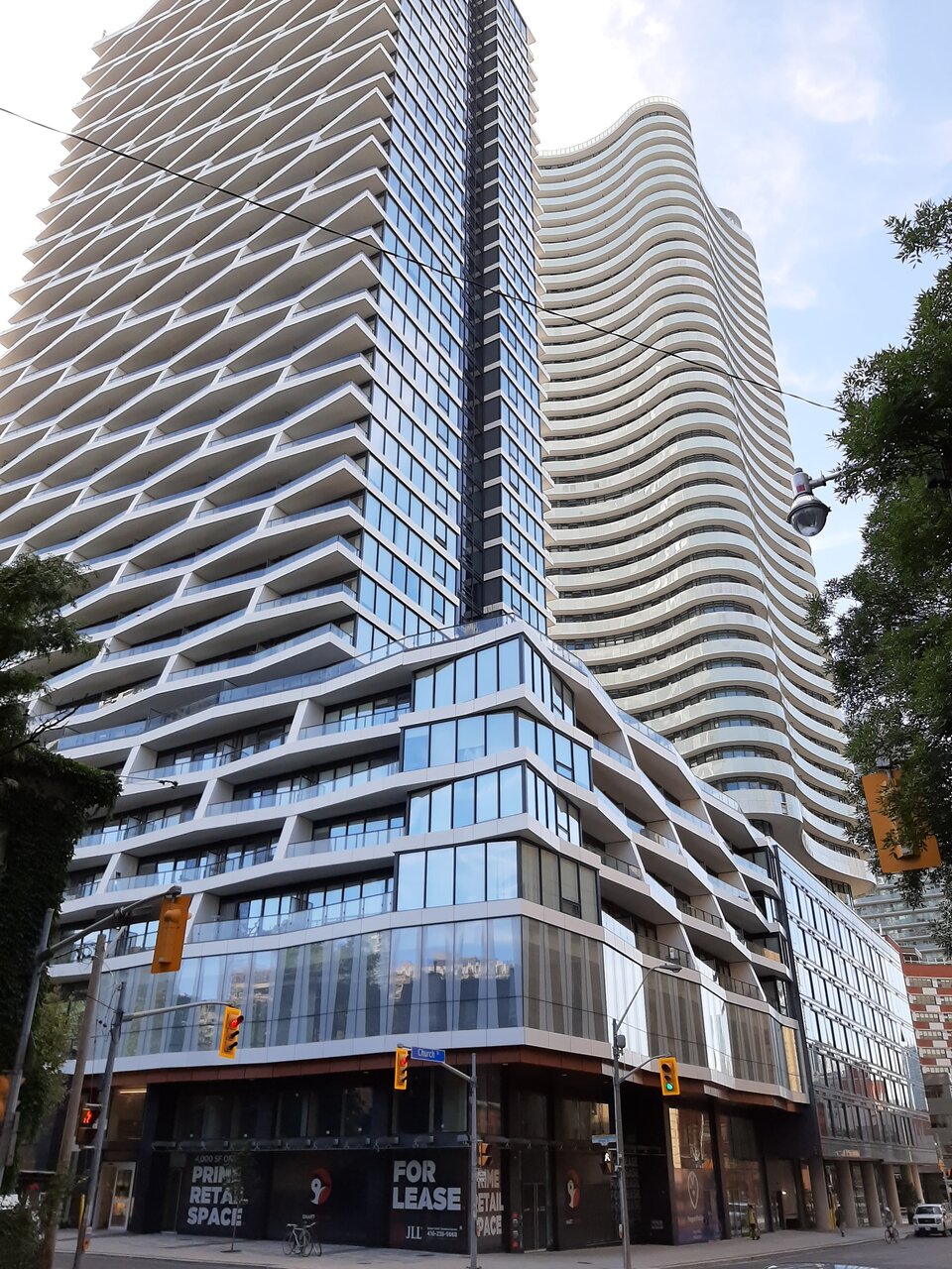
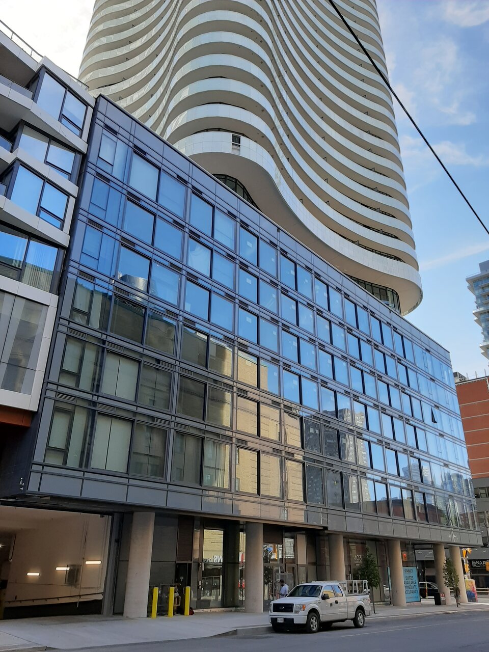
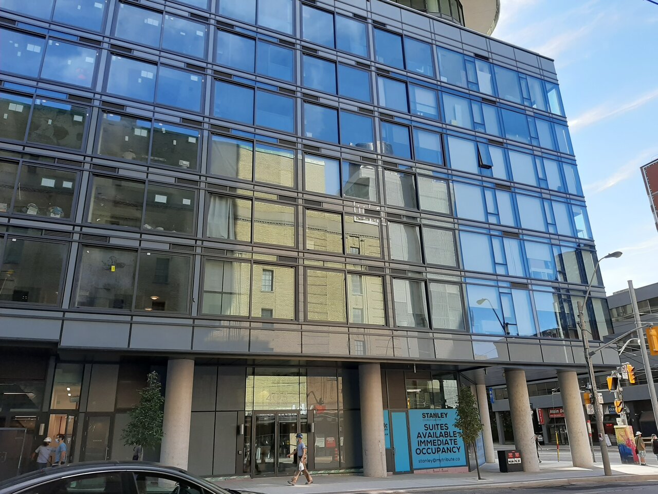
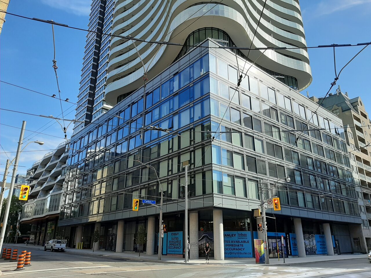
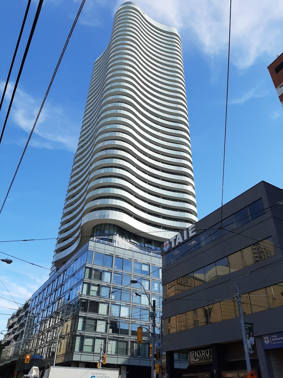
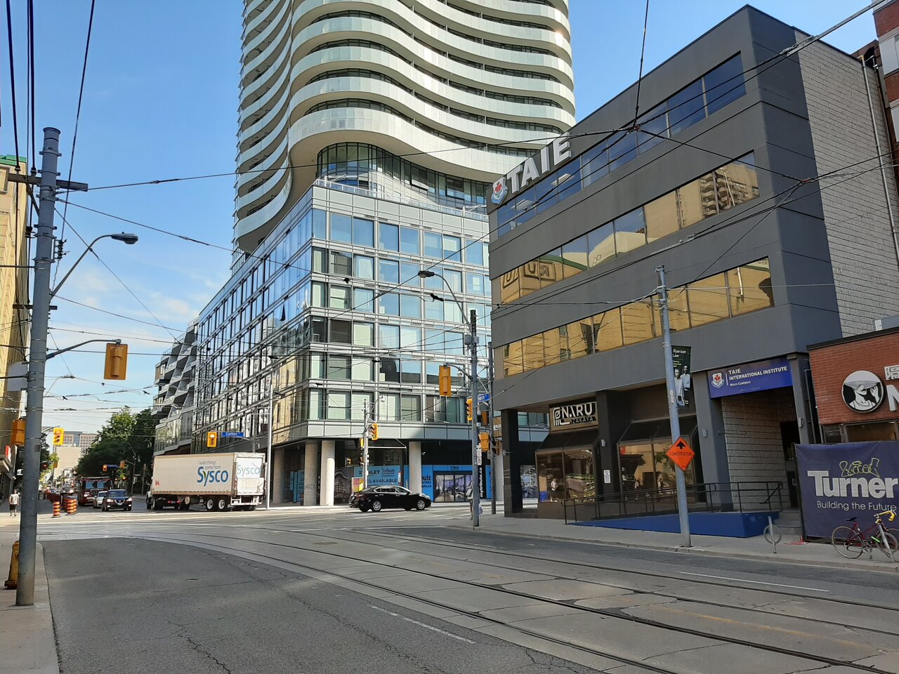
It's pretty rough at street level. The columns feel heavy and the colour palette at the lower levels is dark and drab. The overhang just makes the whole space look shady. Honestly I'm pretty disappointed this is at such a prominent corner. Maybe the commercial tenants will spruce it up a bit, but I don't know how much they can really do, especially with those 2 columns right at the corner, maybe they can paint them or something.
 
They're are not perfect...but they do show with some degree of effort and love how far buildings can go in the pleasing category.
 
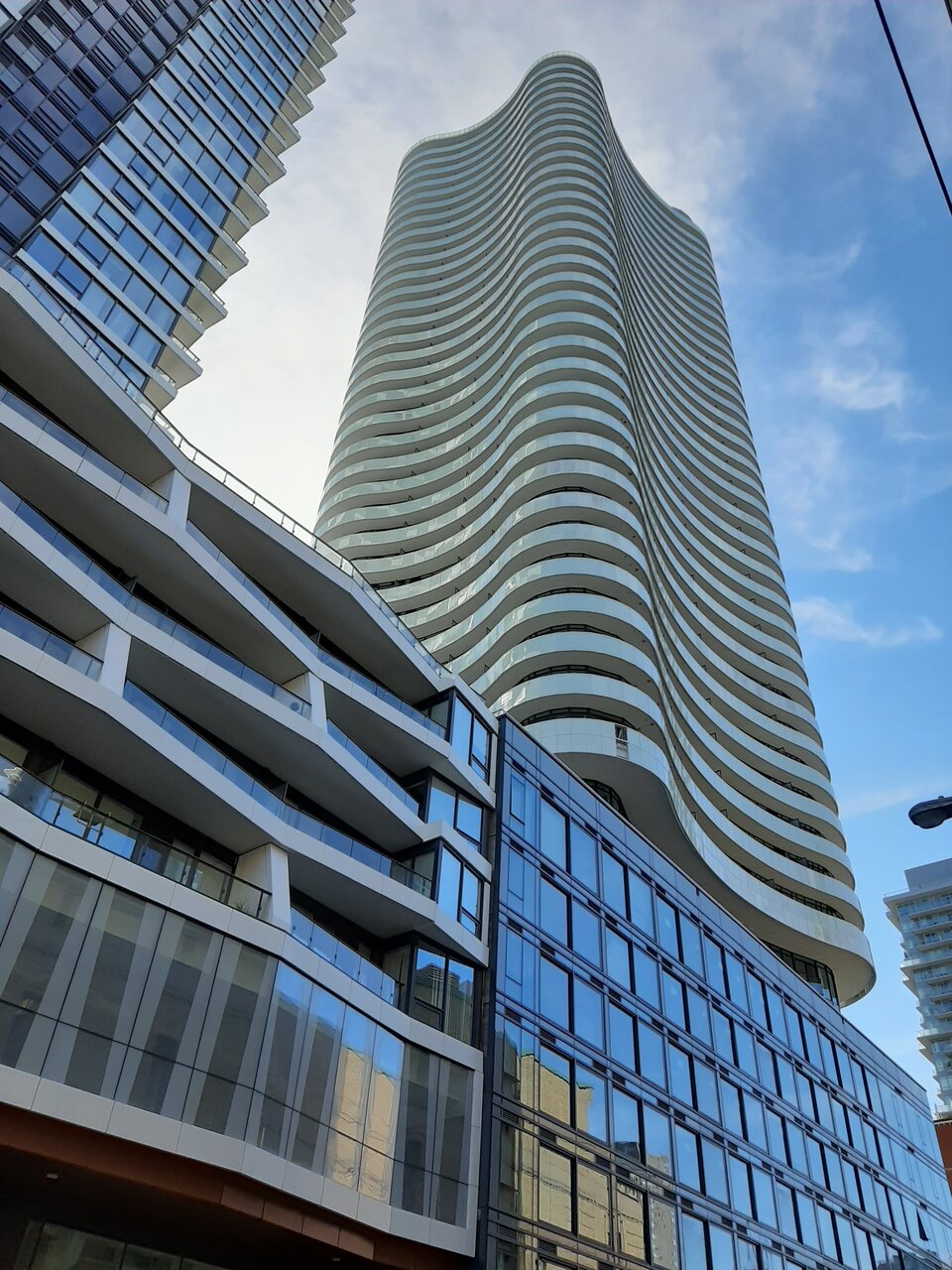
The podium units look like fish bowls. You can see into the units and they look very sloppy with all sorts of furniture and stuff up against the windows. It's real shame.
 
I assumed they weren't finished yet. Agree that it's a let down. Stuff like that is a red flag. I wonder where else they cut corners and/or didn't do things properly.
 
I know I am being selfish since I am not the landlord having to lease out these retail spaces, but I would love it if the banks found homes on the second floor of new mixed-use developments, and more interesting retail occupied the ground floor. Though nowadays with the state of the retail sector being how it is (and especially post-covid), it would probably end up being leased to yet another dispensary if not a bank branch.
 
I know I am being selfish since I am not the landlord having to lease out these retail spaces, but I would love it if the banks found homes on the second floor of new mixed-use developments, and more interesting retail occupied the ground floor. Though nowadays with the state of the retail sector being how it is (and especially post-covid), it would probably end up being leased to yet another dispensary if not a bank branch.
It's gonna be wild when the dispensary market adjusts to how over-saturated it's becoming and tons of them close. Gonna be a lot of empty retail downtown.
 
I see tagging on one of the columns. Hopefully, Scotiabank will cover them with something. Anything would be better than how they look now.
 
I see tagging on one of the columns. Hopefully, Scotiabank will cover them with something. Anything would be better than how they look now.

White paint would do very well (and it will help lighten the columns up) - though not as a deterrent to tagging for sure.

It's gonna be wild when the dispensary market adjusts to how over-saturated it's becoming and tons of them close. Gonna be a lot of empty retail downtown.

Hallelujah! Dispensaries have got to be some of the most unproductive storefronts around - even adult stores have more engaging displays and frontages, and they don't reek, which is a big plus.

AoD
 

Back
Top