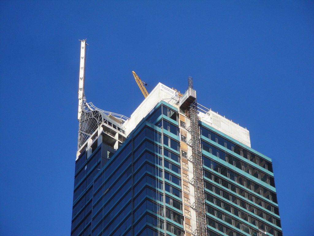
Toronto St Regis Toronto Hotel and Residences | 281.93m | 58s | JFC Capital | Zeidler

November 4th:

6312939506_d8c7676fb3_o.jpg
 
i didn't like how the glass area on the corner got bigger near the spire, but it's all coming together now. looks great.
 
I don't always like Zeidler's work, but this I like.

Zeidler was quite good in the 80's.
Perhaps this design has been hanging around since then.

I agree with you that vibrant cities should have a good mix of building types and styles, but I cannot agree with you that this is a good building. It is not quality, thoughtful architecture.
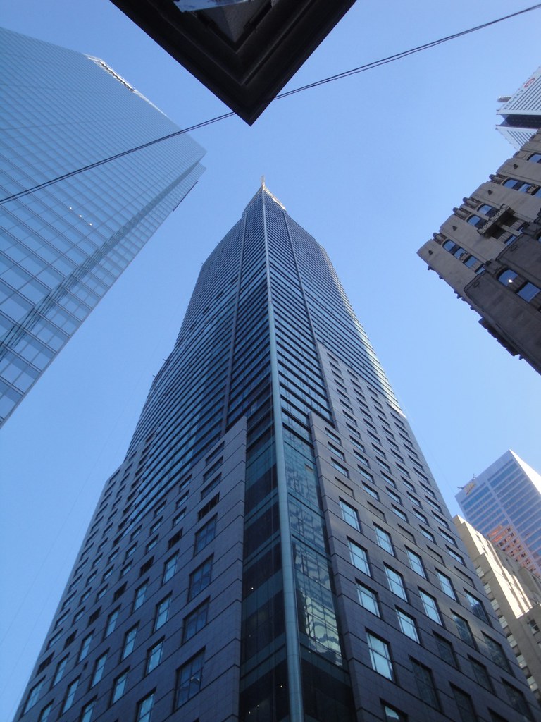
It has a prominent site and very nice proportions, but is flawed in so many ways.
It has a skin which makes curtain wall look like window wall, green window wall at that.
The lower portion of the tower is just banal.
The street level will be dominated by parking and loading, giving nothing back to those not fortunate enough to enter within.
Then there is the top, the spire, the dome, the comb-over, call it what you will, but it is gaudy, gauche and desperately cries "look at me"!
Wait a minute....of course.....it is the perfect built representation of the man himself.
 
... and, as with local hero Harry Stinson, the man and all his works have their fan base precisely because they so exactly represent the values of "gauche" and "look at me"!
.
 
Wait a minute....of course.....it is the perfect built representation of the man himself.

Well you're obviously not an admirer of The Donald, and frankly neither am I. I guess I've decided not to get personal about it.

Above all, welcome to UT. I hope you enjoy posting and reading others' posts on UT.
 
Well you're obviously not an admirer of The Donald, and frankly neither am I. I guess I've decided not to get personal about it.

Above all, welcome to UT. I hope you enjoy posting and reading others' posts on UT.

Thanks TonyV for the welcome, but I have more against the building than I do the man.
The last line was a throwaway, but the body of the post are my opinions.
Open to challenge and debate.
 
In all honestly, beyond the name, the Donald has almost nothing to do with this building. Likely he had very little to do with the design, if any at all. He is a minority stakeholder, and the developer is Talon (owned by Levitan & Schnaider), who have been calling all the shots since day one.
 
Yes but "The Donald" will take the spotlight and say he built it with his own sweat and blood. He'll also remind everyone that the Trump name is the No. 1 in the entire world when it comes to Developer/Hotel's/Residences. Of course we all know Trump had little to do with with Trump Toronto, he had a busy year with his Reality TV show and pretending to run for president and trying to prove Obama is a Kenyan :rolleyes:
 
I cannot believe the number of positive comments this is receiving!
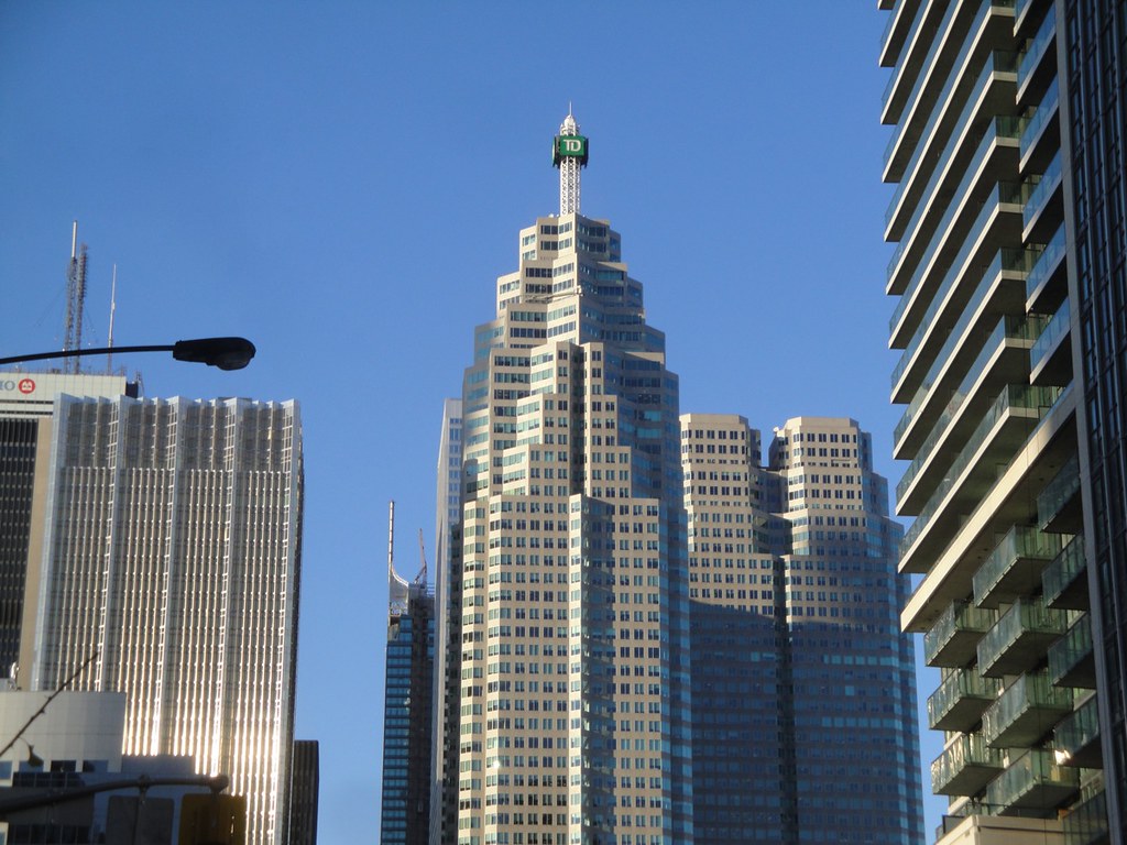
This is a huge step backwards for the Toronto skyline. The comparison to Atlanta Po-Mo is spot on. It reminds me of bad casino architecture, crass splash on a dumb box. This dumb box just happens to be a tall one. It is unfortunate that the good work done by the elegant KPMG Bay Adelaide Tower, is undone in one fell, green, over decorated, swoop.
Along with the Ritz, RBC and Telus towers, downtown had a forward looking momentum. These four examples, while perhaps not world class, do at least try to be modern and of their time, Trump Tower looks like something from the 1980's.
And bad 1980's at that!
I have to see this project every day as I travel to work and it is an abomination of unquestionable proportions.

It's not that crass. Trump's architecture is subdued PoMo with all sorts of engaging details and quality materials. I also prefer more contemporary design, but the Bay-Adelaide Centre is quite bland and merely blends into the sky on many days. There's very little creativity shown in its facade; it looks like it could just be a giant ad for curtainwall. It's the kind of dull, lazy design fashioned as "modern" that people got tired of and turned to PoMo. In terms of proportions, Trump's are admirably traditional and urban, with no windswept plazas.
 
Yes but "The Donald" will take the spotlight and say he built it with his own sweat and blood. He'll also remind everyone that the Trump name is the No. 1 in the entire world when it comes to Developer/Hotel's/Residences. Of course we all know Trump had little to do with with Trump Toronto, he had a busy year with his Reality TV show and pretending to run for president and trying to prove Obama is a Kenyan :rolleyes:
Of course he will. But that is irrelevant to what I'm saying. People consistently comment on the architecture, which they say is gaudy or what not, and then act like it is that way because the Donald designed it. That's simply wrong.
 
Of course he will. But that is irrelevant to what I'm saying. People consistently comment on the architecture, which they say is gaudy or what not, and then act like it is that way because the Donald designed it. That's simply wrong.

We all know Trump didn't design it and yes his involvement is minimal, but the name does not prejudice my opinion.
So where do we find the responsible parties?
Yes, the developer, looking to make money, looking to maximize the yield of the site. Well that results in a very tall thin tower which has long slim proportions. So far so good.
The developer has a target demographic, well to do and conservative in taste and this brings the luxury expectations, the upscale ambitions. The program and small site footprint lead the street edge to be eroded by hotel forecourt and parking entry. Not a good example of engaging with the sidewalk.
So the developer maximizes the profit potential, works within a weak framework of civic urban guidelines and get the design team on board.
The structural efforts to get a building of this height on a small site must be huge, so well done the engineers.
The Architecture. The bland solid base was no doubt used to satisfy the City planners, but the dressing up of the tower is, in my opinion, a great opportunity lost. It could have been tall, elegant, refined, it could have emphasized it's verticality, but no, it highlights each floor with a green spandrel panel. The overall colour is unfortunate. It stops with the stylized art deco headress of a flapper. It harks back to the golden age of steam, when it should be looking to express all the technological advances used to create it.

None of these opinions are influenced by the name, but what I see in person every day.
 
i dont like the donald. however i might have appreciated the same building with tacky GOLD glass!!!!!!!!!!nnnnn
 
The street level will be dominated by parking and loading, giving nothing back to those not fortunate enough to enter within.

I'm not entirely sure that I agree with this. I walk by this site every day, and I think that the martini bar scheduled to open on the corner will work very well. Also, while the front door is technically in a covered driveway area, it is on a diagonal and isn't set very far back from the street; I think that it will actually look quite good from Adelaide (unlike the Sheraton Centre or even the existing Four Seasons, whose front entrances ignore the street entirely).
 
Thanks TonyV for the welcome, but I have more against the building than I do the man.
The last line was a throwaway, but the body of the post are my opinions.
Open to challenge and debate.

There are parts of Trump I like (the onion dome) and other parts I don't (the colour of the granite cladding, the teal glass) and I think that points out the biggest issue I have with it: It's not quite sure what it wants to be. I don't hate it, but I don't like it all that well, either.
 

Back
Top