Toronto St Lawrence Market North | 25.3m | 5s | City of Toronto | Rogers Stirk Harbour

Toronto City Hall, Viljo Revell 1965. I think that's the most recent one of the other sort.

Though to be fair, I don't think the ROM was watered down. I think Danny L was trying his darnedest.

Ditto on Alsop with OCAD.

And Frank Gehry proved with the AGO that his B-game is still pretty good.

Note that I didn't say "in Toronto" when speaking of such watered-down projects. But First Canadian Place and Commerce Court West also come to mind. They don't seem to have the "wow" factor that accompanies the profile of the architects who designed them. They're nothing to be ashamed of but not the most inspiring achievements either. As for the buildings you list, while they're not perfect, but they are the impressively creative, bold, and outstanding buildings that one expects from high profile international commissions.
 
What other sort of projects by international architects in Toronto does come to mind?

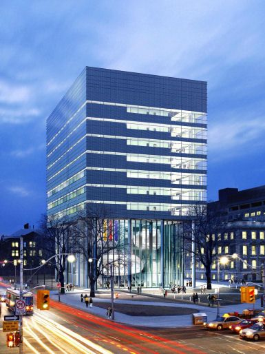
152_38520Toronto20foster.jpg


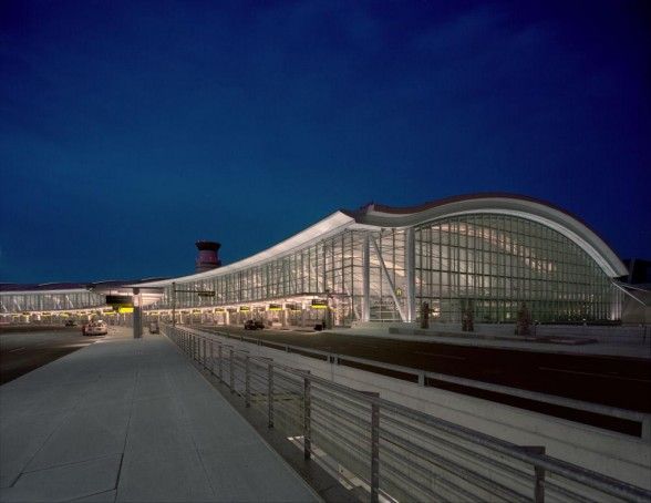
Toronto-Lester-Pearson-International-Airport-by-Moshe-Safdie-and-Associates-in-Toronto-Canada-588x454.jpg
 
Last edited:
Wait, are you throwing those pics out as examples of watered-down architecture, or good architecture? Is that a confirmation or a rebuttal? I can't tell.
 
I hope this announcement doesn't mean that significant cheapening is coming. I'm really not a fan of watered down, anticlimactic projects by international architects. The CBC studios by Philip Johnson comes to mind.

What did the original proposal look like?
 
Foster designed a lovely building, the inside pods are structurally unsafe and students and faculty complained about the noise and claustrophobic feeling in the rooms. Thet are just ornamental now.

Really, I thought they were still used !
 
Wait, are you throwing those pics out as examples of watered-down architecture, or good architecture? Is that a confirmation or a rebuttal? I can't tell.

Definitely good architecture and not "watered-down" or second-rate in any way.

As for "Danny L", unfortunately, what we got was watered-down second-rate. Too bad that William T never developed a crush on Renzo P as we might have had a project equal to the Morgan Library.
 
Note that I didn't say "in Toronto" when speaking of such watered-down projects. But First Canadian Place and Commerce Court West also come to mind. They don't seem to have the "wow" factor that accompanies the profile of the architects who designed them. They're nothing to be ashamed of but not the most inspiring achievements either.

Well, in the case of Commerce Court--Pei's an odd case all around. I think it was more jadedness than lack of a "wow" factor. And when it comes to FCP, Ed Stone's rep had already terminally degenerated to a pretty universal "pretentious vulgarian" status by the 60s/70s.

One forgotten "international" figure in this thread: Calatrava.
 
Well now that we are bringing Mies and Calatrava into the equation, I'm starting to think our dalliances with starchitects haven't been so bad after all. But to go back to the two images charioteer posted above... I've got no complaints about Terminal One - it is as precise a piece of construction as I've seen anywhere, and has some great spaces, too.

But that Norman Foster building, I would put second only to the ROM in the watered-down junk category. The scale of the thing is bizarre, particularly the long, over-thin columns. The dotted glass frit is a clear product of the cheapening, and is the only material/texture on the whole exterior. The College face is treated like back-of-house when anyone who had spent more than 30 seconds on the site would know that it should be treated as a principal facade. The pods are pretty cool at a glance, but have some real flaws as someone stated above. And when put next to any number of other Foster projects, it looks even more shabby.

For an example how to get right everything that Foster got wrong on this one, we only have to move two doors down to another international architect's work - Behnisch and Behnisch's CCBR. Lord Rogers, take note!
 
For an example how to get right everything that Foster got wrong on this one, we only have to move two doors down to another international architect's work - Behnisch and Behnisch's CCBR. Lord Rogers, take note!

Could that be due to the major role played by our own starchitect Sir Peter?
 
And come to think of it, there's also--for good or ill--the *first* piece of international starchitecture on campus, Thom Mayne's Graduate House.

(Yeah, incredibly, prior to Grad House IIRC there was *no* real int'l starchitecture at U of T. Lots of stuff by homegrown/home/national-based heroes like Parkin, Thom, DuBois, Diamond, Andrews way out in Scarberia, etc--and heck, Cumberland/Storm/Sproatt/Rolph and their like, going waaaay back. But no "imports" a la Gropius or Breuer or what have you--other than, I suppose, Giles Gilbert Scott at Trinity. And Warner Burns Toan & Lunde definitely don't count: they weren't Starchitects, they were The Man)
 
Don't get me wrong, I think we have a good record when it comes to projects by international architects, but we've seen a few duds too that are memorable for being unremarkable (ironically). It's those projects that I found worth mentioning in a discussion on the North Market, since there's no point in working with the highest-profile architects only to produce a quality building that's mundane. When it comes to these occasional mundane projects, local firms could have produced better work.

I like the discussion on these sorts of projects that has emerged. I think Foster's U of T building is middle ground. The form is somewhat unremarkable but the materials are quality, it's somewhat responsive to context (with its columns lining up with the heritage building next to it and responding to the Ontario Hydro building). The pods are definitely creative and memorable. Fritted glass was (and continues to be) stylish at the time. Calatrava's atrium at Brookfield Place is spectacular and definitely successful. His little bridge over Mimico Creek was an unusual commission, but it is a nice bridge in its minor context.

I think Carrere and Hastings did a good job with the Bank of Toronto at King and Bay though there aren't that many photos. Robert Stern may not be universally liked here, but One St. Thomas has proven to be an excellent condominium in its particular style. It's beautifully proportioned and detailed, achieving a sense of classical comfort seen in features like the deep, sheltered balconies. It's a focal point for the Yorkville skyline when seen from Queen's Park and the U of T grounds.
 
Foster designed a lovely building, but the inside pods are structurally unsafe and students and faculty complained about the noise and claustrophobic feeling in the rooms. They are just ornamental now.

While the pods have had their share of complaints, the spaces in and on top of them are still in use.
 
greenleaf:

Not sure how the pods at Pharmacy are unsafe per se, other than the single egress.

re: pods themselves

One way they can potentially improve on the situation conceivably is to replace the exterior plaster with translucent materials (though only at certain spots since there is the structural steel cage to content with - it would have the added side benefit of looking like organelles. Maybe also upgrade to a LED-based lighting scheme as well. Make no mistake though, this Foster building did suffer from cheapening; some aspects of the project are distinctively un-Foster, like the standard ceiling tiles.

re: SLM North

We all knew some design changes will be forthcoming - even the jury report called for it (e.g. wood side panels). I am pretty happy just to see this project moving along considering the context.

AoD
 
Last edited:

Back
Top