Toronto St Lawrence Market North | 25.3m | 5s | City of Toronto | Rogers Stirk Harbour

A little summary of overall opinions of the five designs. I made a list of the 22 people who have made a sufficiently full ranking of the designs for me to be able to order all five of them (often with two of the designs 'tied'). The best-regarded design was given five points and the least-regarded design one point, and the average taken for all 22 lists. I ended up with:

Highest possible score: 5.00

Orange: 4.11
Red: 3.91
Green: 2.70
Yellow: 2.25
Blue: 1.98

Lowest possible score: 1.00
 
Last edited:
I had a second look at the models yesterday. A few random thoughts:

* Bud The Spud ( "Blue" team ) works only if you see the North Market as being so important it must stand out radically against the Hall and the South Market. I don't see any justification for that position since, as a civic building, it will contain elements ( market, courts ) allied to both and ought to be seen more as a mediator between those buildings.

* The big curvy statement of "Orange" team's design doesn't just reference Alsop's sculpturally Serra-esque Filmport, but Gehry's Galleria Italia too. It is also clearly a take on the curved roof of the South Market, but the massive nature of these defensive shields seems to be overselling the fairly humble function they actually perform as gallerias outside courtrooms. They don't seem to be symbolic of anything, though they present themselves as if they are.

* "Yellow" team's ground floor market with brick ceiling and the way in which the proposal generally references the materials used in nearbye buildings, and "Green" team's theft and repitition of the South Market's basic form are not inconsequential statements for all their contextual nature. I tend to see these two designs as similar in approach. There is actually a boldness to the "Green" design that works because of the similarity of it's shape to the South Market, whereas Bud The Spud's bold statement has nothing to reference at all.
 
Orange is my hands down favourite. This is the direction we should be going with the architecture in this city.
 
With Russell Russell the token Rochon/Stroumboulopoulous non-designer on the jury, what qualified professionals are involved in selecting the winner?
 
Have you never seen any of Richard Rogers work? This proposal contains multiple references to his style.
Thanks for the reference. Reviewing his work has provided some helpful background and now I can see where they're going with this.

Rogers gracefully melds functional, utilitarian industrial elements with undulating natural materials and organic forms.

I think Red Team's submission rubs me the wrong way because it looks like elements from this style have been hastily applied to disguise a simple glass box arcade. I find the decorative exoskeletal structure to be aggressive and it contributes to a visual mess overall. It lacks the elegance of Rogers' designs. Someone above suggested that it doesn't demand attention and I feel the exact opposite way. This building is a noisy eyesore. The red design, I think, would make a good Pacific Mall or Pladium.
 
Last edited:
If we're doing the ranking thing, put me down for this:

1. Orange
2. Red (if it comes with a team of specialized pigeon assassins)
3. Yellow (I like it but it seems more suited to a hospital or university)
4. Blue (something about is hulking and top-heavy)
5. Green (1990s suburban rec-centre blargh)
 
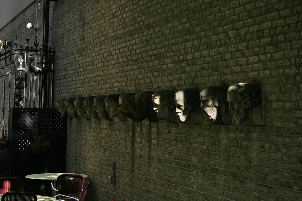
This discussion is great, but my real concern is: who gets the heads? If they haven't been called, I get first dibs.

4590087726_7f53f541fb_b.jpg

The Twelve Apostles are from St. Anne's Church ( 1892 ) which once stood on Dufferin north of Dundas, I believe.
 
* The big curvy statement of "Orange" team's design doesn't just reference Alsop's sculpturally Serra-esque Filmport, but Gehry's Galleria Italia too. It is also clearly a take on the curved roof of the South Market, but the massive nature of these defensive shields seems to be overselling the fairly humble function they actually perform as gallerias outside courtrooms. They don't seem to be symbolic of anything, though they present themselves as if they are.

I take it all back. According to the "Orange" team bumf they're symbolic parentheses! ( Who knew? ) that "unify the hybrid program of market and court into one distinctive form."

So, on a sliding scale of visual heft, we've got a "shed" and a couple of "parentheses" for those who need a good dose of symbolism. Scale that back a bit and, in their bumf, "Red" team refer to the traditional Moot Hall where market and government co-exist ( and that was certainly a characteristic of the 1845 City Hall ), while "Green" team point out how the glazed central section of their building mirrors how the 1845 City Hall is encapsulated within the South Market. "Yellow" team make the link between their building and those that surround it through "materials, geometries, shadows and alignment".
 
My quick reaction...

Blue - too much of a caricature of the big modern blob that is appearing in every major city in the world. It will look silly and dated very soon.

Green - why continue the shape of the South market? Boring.

Orange - the armatures on either side seem contrived, south elevation is banal. Balloons in the render are kind of silly.

Red - the view of St. Lawrence Hall is nice, but the building itself I find hideous, especially the south end which looks like the Pompidou Centre's ugly cousin.

Yellow - lovely render but a bit wishy washy. Funny how obvious it is which firm this is. I love many of their projects.

My 2 cents.
 

Back
Top