Toronto St Lawrence Market North | 25.3m | 5s | City of Toronto | Rogers Stirk Harbour

I like the vertical trim, but don't get why they didn't set the modules to follow the columns? It's like it's out by exactly half a frame
 
I like the vertical trim, but don't get why they didn't set the modules to follow the columns? It's like it's out by exactly half a frame

Maybe precisely so that you can see the structure behind it from the outside? Also the fins avoided those sections and created rhythm in the facade by delineating the modules:

1644699089175.png


1644699190744.png


1644699205912.png


(RS+H/City of Toronto)

AoD
 
Last edited:
I get that it was intentional, but it's not a design choice I like. From the interior you end up with an exposed steel column blocking the view out a window, and from the exterior you end up with a shoddily finished column visible through the glazing.

I know that bringing the inside of the building to the outside and prominently and outwardly featuring the "guts" of the building is all part of the RS+H design language, but this particular detail just looks sloppy to my eye. Maybe if the columns were clad in stainless, or set outside the facade, or painted canary yellow, or they were behind louvers or perforated panels or *something*. This looks accidental and lackadaisical.

I am somewhat confident that the final appearance of the column will be cleaner - though I fully expect it to be exposed as is (instead of covered by drywall or whatnot). What I am not sure about is whether the steel is fireproofed already (intumescent paint?) and whether there will be a final topcoat.

AoD

There are times AoD and I may find each other frustrating, LOL

But there are moments when I greatly appreciate him too.

Not everyone can use intumescent in a sentence correctly!

For those unfamiliar w/the concept:


From the above:

1644723477102.png
 
I've got a feeling that those columns are finished as is. Have a look at the rigging on the columns. No way they're bothering to use softeners like that unless those are finished surfaces.

I dunno. It's largely a taste thing. I also dislike raw, exposed concrete, but then some people like looking at a concrete ceiling or a concrete column. I don't dislike every instance of exposed structure on principle. I do like the exposed structure at 488 University, or at Queen Richmond Centre. Maybe I won't mind this as much when the fins are more distracting to the eye?
 
Jarvis is blocked today for a crane lift - it looks as though they are lifting the elevator machinery and other large stuff onto the upper floors - presumably something they need to do before the roof and wall it.

JARVIS ST From FRONT ST E To KING ST E

Toronto-TMC: Occupying three North and southbound lane due to hoisting

Closure Type:Construction (Planned)

Time Frame daily

From:Feb 13, 2022

Until:Feb 13, 2022

Hours:07:00 a.m. to 07:00 p.m.

Impact:Moderate

Road Class:Minor Arterial

District:Toronto and East York

Contractor:Modern Crane

ID:R142613
 
Last edited:
I've got a feeling that those columns are finished as is. Have a look at the rigging on the columns. No way they're bothering to use softeners like that unless those are finished surfaces.

I dunno. It's largely a taste thing. I also dislike raw, exposed concrete, but then some people like looking at a concrete ceiling or a concrete column. I don't dislike every instance of exposed structure on principle. I do like the exposed structure at 488 University, or at Queen Richmond Centre. Maybe I won't mind this as much when the fins are more distracting to the eye?

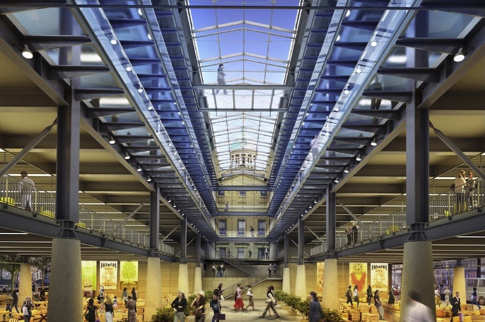
We have a good idea the steel elements will be exposed based on the one interior rendering available for the project (of the central atrium):

4162-24737.jpg

(RS+H/City of Toronto via UT)

It is definitely reminiscent of other RS+H projects, such as Leadenhall Building:


Personally I don't mind it - nor exposed concrete columns - what I do have an issue is when they are poorly/crudely finished (uneven texture/tint).

AoD
 
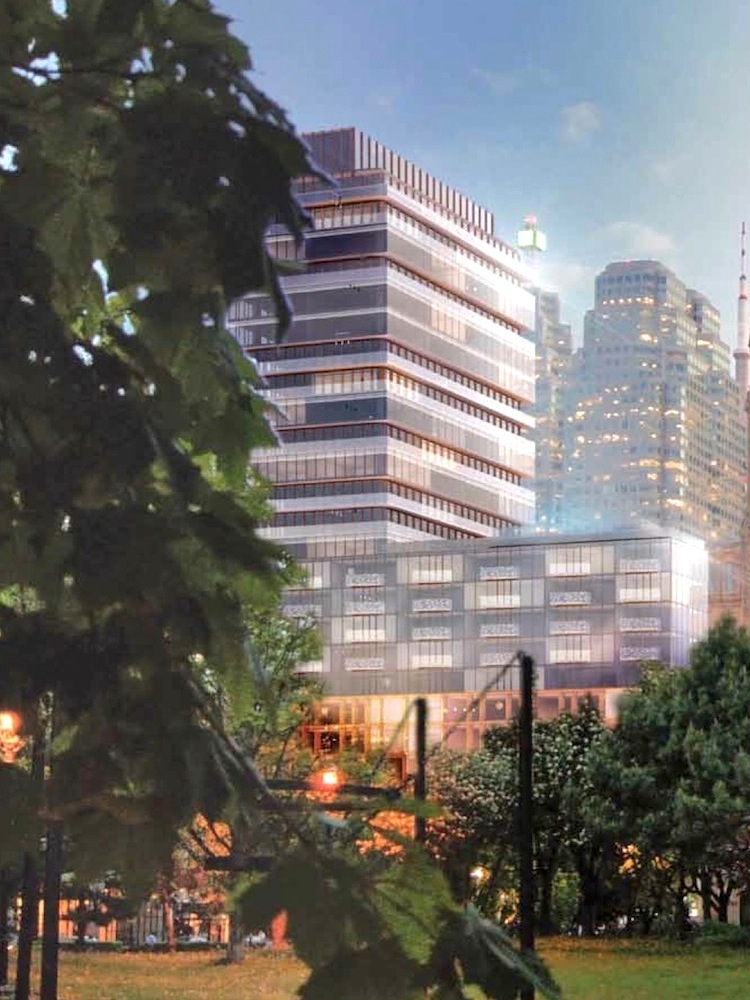
I hope there are still fins coming to that curtain glazing to make it look more robust, as shown in the renderings. Right now, it's a bit too light and thin for my liking.
 
I hope there are still fins coming to that curtain glazing to make it look more robust, as shown in the renderings. Right now, it's a bit too light and thin for my liking.
I assume, like at The Well, the fins will be applied at the end of the exterior installations process, so as to minimize any potential damage to them while other construction continues.

42
 
I assume, like at The Well, the fins will be applied at the end of the exterior installations process, so as to minimize any potential damage to them while other construction continues.

42
Sixty Colborne was a good example of that. Those orange fin thingies where the last thing to go up.


Back
Top