Toronto Spadina Subway Extension Emergency Exits | ?m | 1s | TTC | IBI Group

considering that TTC has been asked to hack and slash their budgets... every dollar here and there couldve been useful...remember theres plenty of emergency exits scattered across the line... they really shouldve stuck with a cookie cutter design for something so minor in significance. Hopefully for the ECT they will be more sensible. Youre probably going to say it was too late in construction to have made that change but it just goes to show the spending culture of TTC..... misplaced priorities....
and the giant mausoleums stations will serve as a reminder....but then somebody is probably going to throw in NYC for example or some other city with beautiful stations....well...they have money...we dont....we cant afford oppulance over function at this age

I doubt cheapening out on emergency exists or this project would have helped TTC with their budget woes.

Who told you NYC has money? Last I checked the MTA running New York's transit system was loaded with huge debts:

http://gothamist.com/2015/02/12/mta_debt_billions.php

Where is all this money they have? They just recognize that good design is worth it.

hence the nation is trillions in debt. do you really want to go negative spending just to look nice. As I said before, its not just for budgets, with every thousand dollars gained they couldve spent it on other tangible items that wouldve been more beneficial to the system.
Spend it on fixing the presto readers, spend it on faster conversion to presto, spend it on cutting less services. Those fancy tiles probably cost 2x as much vs brick. but once again its not just this singular item, but the overall spending culture of ttc on things that dont matter vs things that do
 
honestly...why waste so much money on the aesthetics of an emergency exit.............. once again misplaced priorities....
I love good design. But for an emergency exit that will have hopefully no use, why? Take a new picture of that site in a few years and those hexagons are going to be covered in cobwebs.
 
I think that design is how you respect neighbouring property owners. They will fight progress if you build ugly monoliths next to their property that will be there until the end of time.
generally a true statement.....but everything has a context....take a look at those neighbouring properties.....do you not think that in this location a plain red brick box would have been fine?
 
We can't always have a Hobbit hole as an emergency exit.

image.jpg


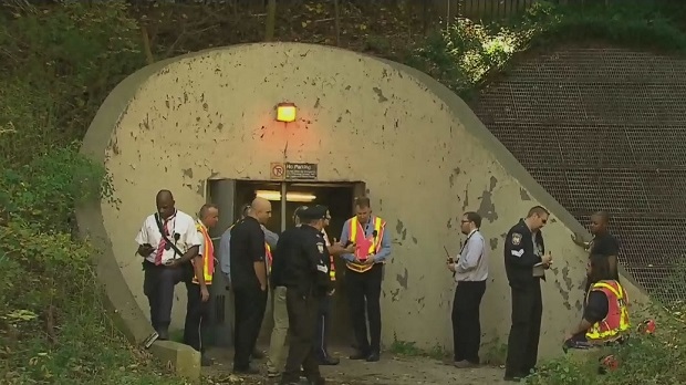
Remember that recent subway fire north of Dupont Station. See link.
 
Even though the exit may never be used, it will be seen by many people in the surrounding area. Consider also that higher-density development may end up replacing the parking lots and mundane suburban uses that surround the exit at the moment. People will see the exit for generations. It's good that it isn't ugly.
 
generally a true statement.....but everything has a context....take a look at those neighbouring properties.....do you not think that in this location a plain red brick box would have been fine?

Right now a brick box would be fine, maybe even a derelict wood shed, but they aren't going to rebuild this emergency exit in 20 years, probably not in 50 years. The area is going to change over time and the way it has been built is quality but not attention drawing. I think that in 25 years people will be happy that the TTC didn't put an ugly shed there, and that the land owners in the area are happy right now that the city didn't do something that would pull property values down.
 
TTC has been asked to slash it's operating budget but, as you may have noticed in recent weeks, capital spending continues freely, even without funding. Fancy emergency exits are the least of their issues.

In the meantime, I'm gonna wait this out and come back when people are complaining we should have spent more making the interiors less spartan again.
 
In the meantime, I'm gonna wait this out and come back when people are complaining we should have spent more making the interiors less spartan again.

It's been about a week since we've last had that debate

Guys, don't you think the interior is too fancy!? I mean, come on, what a waste of money.
 
It's been about a week since we've last had that debate

Guys, don't you think the interior is too fancy!? I mean, come on, what a waste of money.

I don't want stations that resemble the subways stations we built in the 1950's and 1960's. People demanded that the stations look or be inclined to look more like the Montreal Metro stations instead, so we are getting them.
 
I don't have a problem with a thing I have seen. Outside of this rarefied group, many travellers may go from a small not exiting apartment to a tough job or a tough student life. Let the stations (and the public spaces) be bright, airy and open.

As a kid, Royal York bus loop had grass, trees and flowers and the ground level station, floor to ceiling windows. Islington bus station was (and remains) a glum bunker.

Good work of any kind costs money. This project is one year from completion after - well - too long. Learn from this, finish ECLRT and get on with Relief Line. Build a concrete coffin if you like, or build a Montreal-style station. As long as we aren't gridlocked as time and our lives pass us by.
 
Downsview Station is 16 years old now, and every time I go through that station I appreciate the care that was taken it its architecture, and the availability of natural light underground. It's little things like that that make my commute a little better.

Leonard Cohen died this week. But to Tiger, 'Hallelujah" Public works and spaces make a difference.

When I watch the news of Syria or Iraq, I am struck by the bland sand colour and general lack of anything green in the cities in that part of the world. It looks bleak blown to kingdom come. For my taste, it didn't look much better before. We Torontonians are luckier than we may believe.

Safe, bright, accessible, interesting public spaces and places. Tons of parks. Talk of more: Downsview, Raildeck, Ontario Place. Wow.
 

Back
Top