mburrrrr
Senior Member
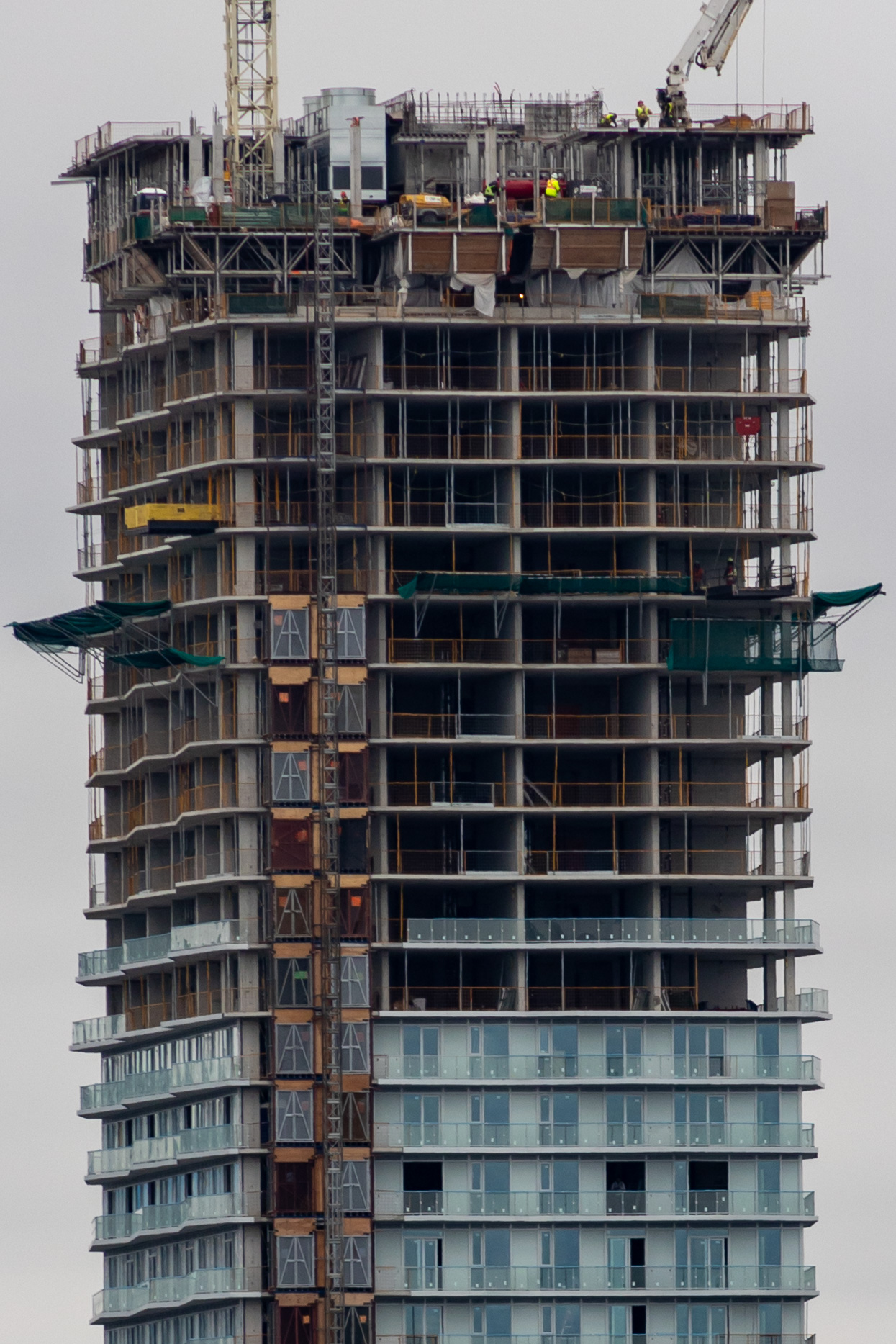
I don’t recall seeing the balcony guards installed before the windows before.

speechless

speechless
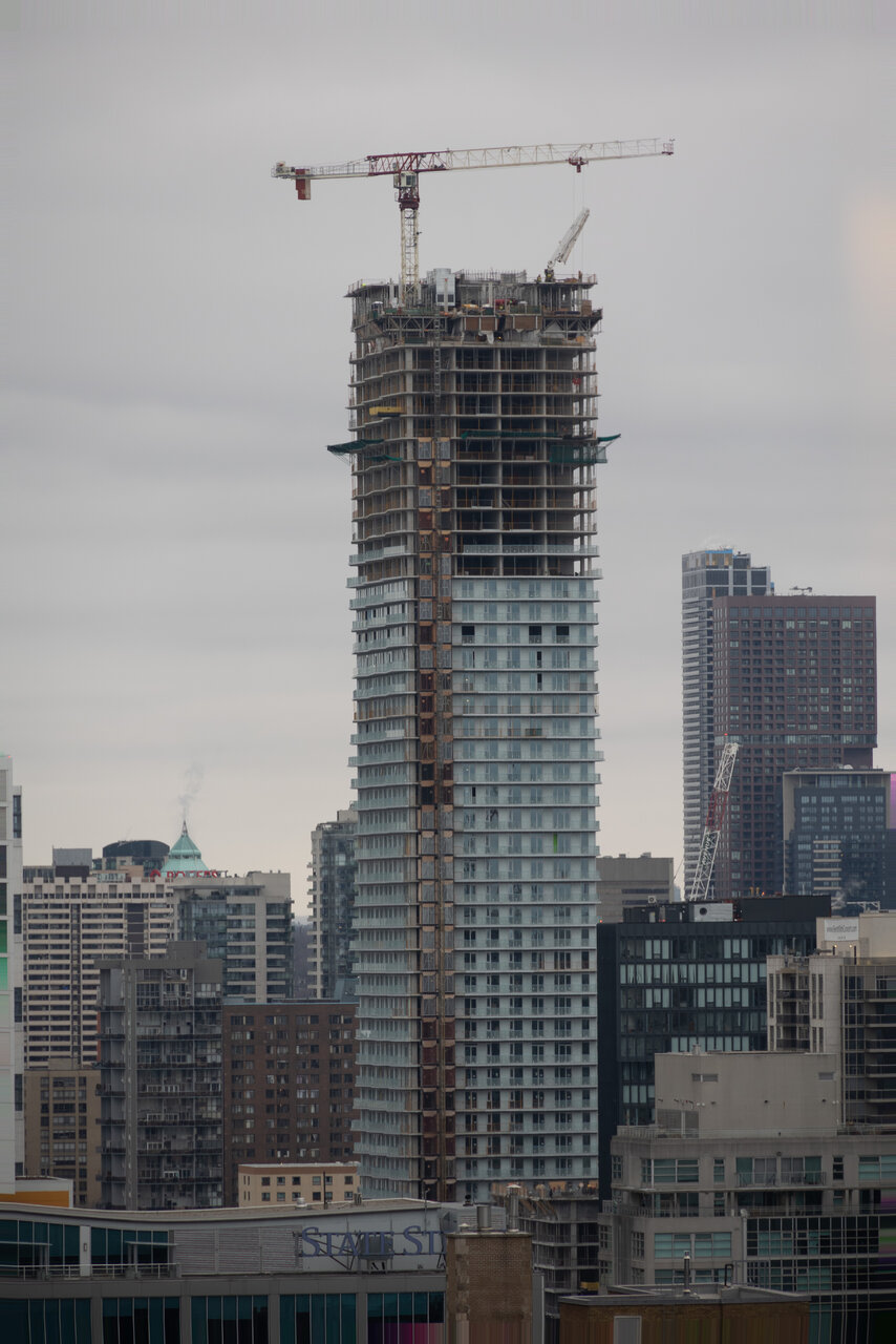
This is the most basic looking tower I've ever seen.
I actually think it's the last shot that doesn't make it look so bad.Those first few shots are some of the least offensive angles for this building.
Certainly it lives up to its lipstick on a beige spandrel pig persona.Definitely looks it’s best when looking up at it from close by.
You work for Pemberton, don't you.... ;phonestly I think this building looks pretty good... (on the Toronto bell curve)... The zig-zag balconies add some visual interest, that colour of spandrel is relatively inoffensive, and I really like the brick and materials on the podium...
lol nope I don't work for Pemberton, I'm currently a student... but thanks for assumingYou work for Pemberton, don't you.... ;p
Easily the ugliest building going up. Unless you're directly under it, then I guess it's fine.