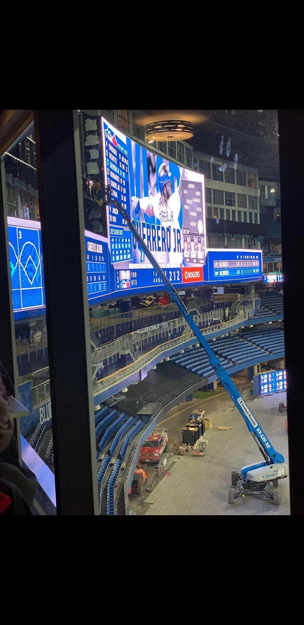
Toronto Rogers Centre Renovations | ?m | ?s | Toronto Blue Jays | Populous

Tropicana field installed LED lights illuminating the fabric roof a few years back. Blue LED lights during game play. They can change the colours for home runs, national anthem before and after games...etc

What ever lights they install at Rogers Centre, will have to be up to MLB standards.


Tropicana-featured.jpg


Tropican-Field-1024x576.jpg
 
How about cantilever a huge outside deck around the southside of the stadium, on the 3rd level -- similar to the Jack Astors patio at Dundas? TVs so you could still pretend to watch the game. With separate access it could be a space for non-game days too.
 
How about cantilever a huge outside deck around the southside of the stadium, on the 3rd level -- similar to the Jack Astors patio at Dundas? TVs so you could still pretend to watch the game. With separate access it could be a space for non-game days too.

There is a patio outside the stadium actually. I don't think it is used anymore.
 
No offence but going modern is what got them in this mess in the first place. People love the classic ball park feel. They've got to try and make it feel that way as much as they can.
A retro look does not belong at the Rogers Center; if a majority of baseball fans like the retro look (not sure why baseball fans would require that, certainly not good in the year 2022) then Rogers made a mistake in having bought the SkyDome. The steps taken so far are not good Modern, like the uninspired exterior paving around the exterior. So Modern is not the issue, it's the poor design decisions that are to blame. Hire a top quality design firm for a high quality, contemporary, cohesive, exciting renovation.
 
A retro look does not belong at the Rogers Center; if a majority of baseball fans like the retro look (not sure why baseball fans would require that, certainly not good in the year 2022) then Rogers made a mistake in having bought the SkyDome. The steps taken so far are not good Modern, like the uninspired exterior paving around the exterior. So Modern is not the issue, it's the poor design decisions that are to blame. Hire a top quality design firm for a high quality, contemporary, cohesive, exciting renovation.
Rogers makes lots of mistakes. their ridiculously expensive NHL broadcast deal is one of them. Buying the skydome is not. they bought it for $25MM and they owned the team and the channels it airs on. That's a no brainer decision to make.

i'm not sure why Retro is not good in 2022 but all the same fans don't require a retro, but it's nice to be in one. Camden Yards and PNC Park are two of the nicest parks i've been to. The new Yankee stadium which is incredibly modern just felt bleh and corporate and sucked the soul out of you. While this is baseball, i went to the Chase Centre in 2020 for a Warriors game and it was the same. It's nice and comfortable but lacks any sort of character.

a lot of these retro ballparks (even if they aren't truly historic) have a level of charm to them that people love. a renovation will not make the Rogers Centre retro so they shouldn't attempt it, but they could try to bring in some elements to make it cozier. If they were to build a new stadium from the ground up, i think that's where you consider the retro design. but that's a non-issue so there's no point in debating that part.
 
A retro look does not belong at the Rogers Center; if a majority of baseball fans like the retro look (not sure why baseball fans would require that, certainly not good in the year 2022) then Rogers made a mistake in having bought the SkyDome. The steps taken so far are not good Modern, like the uninspired exterior paving around the exterior. So Modern is not the issue, it's the poor design decisions that are to blame. Hire a top quality design firm for a high quality, contemporary, cohesive, exciting renovation.


See the above post. It's bang on.
 
Those renders of the Trop, showing fans in the stands, are pretty funny.

LED lighting is everywhere now and, yeah, can probably be used in Rogers Centre in some way (but let's not steal Tampa's catwalks).

As for the architecture discussion - here's the thing: you can't make it retro. You can't just clad it in brick and try to disguise what it is. You also can't really do a lot to make it look 21st Century modern. It's a late-80s Modernist (not MODERN) design. It is what it is. You can do things to MODERNIZE it, certainly. They've hung a lot of banners that mitigate the grey concrete look, for starters. You could certainly use LED lighting to throw a lot of blue and red and white on it, both inside and out too. The roof is what it is but I have fingers crossed they can do glass or something to bring in some light. Even without that, there must be something they can do to make the industrial-grey of the roof interior look a bit better.

You can maybe also knock out walls to open the concourse up to the outside in certain areas.

But you can't shoehorn a retro look in at this point, I agree. And whatever 2021 architecture may end up getting called a few years from now, you can't do much there either. You have to be realistic about what retrofitting a 1985-ish design really looks like.
 
Those renders of the Trop, showing fans in the stands, are pretty funny.

As for the architecture discussion - here's the thing: you can't make it retro. You can't just clad it in brick and try to disguise what it is.

Rendering fans into the stands is probably the only way that Tampa can get fans into the stands. 😄😄

I agree that you can just slap on brick and call it retro, but you can refresh the exterior with brick or panels/siding. A feature wall or elevation could be done with the precast brick, or ACM panel to give the exterior new life and make it more welcoming.
But again, on a $250 million budget, I assume most of the cash is going to be spent on the interior to make the fan experience better.
 
I feel like a translucent roof is a pipe dream at this point. I don't even know how feasible it is to do that work in one off-season.

If we want natural light inside by removing some portion of the 500 level walls, replacing them with glazing it also seems like unrealistic work. But there would still need to be a rail/track system for the roof. And the biggest problem with the idea is that the hotel covers the entirety of the outfield walls. So the demolition would have to occur further down the baselines, which would also be serious work based on the concourse. The building actually extends down the baselines beyond the outfield in both LF and RF. This can be seen if you look at it in Google Earth.
 
The roof doesn't particularly affect functionality/gameplay the way, say, new seating does. In theory, if you can put in new panels (Translucent, clear, whatever), no reason it can be done bit by bit through the season or over a couple of off-seasons. They also don't have to do all 4 panels; even just 2 and 3 would make a big difference.

And I think you're right about the issues letting in light from the north... I'd still like to see options. Could be too much to hope for.

And I also agree about the cladding - I just think it should be something complementary, not slapping brick up to make some lame, faux-retro facade that doesn't work otherwise.
 
No offence but going modern is what got them in this mess in the first place. People love the classic ball park feel. They've got to try and make it feel that way as much as they can.
They were riding the modern wave. Then it unexpectedly went classic soon after SkyDome opened. And trends could conceivably swing back the other way too.
 
Well, if it makes people feel any better, the same architectural firm that designed Camden Yards and PNC Park will also be overseeing this reno.


Populous has a phenomenal track record with MLB parks relative to the other firm that designed this hot pile of garbage:

They did a great job at Nationals Park. Visited it a week after went to a game at Wrigley, and somehow the stadium is much much larger, and yet felt nearly as intimate, and not a retro park.
 

Back
Top