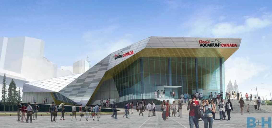
Toronto Ripley's Aquarium of Canada | 13.11m | 2s | Ripley Entertainment | B+H

The dross we are getting:

Ripleys3.jpg


Enough said.[/QUOTE]

am I the only person that thinks this is ugly?
 
I doubt, strongly, that you are the only person who thinks it is ugly.....there is a big leap from that, however, to "everyone thinks it is ugly".

The attractiveness of any building (IMO) has a lot to do with context. Would this building be suitable at, say, Avenue Road and Bloor....probably not.....is it out of place at the base of the CN Tower and next door to the SkyDome and the South Building of the Convention Centre? I don't think so.
 
The building is smaller than I'd like, but I think the angles are quite interesting. It certainly doesn't seem "ugly" to me -- perhaps a bit bland, but not unattractive.
 
That's just a rendering. I think in the end, the glass beneath the sting-ray shaped roof will provide a higher contrast to the other materials. Should be interesting, if, as said above, a bit bland.
 
The thing to remember is; this is simply a tourist attraction, not a serious, investigative, help the oceans and fisheries centre of new and current knowledge. This will not be a place people will refer to if there is a problem with a fish species or if experts are needed for lake or sea life problems.

This is a place for tourists to send the kids while Mom goes shopping and Dad goes to the Jays game. They will be able to buy dolphin shaped lollipops at the gift shop then skip downtown to grab lunch before the head out to the new roller coaster at Canada’s Wonderland.

That’s how it will be perceived and that’s how it was designed. I’m disappointed in its appearance given it's choice downtown location; however, the design makes its developer's intended purpose very clear.
 
this is simply a tourist attraction, not a serious, investigative, help the oceans and fisheries centre of new and current knowledge.
True, but how common is it for non-coastal aquaria to have a research focus? (I genuinely don't know, although I'd guess it's rare.)
 
True, but how common is it for non-coastal aquaria to have a research focus?

My comment was tongue in cheek - I'm not actually a big supporter of this particular pony show. I'm more of a "go big or go home" kinda guy - especially when it comes to my Toronto - but some seem satisfied to have an aquarium for the sake of having an aquarium. I would have thought Toronto was past that stage but there seems to be lingering uncertainty.
 
My comment was tongue in cheek - I'm not actually a big supporter of this particular pony show. I'm more of a "go big or go home" kinda guy - especially when it comes to my Toronto - but some seem satisfied to have an aquarium for the sake of having an aquarium. I would have thought Toronto was past that stage but there seems to be lingering uncertainty.

We elected Rob Ford, so I don't think we're past anything. Any pretensions for greatness went out the window the minute Don Cherry introduced His Horror-ship to council.
 
I doubt, strongly, that you are the only person who thinks it is ugly.....there is a big leap from that, however, to "everyone thinks it is ugly".

The attractiveness of any building (IMO) has a lot to do with context. Would this building be suitable at, say, Avenue Road and Bloor....probably not.....is it out of place at the base of the CN Tower and next door to the SkyDome and the South Building of the Convention Centre? I don't think so.

Good point. Having said that, I think we should strive for all Toronto architecture, especially large, cultural institutions, to be aesthetically excellent. This area is a former wasteland, themepark, concrete jungle experiment though.
 
You can see that there was a concerted effort invested in the design. It's not a box with no thought put into it. To me it sort of looks like a futuristic robot whale.

All those facets will look very interesting with changing light and the stairs will add to the area by providing a place for people to sit and congregate while the various levels created by the slopes will add a little more dynamism to the base of the CN Tower.

My only hope is that they change their mind about the grey. The CN Tower, the SkyDome and their surrounding grounds are already so grey. I hope that either some colour is added or perhaps a reflective black or white paneling.
 
The idea that it has to be world-class or nothing has ruined many tourism-related projects in many cities. Once you attach a huge price tag and/or a world-class architect or cutting-edge architecture to a project, you're also more likely to find inflated promises with regards to the number of people, jobs, and money brought into the area. The fact is, this sits right beside a world-class attraction and Toronto has plenty of top-notch attractions already. The entire point of this aquarium is to add depth to the city's tourism product, not be something that rivals Atlanta or Dubai. It'd be like complaining that the ferris wheel in Niagara Falls isn't as big as the one in London (and Niagara Falls IS a world-class tourist destination). But if this is important to you and if we're only looking for world-class, we might as well complain that the ROM isn't the British Museum, that the AGO isn't the Louvre, and that the zoo isn't San Diego's, and that ultimately Toronto isn't London or New York (mind you, even these top-tier destinations have their fair share of b-level attractions).
 

Back
Top