You are using an out of date browser. It may not display this or other websites correctly.
You should upgrade or use an alternative browser.
You should upgrade or use an alternative browser.
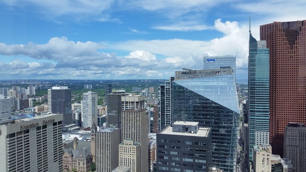
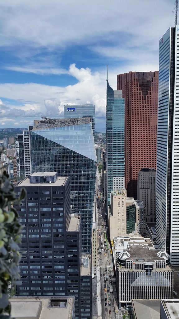
Toronto Richmond Adelaide Centre: EY Tower | 188.05m | 40s | Oxford Properties | Kohn Pedersen Fox

Rascacielo
Senior Member
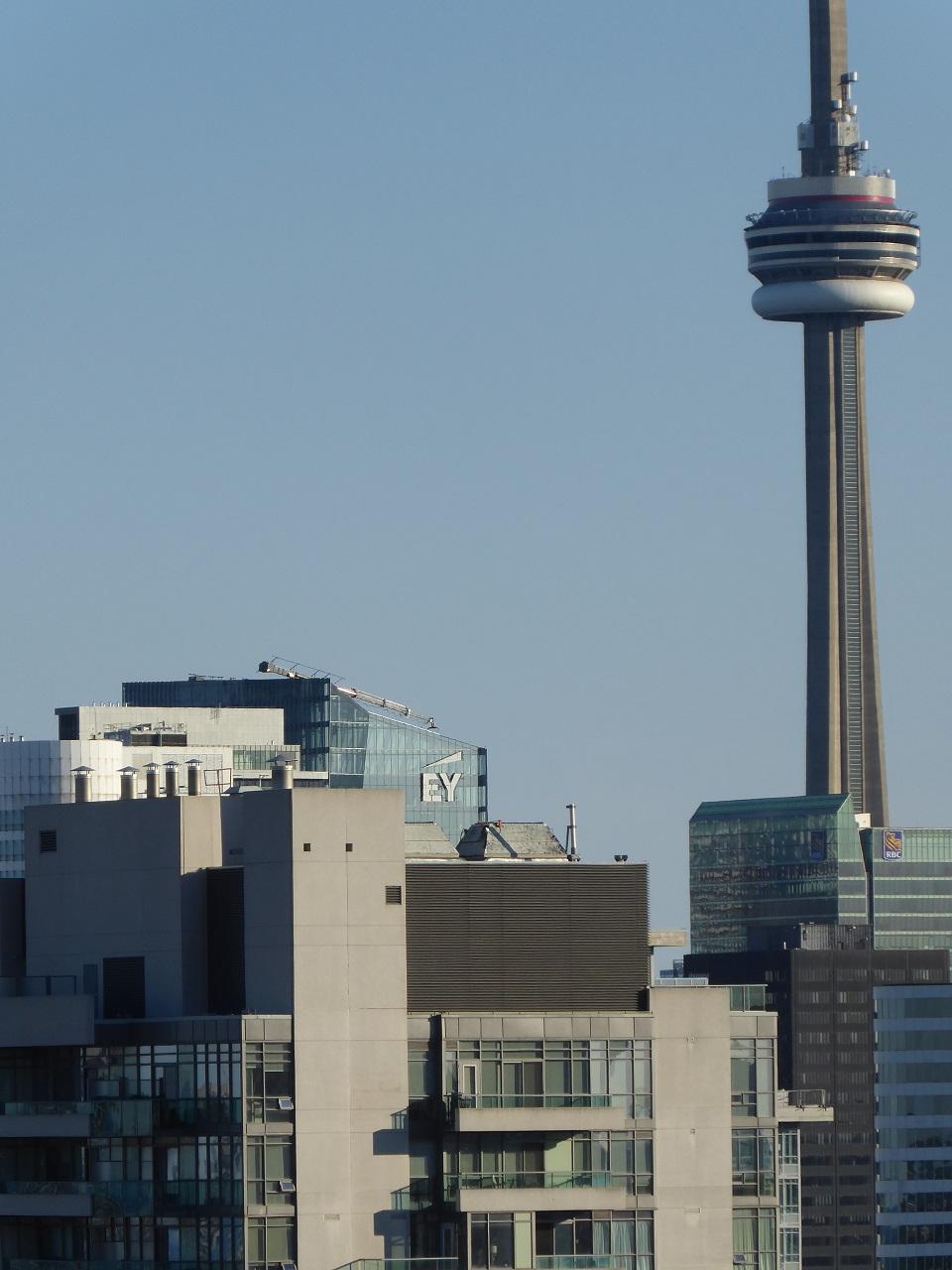
EY sign peeking behind Radio City
christiesplits
Senior Member
Respectful scale for the sign. The worst tower signage I've seen recently is just north of city hall on the old Zurich building - the offensive "Tata Consultancy Services" sign emblazoned over the recladded building.
Skeezix
Senior Member
Member Bio
- Joined
- Apr 25, 2007
- Messages
- 4,343
- Reaction score
- 2,688
- Location
- East of this, west of that
Respectful scale for the sign. The worst tower signage I've seen recently is just north of city hall on the old Zurich building - the offensive "Tata Consultancy Services" sign emblazoned over the recladded building.
Personally, I feel the nearby "Munich RE" sign at 390 Bay is worse.
stjames2queenwest
Senior Member
Agreed the Munich sign has no creativity involved. The Tata consultancy is atleast silly. It always makes me smirk.
I was hoping they would leave this side without a sign. But it's pretty non offensive.
I was hoping they would leave this side without a sign. But it's pretty non offensive.
adma
Superstar
Personally, I feel the nearby "Munich RE" sign at 390 Bay is worse.
All the more so for its replacing the venerable illuminated 390--arguably the Thomson complex's "redeeming factor" (at least to those who miss the Temple building)
jcam
Active Member
Part of me does (and part doesn't) want to see a partial re-clad with a new-old-facadectamy of the Temple building.All the more so for its replacing the venerable illuminated 390--arguably the Thomson complex's "redeeming factor" (at least to those who miss the Temple building)
adma
Superstar
Part of me does (and part doesn't) want to see a partial re-clad with a new-old-facadectamy of the Temple building.
Don't.
(Besides, if we were to time-travel back to 1969/70, I suspect we'd think much more highly of the presumably-extant interior. And remember my critique within this thread of the Concourse facadectomy.)
steveve
Senior Member
Not a fan of logos in general, but I think it works for the facade facing City Hall, which I've felt has always been the bland side of the building. It's not a bad logo either in comparison to others.
G.L.17
Senior Member

christiesplits
Senior Member
It's been said ad nauseam, but gosh I wish this tower were a bit taller.
ProjectEnd
Superstar
Some will recall that originally, it was to be much shorter (28 storeys).
salsa
Senior Member
Some will recall that originally, it was to be much shorter (28 storeys).
I remember that time.
Attachments


Irishmonk
Senior Member
Well, that makes me happier.
marcus_a_j
Senior Member
June 27, 2017