skycandy
Senior Member
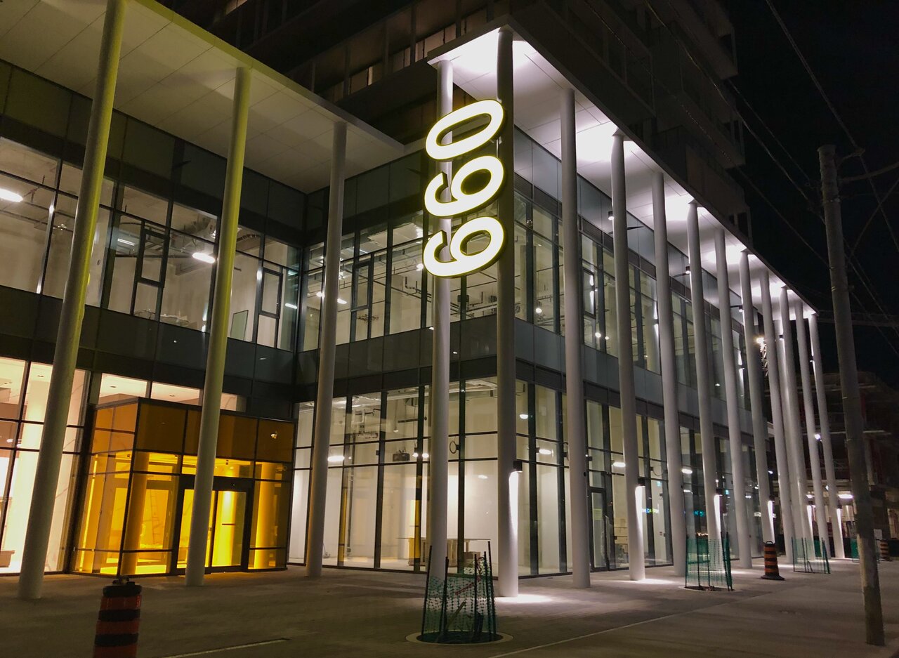
The lit 660 is indeed yellow but got washed out in my cell shots.
The sad thing is that warm colours were a major part of the local vernacular for close to 200 years. But for some reason architects want everything to be monotone and cold now. When they do use colours it's only as a "splash" here and there in an otherwise grey cityscape. We need more warm and bright colours in a city with cold winters.Grey, transparent, and minimalist from one end to the other. It's an improvement over what was but bleak and soul destroying at the same time. These neighbourhoods are screaming out for earth tones, texture, embellishment, warmth, layering, and a break from the sterile monotony of it all. If all of Toronto looked like this there's no way in hell I'd stay.
... World Urban Pavilion going in the 2nd floor space behind the 660 sign (sign is for the 'business centre' for upcoming tenants in a 2nd floor retail space)...
I actually really appreciate the bright yellow. City could use more bright Colors. Have not seen it in person but appreciate when someone in Toronto has the guts to go non-grey for a changeNoticed this a few days ago, the most terrible eyesore on this stretch of Dundas. Bright yellow plastic on an otherwise beautiful building. Also the 099 thing. It definitely looks like a 099.
God this sign is so ugly. Also it's wrong. Vertical signage is always rotated 90 degrees from original alignment, not 270 degrees... This reads "099". Stupid sign.The lit 660 is indeed yellow but got washed out in my cell shots.
The lit 660 is indeed yellow but got washed out in my cell shots.
Time for a Pinterest raid:God this sign is so ugly. Also it's wrong. Vertical signage is always rotated 90 degrees from original alignment, not 270 degrees... This reads "099". Stupid sign.


Time for a Pinterest raid:

…so not always.
42
Ahh, love the OTNOROT LACINATOB NEDRAGTime for a Pinterest raid:
42
!meg dekoolrevo na s'ti ,haeYAhh, love the OTNOROT LACINATOB NEDRAG
I doubt that labourer levelling the HPB appreciated you taking this pic at that specific moment...