


urbandreamer
recession proof
10 June 2012

|
|
|
I am fairly certain building technology in the 70s would not allow you to get a building that look remotely similar to what the illustration suggests. You'd need ultra-clear glass for that. What you are likely to end up with is a mirrored glass box.
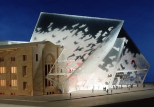
I wonder whether transparent library walls would be any more desirable than transparent museum walls where it comes to preserving a collection.
10 June 2012
I was just thinking that! Oh no, wait a minute, I wasn't thinking that at all.I agree - it's the architectural equivalent to Zhang Huan's recent staging of Semele. There's no real dialogue between the addition and the original.