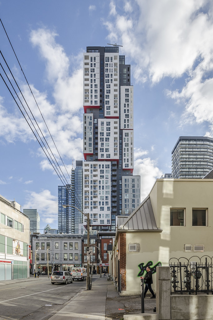
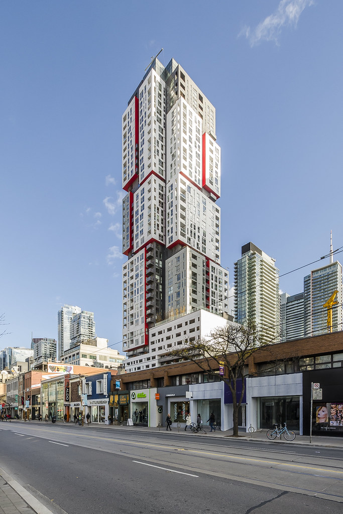
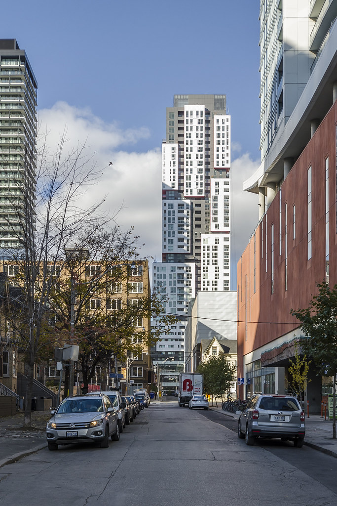
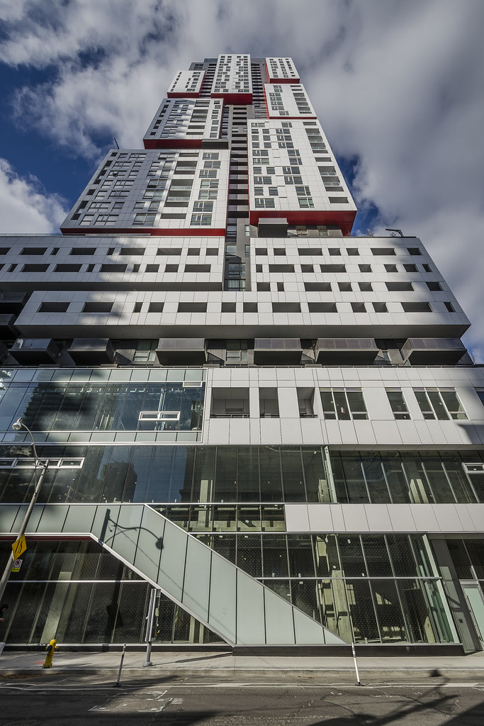
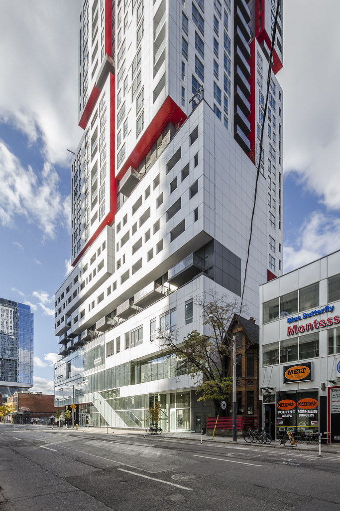
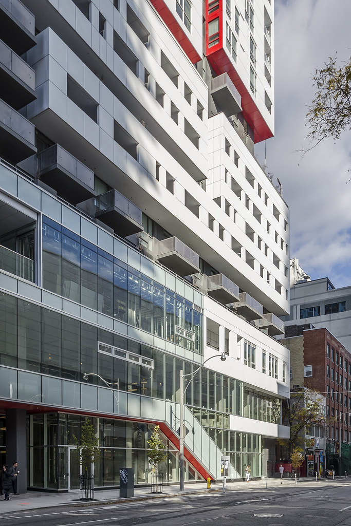
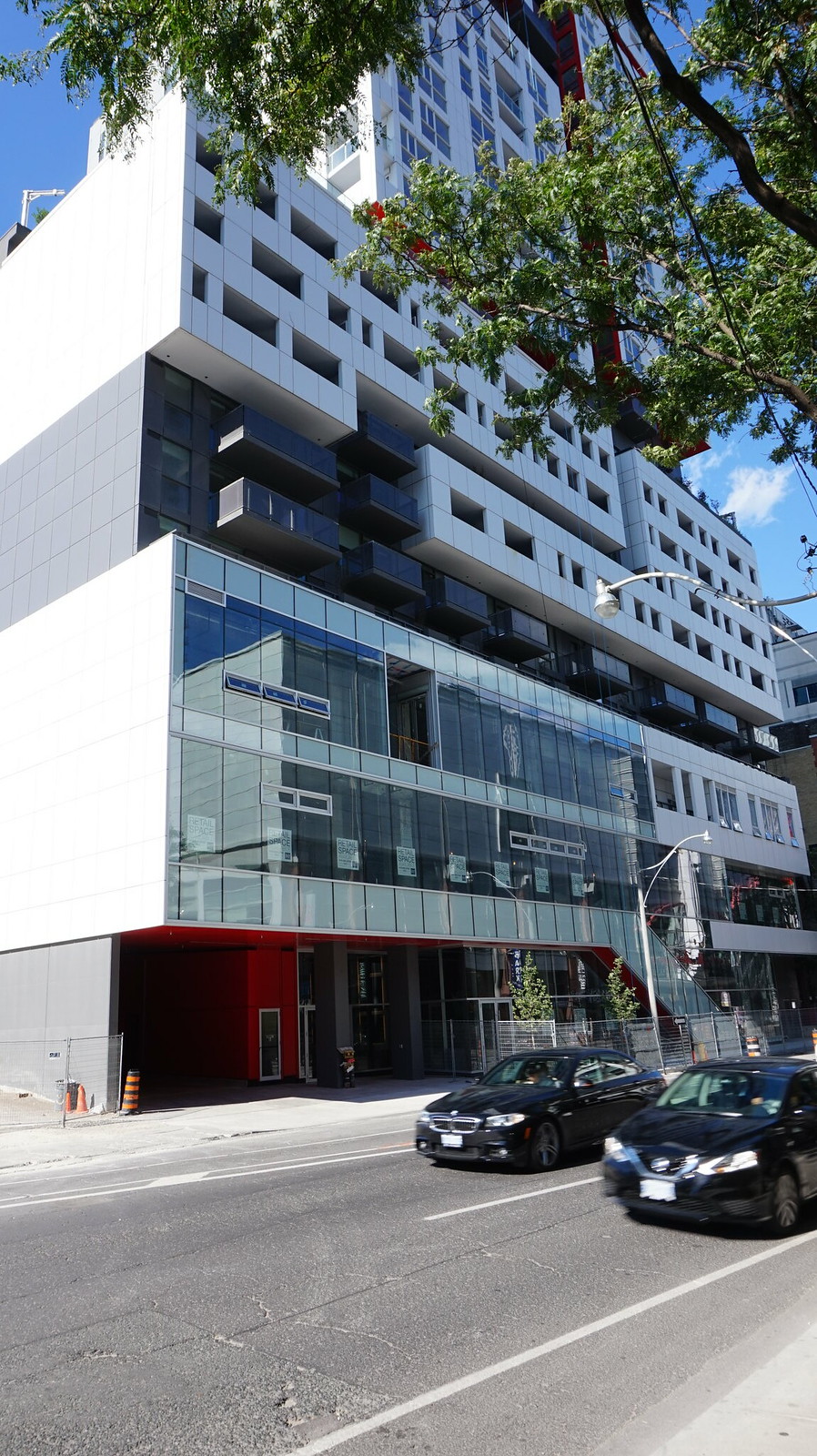
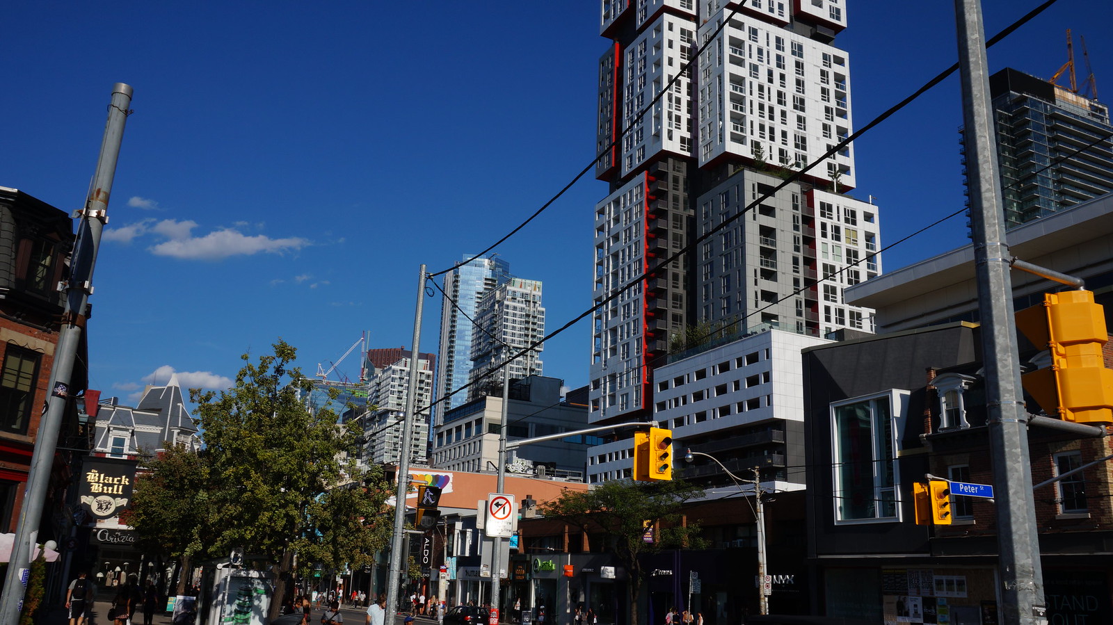
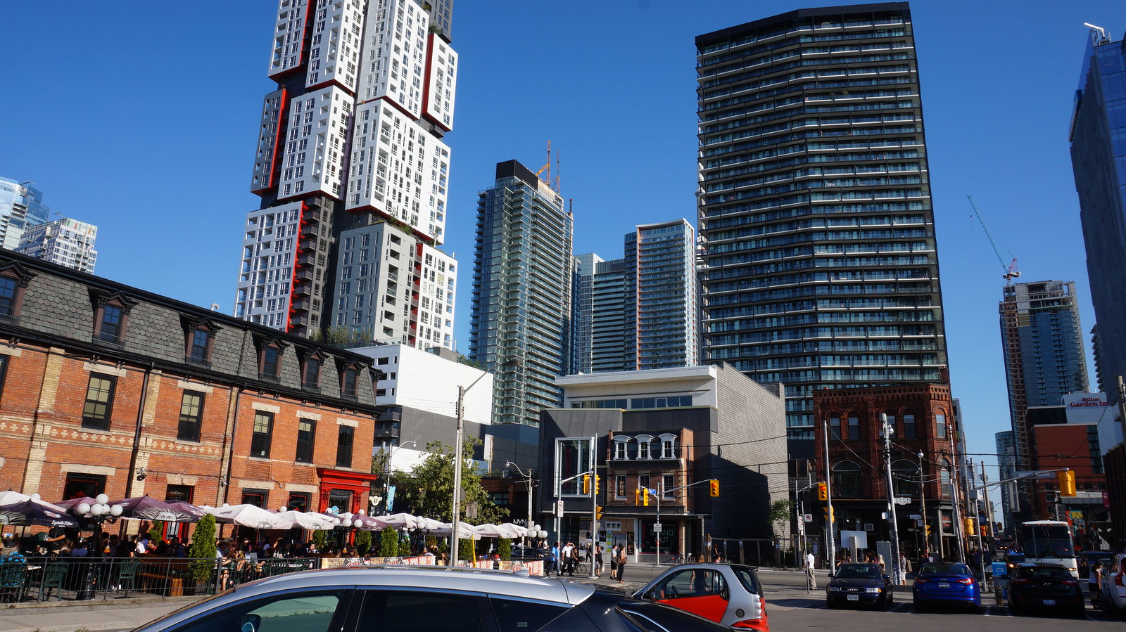
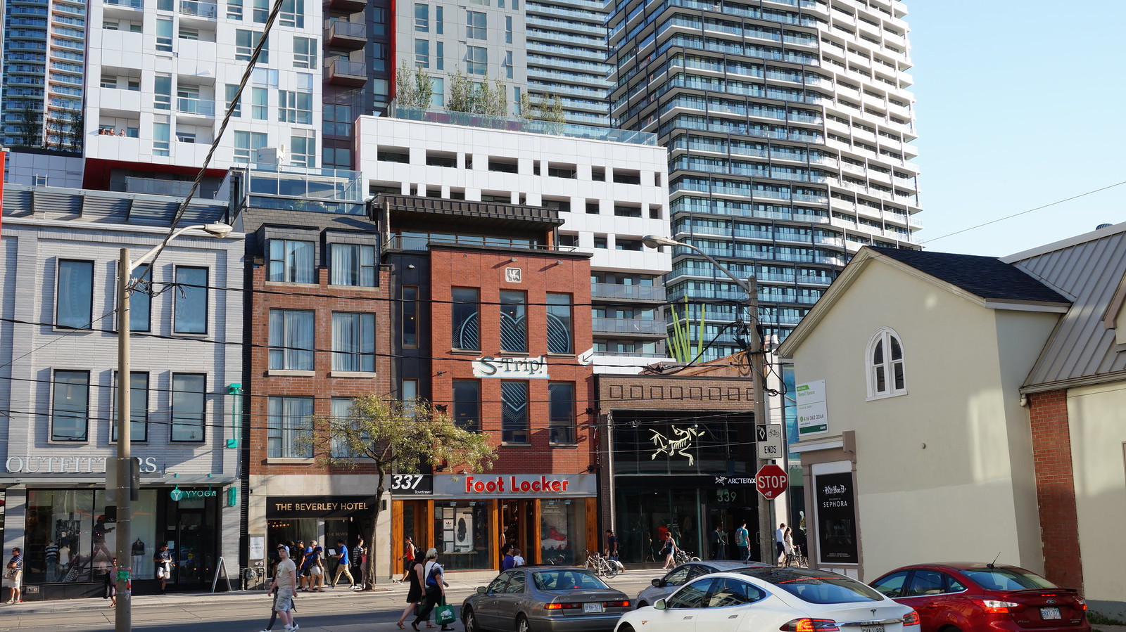
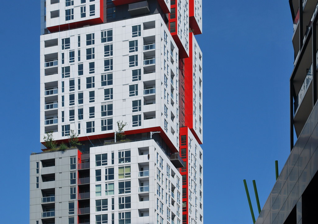
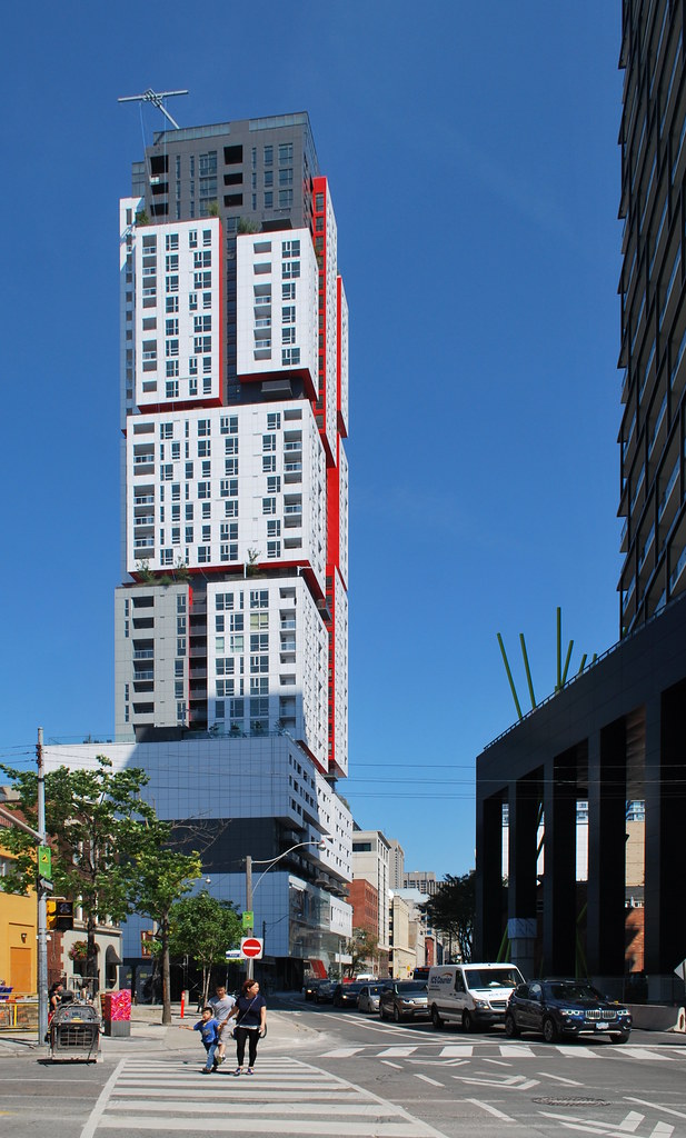
Surely the point of the heavy casements is to look a bit awkward, as it's that awkwardness higher up the tower which gives Picasso much of its charm. Picasso, like many other Teeple designed buildings, breaks strict minimalist rules of modernism to add atypical gestures (which here include projecting volumes and garish red) that are odd and awkward. It's still done with restraint, and it all looks entirely thought out to me.I don't know why they had to mar an otherwise decent curtain wall with those heavy white casement windows and the heavy white framed vents. It either looks temporary or an afterthought, and reminds me of those typical vinyl clad windows you see on houses.
Something frameless or lower profile would look much better and blend into the façade, rather than bring too much attention to itself.
That said, I'm not nuts about the podium as a whole. Probably could have used more casement windows (and more detail in general).
42
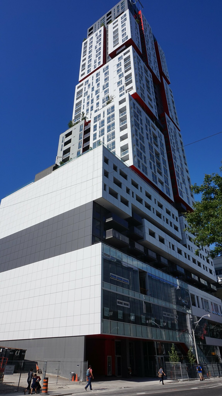
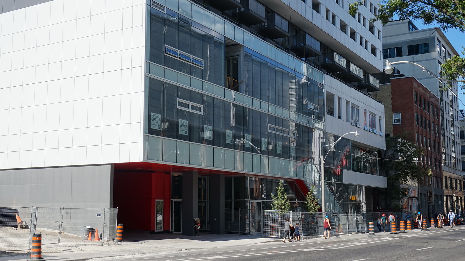


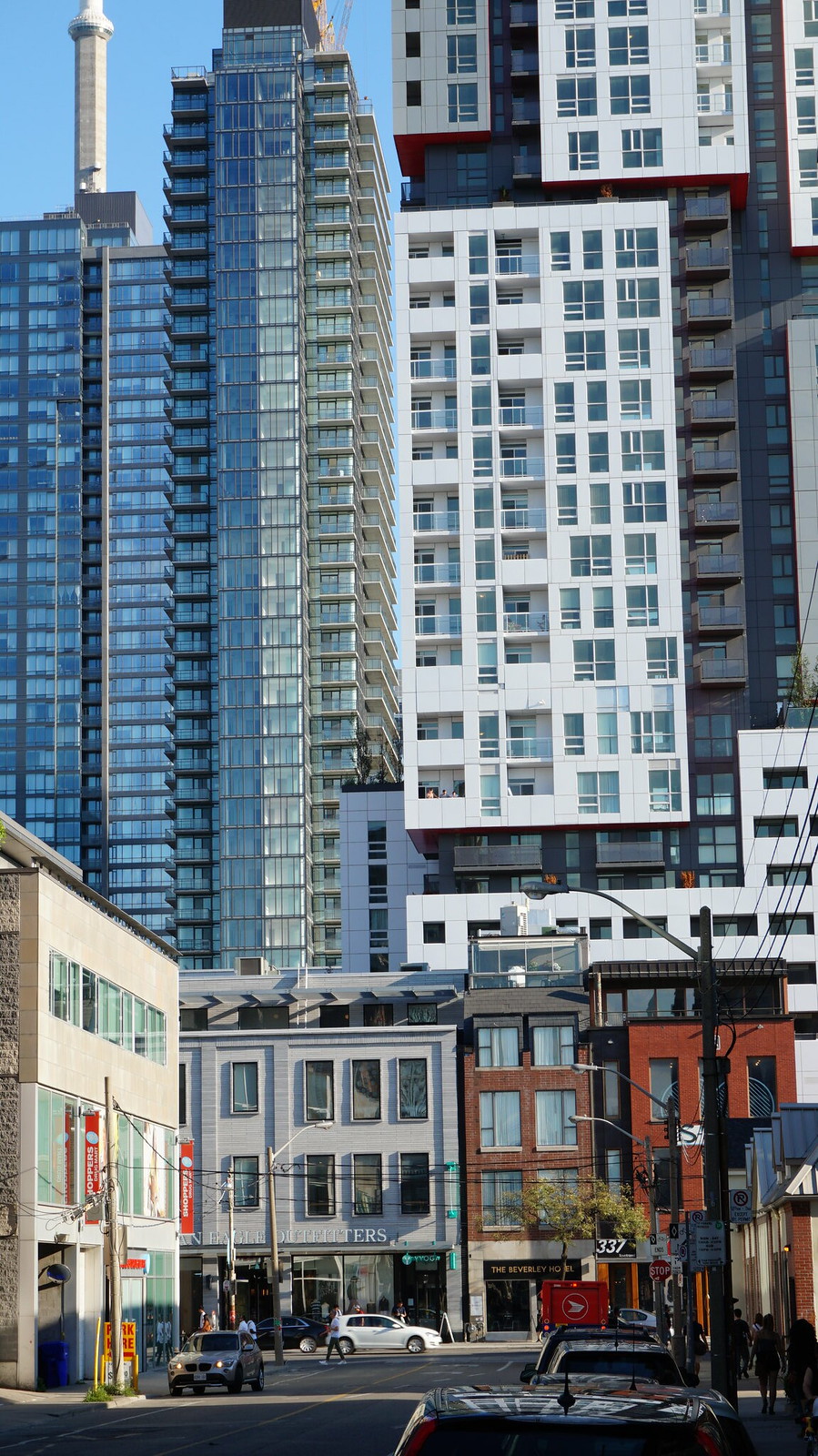
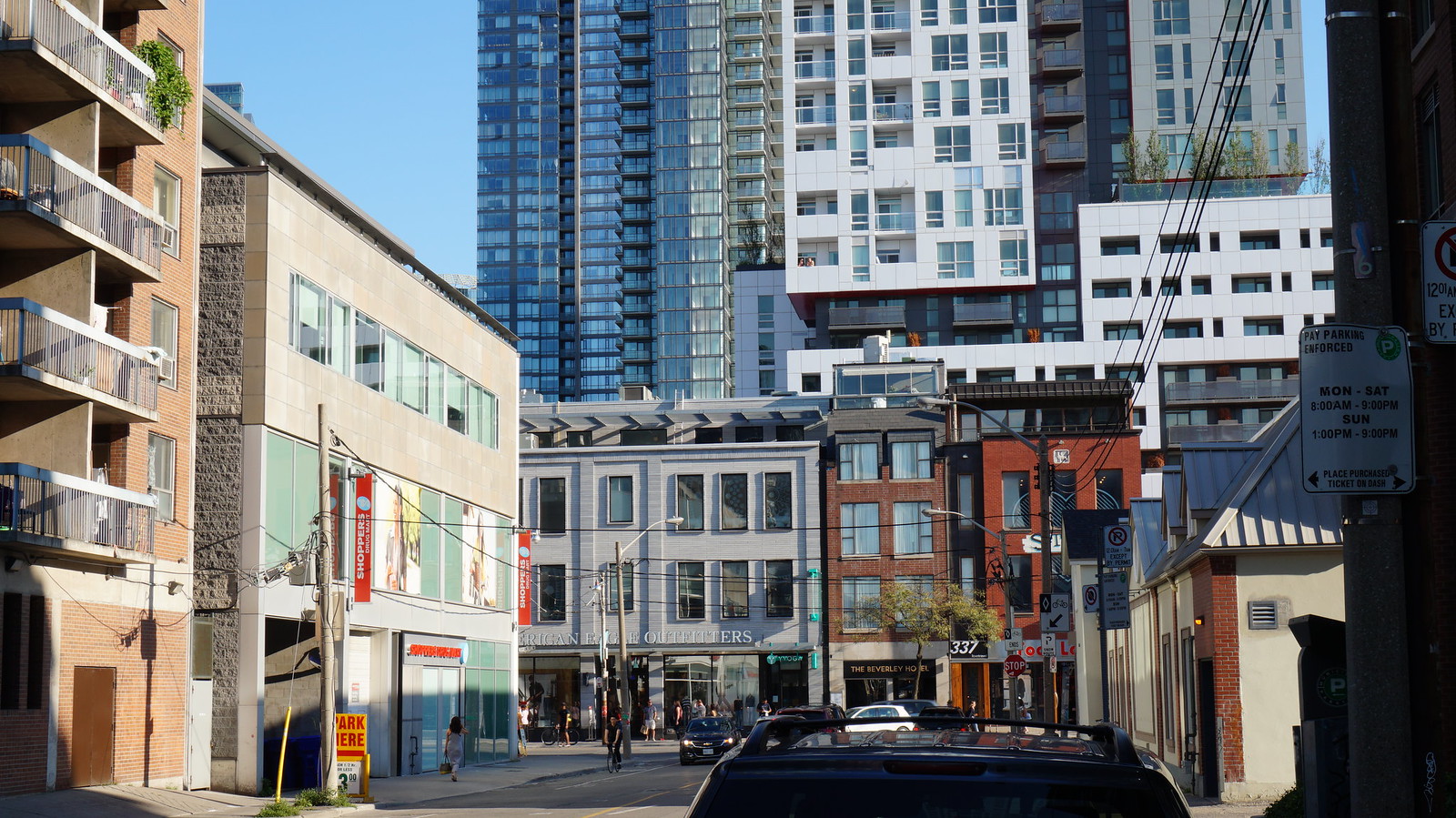
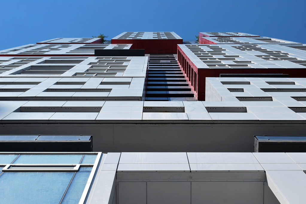 Picasso
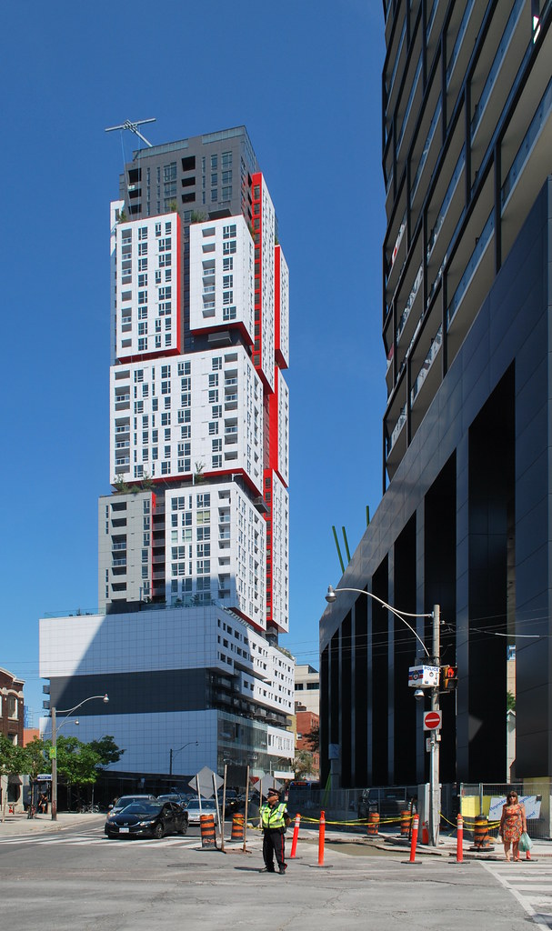 Picasso
 Picasso
 Picasso


