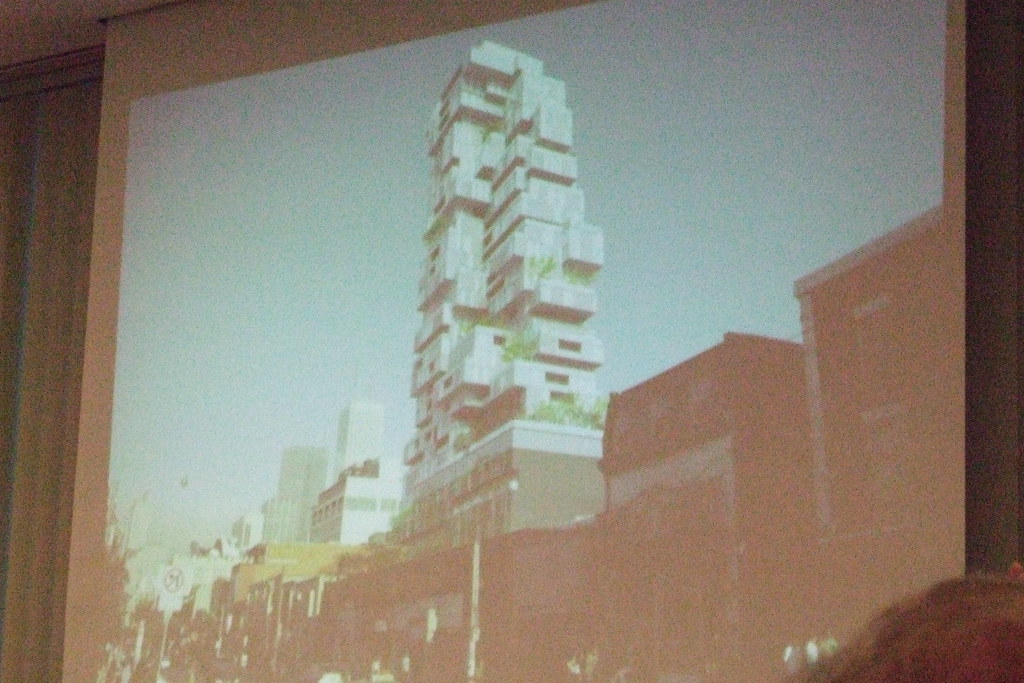
Toronto Picasso Condos | 128.62m | 39s | Mattamy Homes | Teeple Architects

Though not as distinct as the original hotel concept, the design looked very good. The black and white cladding, accented with reds, will be decoratively lit at night in order to highlight its prominent place at the south end view terminus from Beverly and the north end view terminus from Widmer.

It's a hell of a lot more interesting than the repetitive glass towers found at the Cityplace developments.

Sounds like it still has potential to be a good landmark. I look forward to seeing more renderings and maybe should have reserved judgment until then. Still, the original design was so striking that one could feel that this one was going to be about compromises.
 
Some additional details from the meeting:

  • Two levels of retail with escalators.

  • Height of building remains the same as earlier iteration but floorplates are bigger to compensate for the loss of the hotel component

  • Different colours used on different sides of building. Vaughan indicated that this is meant to be a 'three-dimensional' building which will change with different perspectives.

  • Buyers will be given two or three different spandrel options to customize the exterior of their suite.
 
New, larger renderings from BlacktowerTV: http://twitter.com/#!/BlacktowerTV

monarc.jpg


monc2.jpg
 
Last edited:
It looks like a "supermodern living module". Hehe... really cool and different. I don't even mind the bulky massing... it makes it quite unique and striking, even if it is clunky.
 
It seems really clunky and disjointed. Hopefully a better render might reveal a bit more.

Current Design:
monarc.jpg

monc2.jpg
g

Earlier Designs for Reference:
2589923267_2e2d50129f_b.jpg

gvoorttto.jpg
 
Last edited:
the older design is so mucg more interesting as a visitor point of view nyways.. the new rendering is way to cleaned up.. toronto is all about unique archutecture.. i like the older more bizzare personally.. the black and white one is to. sterile and tthe cladding on it i can see being very pour in the end. as i have been watching these forums alot seeing what materials they use and if its anything like uptowns podioum it will look horrid. (mind you th rest of uptowns upper tower portion i am in love with) very different for toronto. and yet fits in with its uniqueness
 
Last edited by a moderator:
Go With The Old rendering PLEASE! New Render Is Horrid! Tourist observation

It looks like a "supermodern living module". Hehe... really cool and different. I don't even mind the bulky massing... it makes it quite unique and striking, even if it is clunky.

from an outsiders point of view of toronto i also feel that as this building is going to be seen "big time" from "the place to shop" All along the amazing and famous Queen street.. id rather look up and gazae at a piece of art like the earliar render. the bulkiness of the new render makes all the surraounding buildings look chunky as well.


(im not archutect, so dont let me give any impressions about that, but the appeal of the old render gives so much more interest to the eye. and gives toronto a fresher look from ground level looing up, I feel. The older render is much more appealing, From a tourists stand point.. it gives the feel like your in a larger and more cultured city, and i have seen a few builings similar to this in other areas of the world.. and they all look great but in and amungst torontos buildings, it will be a real appealing structure, on its own, and in one of the greatest cities i have ever visited, though i am bias to that as i grew up not all to far from the city its self.)
 
Ug, please tell me the new design is a joke. The older one is head and shoulders above it.

There's almost no comparison between the two imo.
 
The old one was better by far... however, if someone showed me the new one and I didn't know the old one existed, then I would say it's excellent. So going by that, it's pretty darn good!
 
The old one was better by far... however, if someone showed me the new one and I didn't know the old one existed, then I would say it's excellent. So going by that, it's pretty darn good!

I was just about to make the same post. In this case, since the original is indeed better, it makes the revised design look clunky in comparison. Judging it independently though, I believe it's a creative and attractive proposal that will definitely garner attention once built.
 
I was just about to make the same post. In this case, since the original is indeed better, it makes the revised design look clunky in comparison. Judging it independently though, I believe it's a creative and attractive proposal that will definitely garner attention once built.

yes i will agree with you on that.. it still is a nice looking building.. but still would rather seen it somewhere else in the city then right there. the newer render just looks like they are taking other prjects currently being build and changing them up a bit to make a slight change. like the green glass everyone hates.. this black on white theme seems to be happening just as much. im all for mixed materials but in this location a bold structure like this the new render is to much! regardless of what any of us think they will still go a head with what they want not what the point of view is from anyone else. (sadly, some of us on here are just regular joes, and our oppinions dont matter much) though it seems the more we all watch these projects rise and fill in.. alot have been just... "ok", not all that great. Just fillers for space, noth thought out. But thats no way to set the future of toronto. (all just my rambling oppinion though)
 
I spoke with one of the principals involved with this project today, and I can assure you that nothing about this project will be "not thought out": Monarch and Goldman intend to have a major landmark here. Wait for the official renderings!

42
 
I spoke with one of the principals involved with this project today, and I can assure you that nothing about this project will be "not thought out": Monarch and Goldman intend to have a major landmark here. Wait for the official renderings!


Alright, I'll wait with fingers/toes/eyes crossed!
 

Back
Top