Toronto Parliament Street Data Centre | ?m | 5s | BRL Realty | WZMH

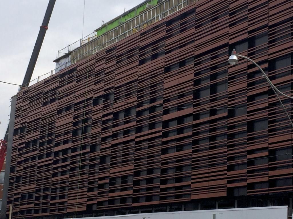
As a friend pointed out to me, the slats will present a perfect roosting place for pigeons and birds, who will contibute their own "artwork" in time. I wonder if the architect considered this in the design? This could end up being the "Pigeon House". Let's hope not.
 
I have to say, I think I like this buildings design better than pretty much ever condo to go up in the West Donlands area, aside from River city.
 
I have to say, I think I like this buildings design better than pretty much ever condo to go up in the West Donlands area, aside from River city.

I don't see anything particularly interesting about this design except for that facade with the slats. Otherwise it's just a squat box.
 
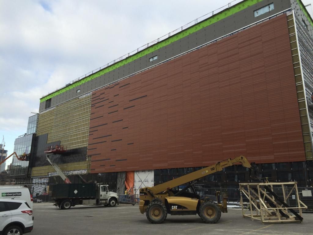
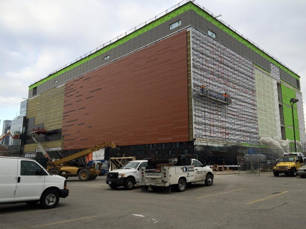
Gotta say, the renderings for this project did absolutely nothing for me. The finished product though is incredible!
 
Got to say I was expecting the vertical "fins" underneath the terracotta cladding to show up less than it does in reality. It's a bit distracting.

AoD
 
Got to say I was expecting the vertical "fins" underneath the terracotta cladding to show up less than it does in reality. It's a bit distracting.

AoD

To each their own! That's actually what I like compared to the rendering. Gives it more of an appearance of having windows, than just a blank wall.
 
Well I gotta say, you guys are a couple of jokers! :)

I do like the paneling on the side, it already is more interesting to look at than any of the sidings on the condos near by, and this from an institutional building. I hope the next buildings in this area post Pan-am ante up a bit.
 
In MCC this design would pass as architecture. Here, next to the DD, it's an appalling failure.
68nUzr1.jpg


rLzl1l4.jpg


5VxV7MW.jpg
 
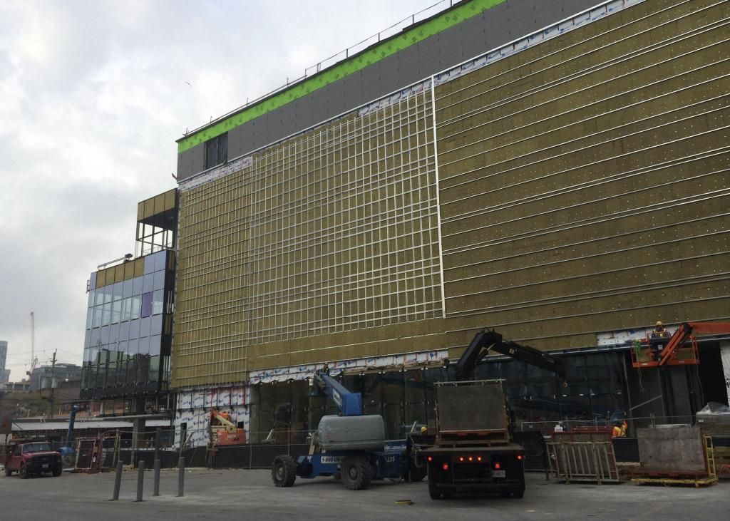
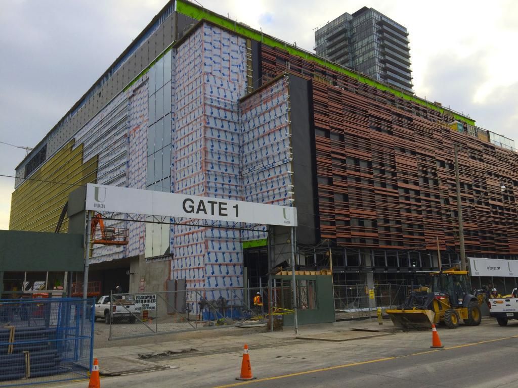
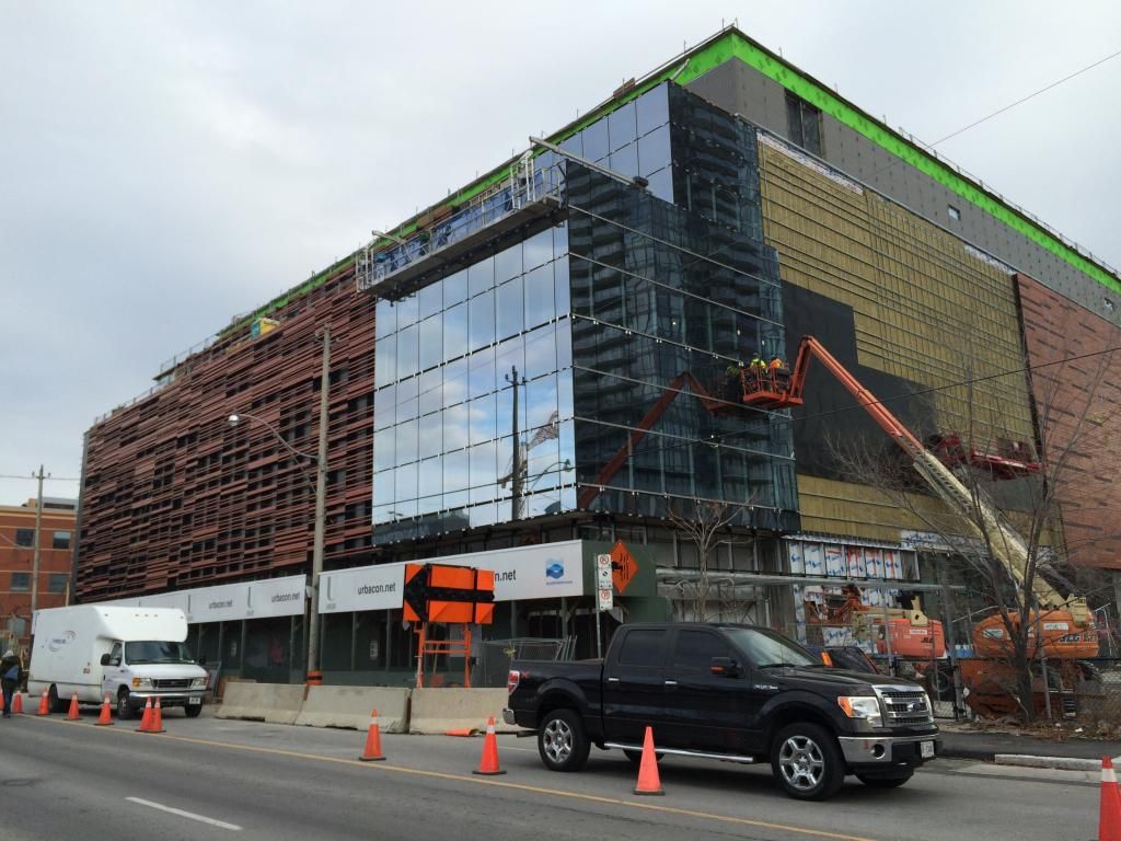
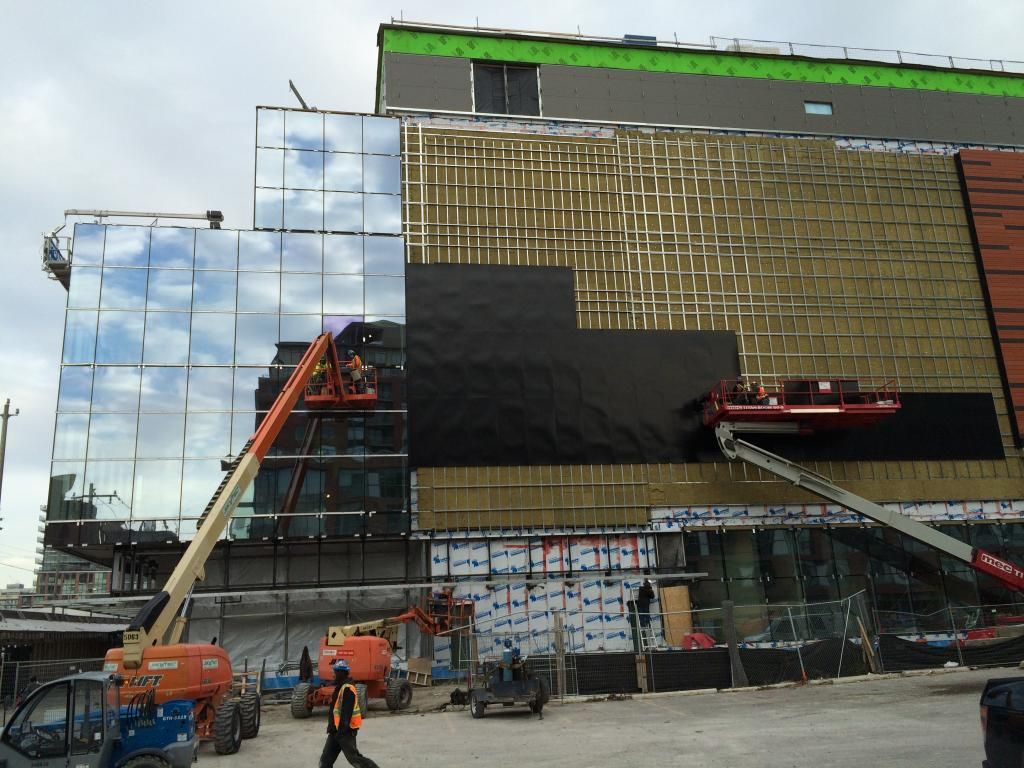
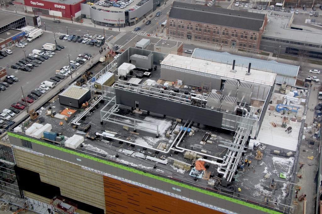
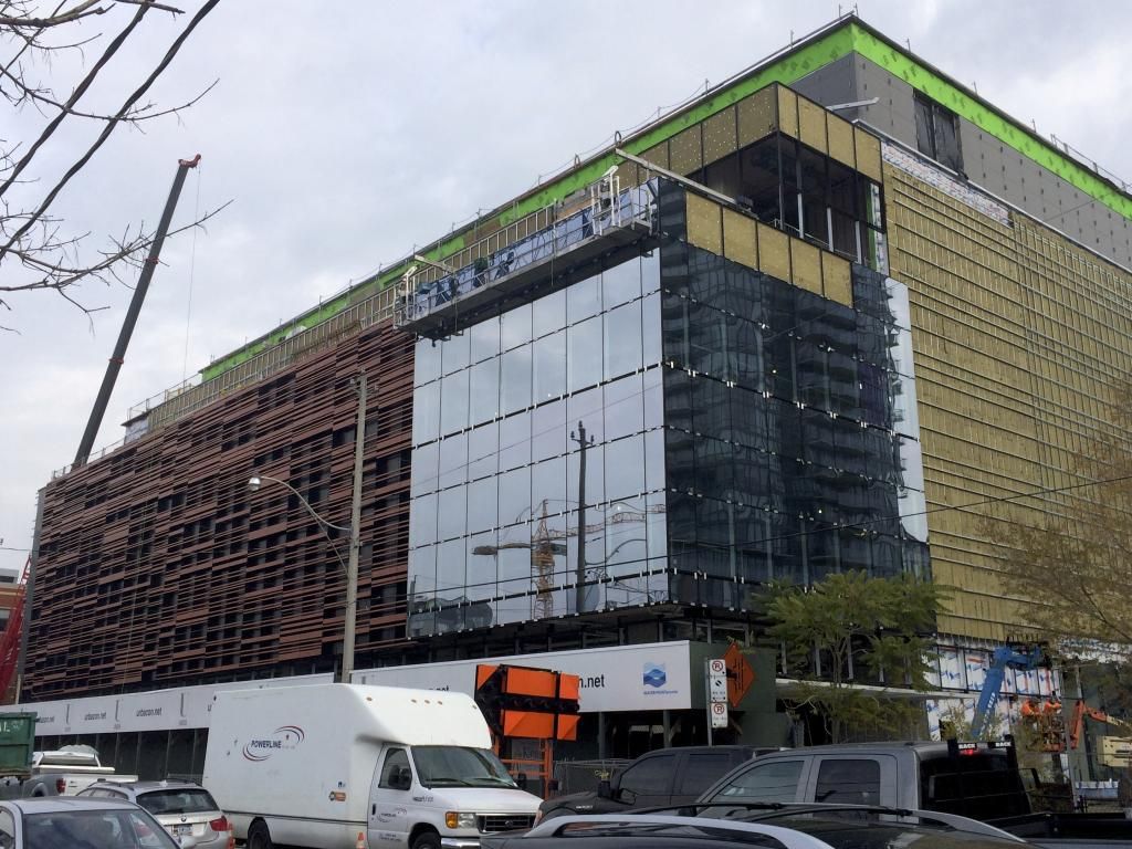
Construction update. Photos taken November 19, 2014:


^ North and West Elevations


^ West Elevation


South Elevation


South Elevation facing Mill Street


South and East Elevations


Roof top view
 
Ohhhhh, I get it.

That's some good cladding. This is going to look really good along the sides.

42
 
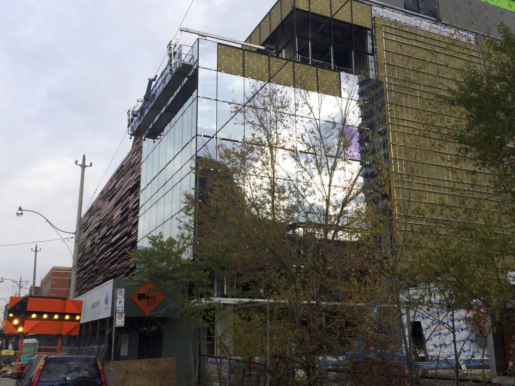
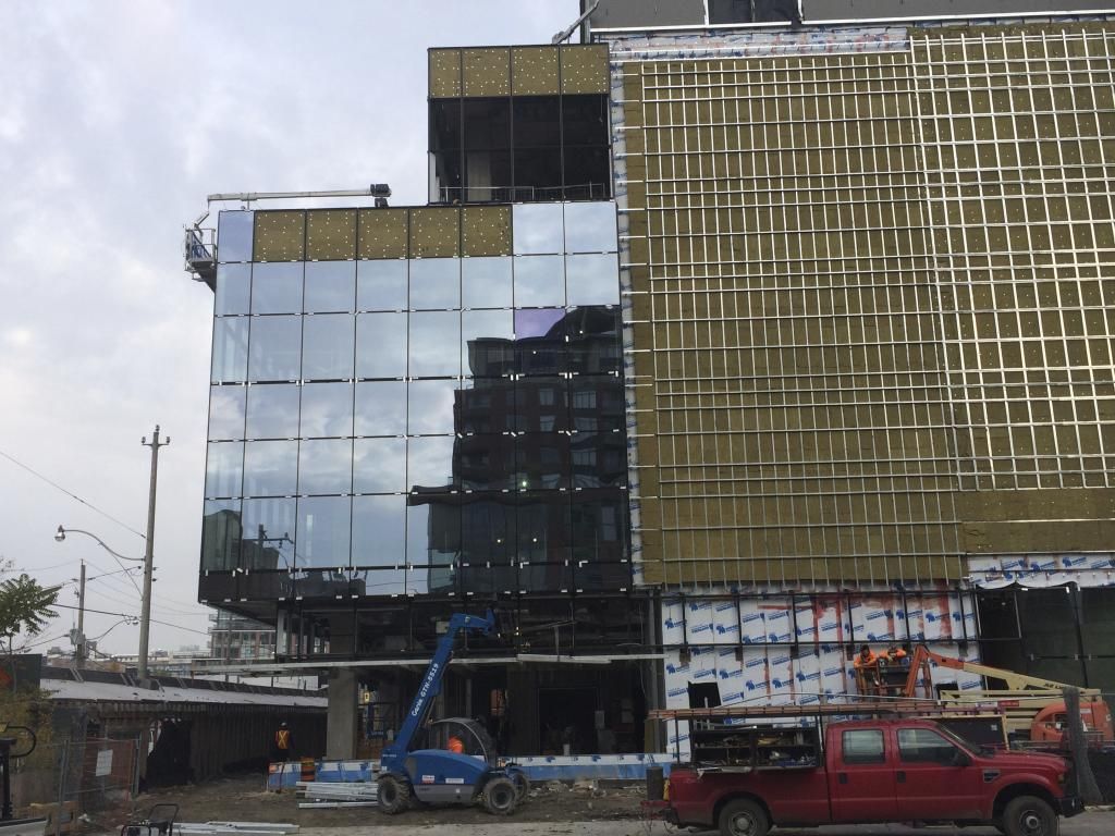
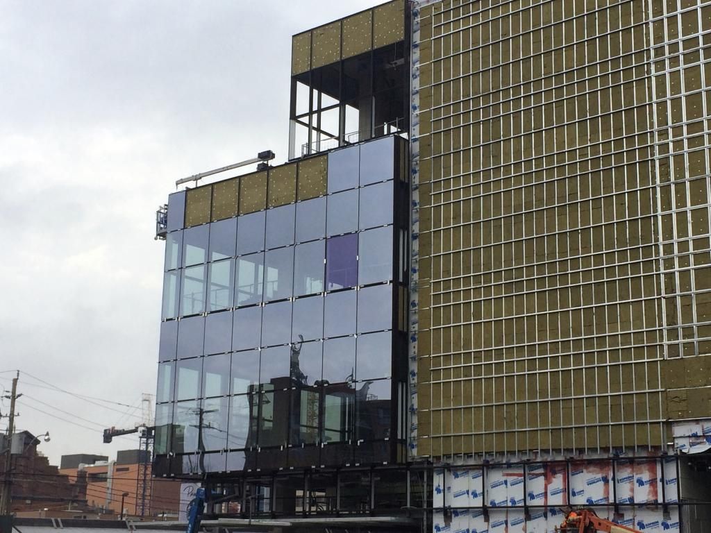
I have to admit that as I watch the cladding go up, this building continues to surprise and delight me. I attended the Waterfront Toronto design review panel meeting a couple of years ago when the architect presented his design for the first time, and I remembered being quite impressed with his renderings and attention to detail. That said, I’ve grown to become a major skeptic of architectural renderings and I usually take them with a grain of salt because the finished product invariably fails to live up to the promise. That’s not the case here at all. If anything, this building, as it unfolds, seems uncannily true to the renderings, and for that I am grateful because I can’t go home without passing by this building every day. I like the unconventional intermittent tile pattern on the Parliament Street façade, and the Mill Street tile treatment is pretty cool too, and not overly offensive in any way despite its lack of glazing except at the base. But it’s the slick glazing on the south-west corner, and the perimeter of the ground floor that really sets this building apart and belies the fact that it is really just a “data center” after all. So far I give it a solid two thumbs up, but I reserve final judgment until I see how it all ties together on completion. Somehow I don’t think I will be disappointed.

As far as data centers go, I know of only one other in downtown Toronto (Allied REIT’s building on Front St. West, east of Simcoe), but this one takes the cake. I wouldn’t be surprised that if data centre followers around the world (if there is such a fraternity) put it to a vote, this could perhaps be No. 1.
 

Back
Top