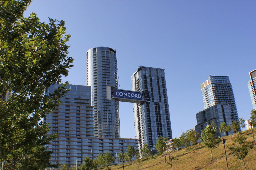
It's a shame that Parade lacks design accents along its neutral grey facade, which looks greyer than the average glass-clad tower. The renderings showed the horizontal lines of the podium with a bright orange colour, but what we got is such a neutral shade of orange that it might as well be beige. The connecting bridge and the sleek flat roofs look great. The complex's silhouette and positioning in the neighbourhood looks like it's supposed to be a centrepiece; however, a centrepiece shouldn't have such neutral cladding. It's overly grey and neutral in any daytime lighting conditions.
 and this is from yesterday afternoon.


