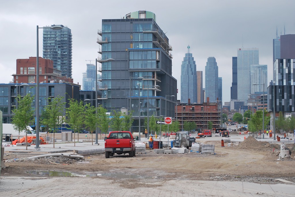
Toronto Pan Am Village in the West Don Lands | ?m | ?s | DundeeKilmer | KPMB

Yeah but you're missing the point. This neighbourhood was designed from scratch. We had the opportunity to really be creative and build something really special. We had the opportunity to create something that's a destination and not just another residential neighbourhood. We had the opportunity to use colour and materials creatively, to excite the city and what do we get? We get a typical, grey, spandrel box neighbourhood, that needs to be fixed with trees and hopefully some retail animation. The architecture and urban design do not stand on their own, if we need trees to just make this place less depressingly grey and boring. I think the city screwed up big time and threw away a fantastic opportunity to develop a great new destination district. This is not suburbia, this is basically still downtown Toronto. It's right beside the Distillery District, yet you'd think it was Scarborough or something. Obviously, tourism and giving Torontonians a new place to enjoy, wasn't part of the plan. It's basically a shorter version of Cityplace and we all know how interesting that area is.
 
It looks a lot better in person, aside from the horrendous colour choice for the mechanical penthouses. I would have liked more colour, but it hardly makes this area a disaster. Once it's populated and the greenery grows in a bit, it will look a lot better.
The George Brown building is getting a band of red today above the big window wall on Cherry Street but even so it is a rather colourless area.
 
Image by Waterfront Toronto. Even they couldn't come up with a more flattering way to present this.

I went down there yesterday and took some photos so hopefully mine are a little more flattering. But I agree, this area really is unnecessarily dreary. I appreciate the little colour they do have in the mechanical space, and it complements the greenery in the area, but just wish they would include more. I don't know why everything has to look so monotonous.

West Don Lands by Marcanadian, on Flickr

West Don Lands by Marcanadian, on Flickr

West Don Lands by Marcanadian, on Flickr

West Don Lands by Marcanadian, on Flickr

Pan Am Village by Marcanadian, on Flickr

Pan Am Village by Marcanadian, on Flickr

Pan Am Village by Marcanadian, on Flickr

Pan Am Village by Marcanadian, on Flickr

Pan Am Village by Marcanadian, on Flickr

Distillery District by Marcanadian, on Flickr

Pan Am Village by Marcanadian, on Flickr

Pan Am Village by Marcanadian, on Flickr
 
It doesn't look that bad, but I agree tat they could've built those buildings with different material.
 
Green is a polarizing colour for architectural materials. Though some of the mechanical boxes in this area are awful, I like the rounded mechanical penthouse. It softens the rigidity of the architecture slightly.
 
We will be running a story on Monday about the West Don Lands, and I'm going to be running a number of photos in advance of that to give you more to chew on.

I'll start with a few shots aimed along bits of Cherry Street and at the old Canary Restaurant building. Owned by the Province, the building is currently having its exterior restored by DundeeKilmer, but is not expected to have anything in it at the time of the Pan Am Games. I believe it is immediately south of this building where the Anishnawbe Health Centre (being designed by Douglas Cardinal) will be built, but I don't have final confirmation of exactly the parcel being transferred from the Province for that.

2P1390665.jpg


4P1390749.jpg


Looking south along the new streetcar tracks:
3P1390748.jpg


Looking back north along Cherry Street from Mill Street:
5P1390663.jpg


42
 

Attachments

  • 2P1390665.jpg
    2P1390665.jpg
    93.9 KB · Views: 1,072
  • 3P1390748.jpg
    3P1390748.jpg
    96.8 KB · Views: 1,045
  • 4P1390749.jpg
    4P1390749.jpg
    100 KB · Views: 1,066
  • 5P1390663.jpg
    5P1390663.jpg
    95.1 KB · Views: 1,061
Yeah but you're missing the point. This neighbourhood was designed from scratch. We had the opportunity to really be creative and build something really special. We had the opportunity to create something that's a destination and not just another residential neighbourhood. We had the opportunity to use colour and materials creatively, to excite the city and what do we get? We get a typical, grey, spandrel box neighbourhood, that needs to be fixed with trees and hopefully some retail animation. The architecture and urban design do not stand on their own, if we need trees to just make this place less depressingly grey and boring. I think the city screwed up big time and threw away a fantastic opportunity to develop a great new destination district. This is not suburbia, this is basically still downtown Toronto. It's right beside the Distillery District, yet you'd think it was Scarborough or something. Obviously, tourism and giving Torontonians a new place to enjoy, wasn't part of the plan. It's basically a shorter version of Cityplace and we all know how interesting that area is.

+100
 
We had the opportunity to create something that's a destination and not just another residential neighbourhood....It's right beside the Distillery District, yet you'd think it was Scarborough or something.
I don't know where in Scarborough there are buildings of the form and plan of these. I don't know where in Scarborough you'll find a residential neighbourhood with the same concerns for the streetscape. I don't know where in Scarborough there is this mix of recreational (YMCA, the new parks), institutional (George Brown), residential and heritage elements. Not every design decision is going to prove a success and there will always be constraints, especially with public money involved, but this is far from some thoughtless, cookie-cutter undertaking, it's far from what we consider bland suburbia.
 
Last edited:
Well, as others have noted, the area actually looks better in person than in photos. One of the reasons I think it appears more drab than it is in the photos is that it is still under construction and, as a result, there is a lack of people on the streets. I believe that once it gets filled up and there is real human activity in and about the neighborhood, it will have a more connected feel to it.
 
Agreed, no doubt you are right…

but nevertheless I am hoping that the next buildings here will not be gray. I like gray brick, a lot, and especially the ironspot gray for its sheen, but I do not want to see entire neighbourhoods of it. I don't want entire red brick neighbourhoods either. There's no reason that we cannot have gray, red, and buff brick as well in today's neighbourhoods (and come to think of it the purply-brown ironspot that was used on Paintbox is another terrific brick). It's time for Toronto architects to mix it up a bit more again with this material.

42
 
More new shots from a recent tour of the Pan Am Village, this time focusing on the new presentation centre (currently being used for Canary Park Condos), and then out on to Front Street where interlocking paving stones are being laid. You get a close-up on the interlock too, for your general edification.

1P1390666.jpg


2P1390761.jpg


3P1390747.jpg


4P1390705.jpg


5P1390714.jpg


6P1390733.jpg


7P1390712.jpg


8P1390720.jpg


9P1390723.jpg


42
 

Attachments

  • 1P1390666.jpg
    1P1390666.jpg
    93.9 KB · Views: 1,537
  • 2P1390761.jpg
    2P1390761.jpg
    91.6 KB · Views: 1,543
  • 3P1390747.jpg
    3P1390747.jpg
    95.3 KB · Views: 1,516
  • 4P1390705.jpg
    4P1390705.jpg
    95.1 KB · Views: 1,530
  • 5P1390714.jpg
    5P1390714.jpg
    98.8 KB · Views: 2,043
  • 6P1390733.jpg
    6P1390733.jpg
    96.3 KB · Views: 1,526
  • 7P1390712.jpg
    7P1390712.jpg
    94.7 KB · Views: 1,497
  • 8P1390720.jpg
    8P1390720.jpg
    95.2 KB · Views: 1,527
  • 9P1390723.jpg
    9P1390723.jpg
    97.2 KB · Views: 1,534
I love all the pavers. How on earth are they going to control the weeds that love the little spaces between each one?
 
This batch focuses in on the George Brown College building by architectsAlliance, and the TCHC buildings by Daoust Lestage of Montreal.

01P1390662b.jpg


02P1390746.jpg


03P1390741.jpg


04P1390743.jpg


05P1390736.jpg


06P1390734.jpg


07P1390710.jpg


08P1390735.jpg


09P1390725.jpg


10P1390726.jpg


11P1390729.jpg


13P1390731.jpg


14P1390730.jpg


These shots (and the other recent inside-the-fence shots of recent posts including those in the Canary Park and Canary District threads) were taken when we sat down with Ken Tanenbaum of the Kilmer Group, half of the DundeeKilmer development team building the Pan Am Village. We have the interview up on the front page.

42
 

Attachments

  • 01P1390662b.jpg
    01P1390662b.jpg
    97.5 KB · Views: 1,457
  • 02P1390746.jpg
    02P1390746.jpg
    93.9 KB · Views: 1,436
  • 03P1390741.jpg
    03P1390741.jpg
    90.1 KB · Views: 1,433
  • 04P1390743.jpg
    04P1390743.jpg
    93.3 KB · Views: 1,439
  • 05P1390736.jpg
    05P1390736.jpg
    97.6 KB · Views: 1,434
  • 06P1390734.jpg
    06P1390734.jpg
    96.9 KB · Views: 1,436
  • 07P1390710.jpg
    07P1390710.jpg
    94.4 KB · Views: 2,001
  • 08P1390735.jpg
    08P1390735.jpg
    93.6 KB · Views: 1,410
  • 09P1390725.jpg
    09P1390725.jpg
    92.4 KB · Views: 1,427
  • 10P1390726.jpg
    10P1390726.jpg
    93.9 KB · Views: 1,956
  • 11P1390729.jpg
    11P1390729.jpg
    95.9 KB · Views: 1,430
  • 13P1390731.jpg
    13P1390731.jpg
    96.3 KB · Views: 1,434
  • 14P1390730.jpg
    14P1390730.jpg
    96.9 KB · Views: 1,442

Back
Top