Riseth
Senior Member
Fantastic addition to this part of the city. Really fits in well here.
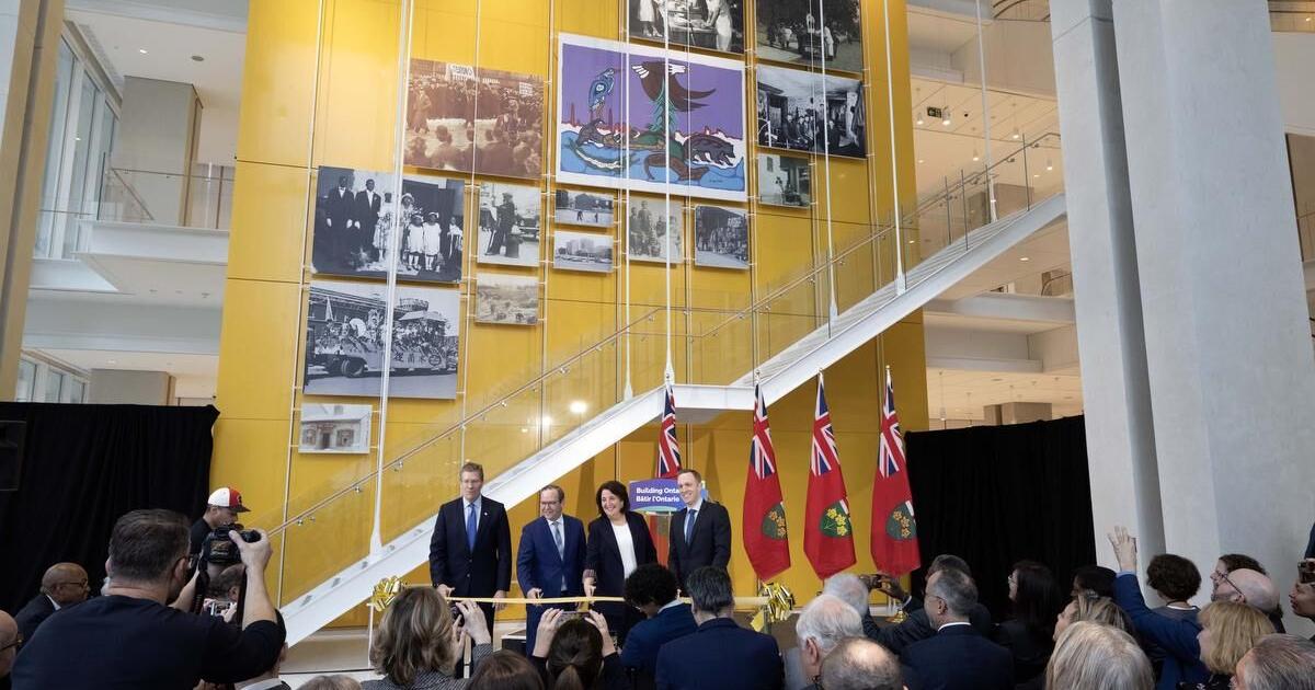
Article up from the Star on today’s ribbon-cutting. Opening Monday.

Province unveils $956-million downtown Toronto courthouse
The new court building will eventually take on all criminal matters from six existing courthouses scattered across the city — a move critics say raises access-to-justice concerns for people living outside the city centre.www.thestar.com
Speaking to reporters on Tuesday in the building’s atrium, Downey batted away criticism that the courthouse has already become too small before it even starts hearing cases. The association representing Crown attorneys has said the government has had to find office space for prosecutors in the surrounding area because there isn’t enough room in the new building for all of them.
Off topically: I'm not sure how one does loading docks better though.Now maybe we can do something about this mess. View attachment 459047
Speaking to reporters on Tuesday in the building’s atrium, Downey batted away criticism that the courthouse has already become too small before it even starts hearing cases. The association representing Crown attorneys has said the government has had to find office space for prosecutors in the surrounding area because there isn’t enough room in the new building for all of them.

The opening means that Old City Hall will soon be available for alternative uses, right?
I'll concur with @AlvinofDiaspar that the streetscape under delivers. I will remain somewhat hopeful that when every last planting is in the ground it will look a bit better.
The pedestrian-scale lighting is ultra-plain and lacking in colour. I'm betwixt and between on going with a modern look here, though the building certainly could call for it, but we already have 2 other different styles of lighting within 1 block, this makes 3 and it is not an improvement.
I think it also would have been nice to something other than plain concrete for the sidewalks.
There are other things I would also have done different, but that's as much personal taste as quality; to me there's just no getting around the sidewalk/surface treatment being under-whelming and the lighting being almost offensively dull.
****
@ADRM absolutely awesome photo montage does, however, leave me very pleased with the building interior, which frankly, I like more than the exterior form. I think the incorporation of 'warmth' is very obvious and most welcome.

 www.som.com
The attention to detail is amazing (and throw in some decent materials like wood and coloured glass and metal, and it is amazing that all this was accomplished for a public building). This demonstrates that modern does not have to equal bland.
(ADRM, thank you very much for the photos. appreciated)