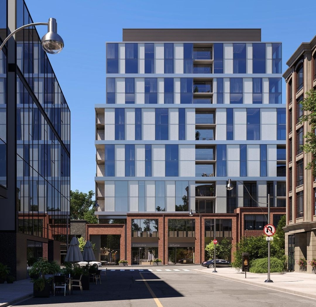
Toronto One Roxborough West | 49.7m | 12s | North Drive | Reflect Architecture

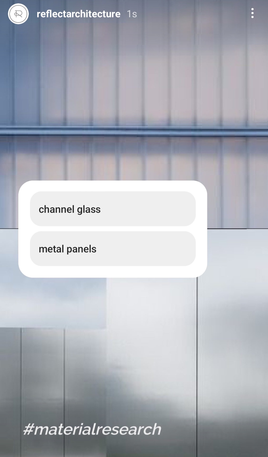
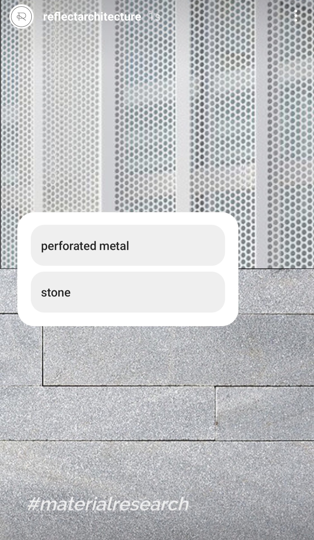
Reflect Architecture conceptualizing on what type of materials to use for this project, posted in their IG story:


Screenshot_20220315-184318_Instagram.jpg
Screenshot_20220315-184324_Instagram.jpg
Screenshot_20220315-184329_Instagram.jpg
 
Last edited:
From Reflect Architecture's IG:


View attachment 382730View attachment 382731View attachment 382732

For some reason, I missed this post earlier.

Hmmm, 100,000ft2, based on zero setbacks (just for somewhere to start) gets you 7.69 floors. The....ummm, sketch, if one wants to call that looks like 6 floors, but unless the includes an adjoining property, that math doesn't work for me.

Assuming a setback above the 3rd floor, we would be looking at something in 9-11s range I think. But we shall see.........

Edit to add:

Went to Reflects' website.

They clearly identify this site, I believe I did capture the footprint properly:

1647385885641.png


No indication of any add-ons for an assembly here, that I can see.


View attachment 403699

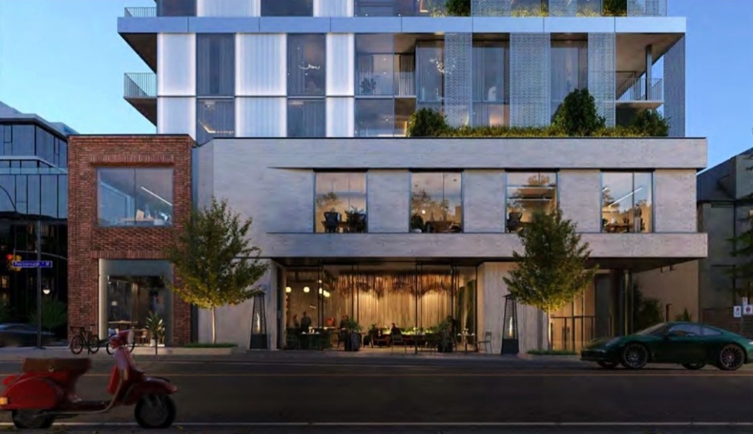
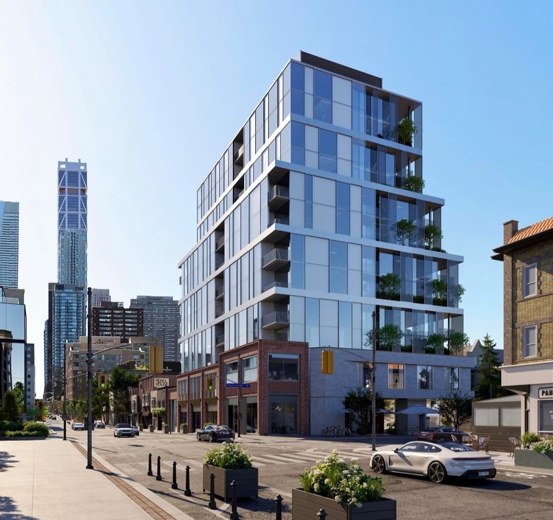
The massing is ok; though I'd prefer a 3rd floor on the brick podium, approximately matching the height of the yellow brick building across the street to the north.

What's above the podium, aesthetically is banal in the extreme and doesn't seem particularly fitting to this location. I'm fine w/modern here..........but not this particular shade.
 
Application for this one is filed:


and

*Docs are Up*

As previously noted by @AlbertC this is Reflect Architecture

I'll just post the one render as they are all the same as those Albert has posted previously.

1655195063074.png


1655195221155.png


From the Planning Report:

1655195479615.png


Note that we are again over 2 spaces per residential unit. On that subject, the report says this:

1655195711857.png


The parking is across 3 underground levels.

On Landscape/Streetscape, I would call the plan, unambitious.

It does add 2 street trees on the Roxborough frontage, as a well as a bumpout at the corner of Yonge and Roxborough.

However, there are no trees proposed on the Yonge frontage, and the proposed sidewalk treatment is plain concrete with 2 rows of brick banding.

1655195934717.png
 
In terms of design, I've seen better and I've seen worse. I do wish there was a more stepped profile facing onto Yonge St. to give this a bit more visual interest.
 
Last edited:
Yonge Street is too crowded and deserves a larger setback. I would be fine with more height in return for a slimmer profile at grade. The sidewalks here are already jammed with planters, bikes, patios, signs, gas meters, etc. With all this development in Summerhill there's an opportunity to get a bit more space at grade for everything.
 
What a let down! this site is in one of Toronto's best neighborhoods and this design falls short of acceptable. If these are the renderings, just imagine how bad the the actual product will be. In my opinion, they should build a contextual building that fits in with the historic appeal of the neighborhood, like Audax is designing up the road. They have the ability to charge a massive premium on this site, if they get the design right.
 
  • Like
Reactions: xy3
What a let down! this site is in one of Toronto's best neighborhoods and this design falls short of acceptable. If these are the renderings, just imagine how bad the the actual product will be. In my opinion, they should build a contextual building that fits in with the historic appeal of the neighborhood, like Audax is designing up the road. They have the ability to charge a massive premium on this site, if they get the design right.
Uh if we are talking about context, this site is right across from this stunner:

1656002256128.png


I also like the Audax proposal but it is OK to have different styles, if executed well. There is no set context for Summerhill. It varies.

I do agree that the architecture needs to improve, though. It's got a long way to go to make the most of this location and the prominent corner.
 
My issue with this dreadful design is 3rd storey and upwards. One can see that they tried to emulate the small retail bay context up and down Yonge. This interior designer got a crack at a midrise and they are going a bit manic with the use of materials. And yes, Rosedale and Summerhill have context and deep history to take design cues from. They have there own Heritage Conservation Authority. The neighborhood is rich in heritage architecture with red bricks pulled straight from the Don Valley Brick Works. This site deserves so much better. Please for the love of the city, don't get sucked into this design. You can sell for $2500psf + on the exit with a beautiful high-end traditional design. This site deserves the best.
 
Last edited:
  • Like
Reactions: xy3

Back
Top