Toronto One Bedford | ?m | 32s | Lanterra | KPMB

Now that sleek Clewes point towers with simple podiums and easy pedestrian access ( 18 yorkville, Radio City ... ) are the gold standard, encountering a Vu or a One Bedford - where the statement is less pared-down - is bound to disappoint.

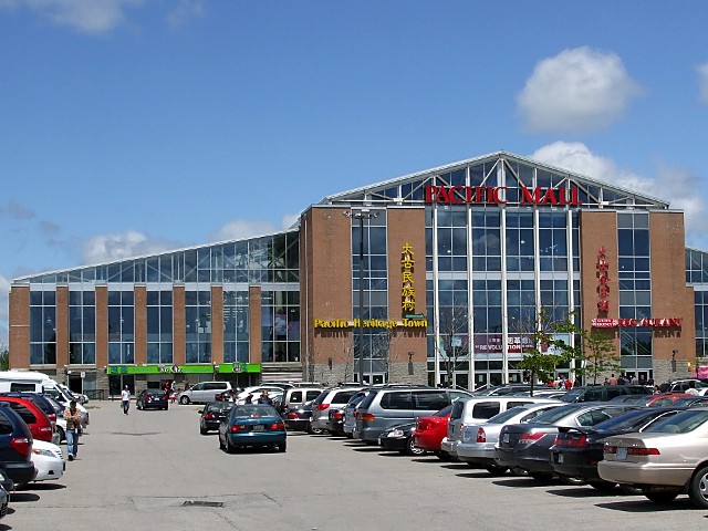
for your information, the 'great man' himself was also the architect behind magnificent projects such as Pacific Mall @ Kennedy+Steels in Markham ... truly a masterpiece :rolleyes:
pacific-mall-3411f.jpg

ext03.jpg


And nothing speaks class more than these utilitarian interiors ~ :p

Click to Enlarge
 
Last edited:
Not that I want to go further off topic, but I feel the need to defend the architecture of Pacific Mall. It's a pleasure to be inside that space. I wish we had something like it downtown (other than the St. Lawrence Market, that is).
 
As a pretty straightforward shed, I think Pacific Mall looks good and does its job well. And I agree about the interior. The food is great too.
 
The Mall's exterior could have been simplified - ditch the brick, maybe - to make it noticeably an updated rural barn. In spirit, it reminds me a bit of The Great Man's design for the Corktown Brownstones on King Street - the essence of the Regency rowhouse rendered in shorthand.

William Berczy surveyed and settled Markham in the same year Toronto was founded. I'd rather see something like this named after him than that condo on Front.
 
From: Multiculturalism at Work: Pacific Mall in Toronto as a Case Study by Ho Hon Leung and Raymond Lau

http://ceris.metropolis.net/Virtual Library/other/leung/LeungPacificMall.pdf

" The architectural design of the mall is a mix of red bricks, steel beams, and glass. The impression Wallman Clews Bergman, the architect of the mall, wanted to create was “a ‘fabulous transparent building as different as possible from its surrounding’ (Wallman email interview) [quotes in original]. Rather than a typically internalized shopping mall, the architects had modeled a contemporary and innovative market building with extensive glazing at the exterior walls” (Chen, 2005: 95-6). However, the developer of the mall, a non-Chinese business person, stated, “Yet here is Canada, a mixed [ethnically diverse] country, not China, not Hong Kong. The architectural style should not resemble Chinese at all. I don’t want it to stand out too much. It blends into the neighborhood.” Both views are a correct description of the mall. Anyone driving by the intersection of Steels and Kennedy Road immediately notices the mall. The glazed structure and its size give a sense of fabulous transparency and distinguish the mall from its surroundings. The lot is huge with nearly a thousand outdoor parking spaces. Yet, aesthetically, it harmonizes with its surroundings, in ways that the red brick color and the large pieces of glass panels resemble the typical construction materials in Toronto."
 
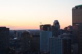
One Bedford off in the distance (you can see the crane) near sunset today

Click on the thumbnail to enlarge, then click again on the image for full size.

 
The more I see this condo rearing its face all around the city... the more I'm hating it. I especially hate looking at it from the UofT campus.

4350663770_b11757da5d_o.jpg
 
Oh, yuck!

The damn thing looms over the Annex like you wouldn't believe. It's like a monolith when you take the Dupont bus down Bedford from Avenue. I didn't realise I had it in me to feel so much sympathy for Annex landowners, but man.
 
C'mon, this is being built in the heart of the nations largest city - on top of a massive underground transit interchange, no less.
 

Back
Top