Toronto New Park at 229 Richmond West | ?m | ?s | City of Toronto | Gow Hastings

Top choice for the New Park at 229 Richmond Street West


  • Total voters
    42
  • Poll closed .
There is additional info and renders to be found within the survey. I am extracting those starting in this post, and will do one post per proponent:

The survey is here: https://s.cotsurvey.chkmkt.com/?e=354094&d=l&h=116639AFF7ACF05&l=en

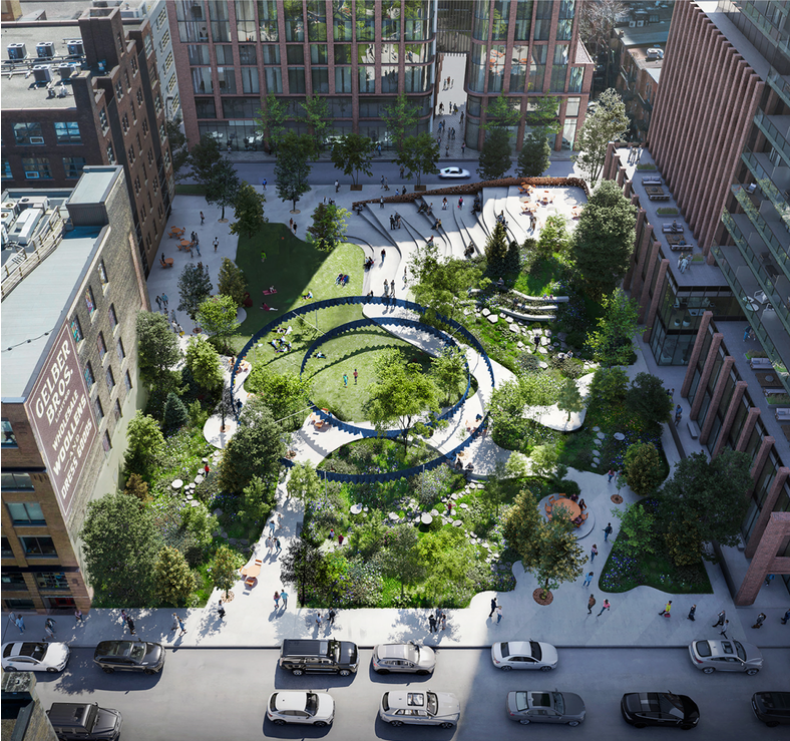
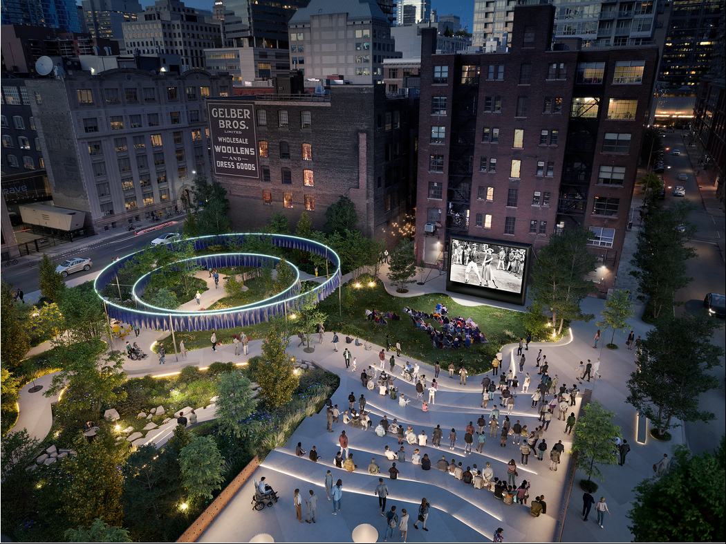
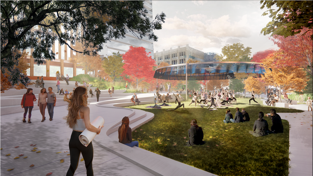
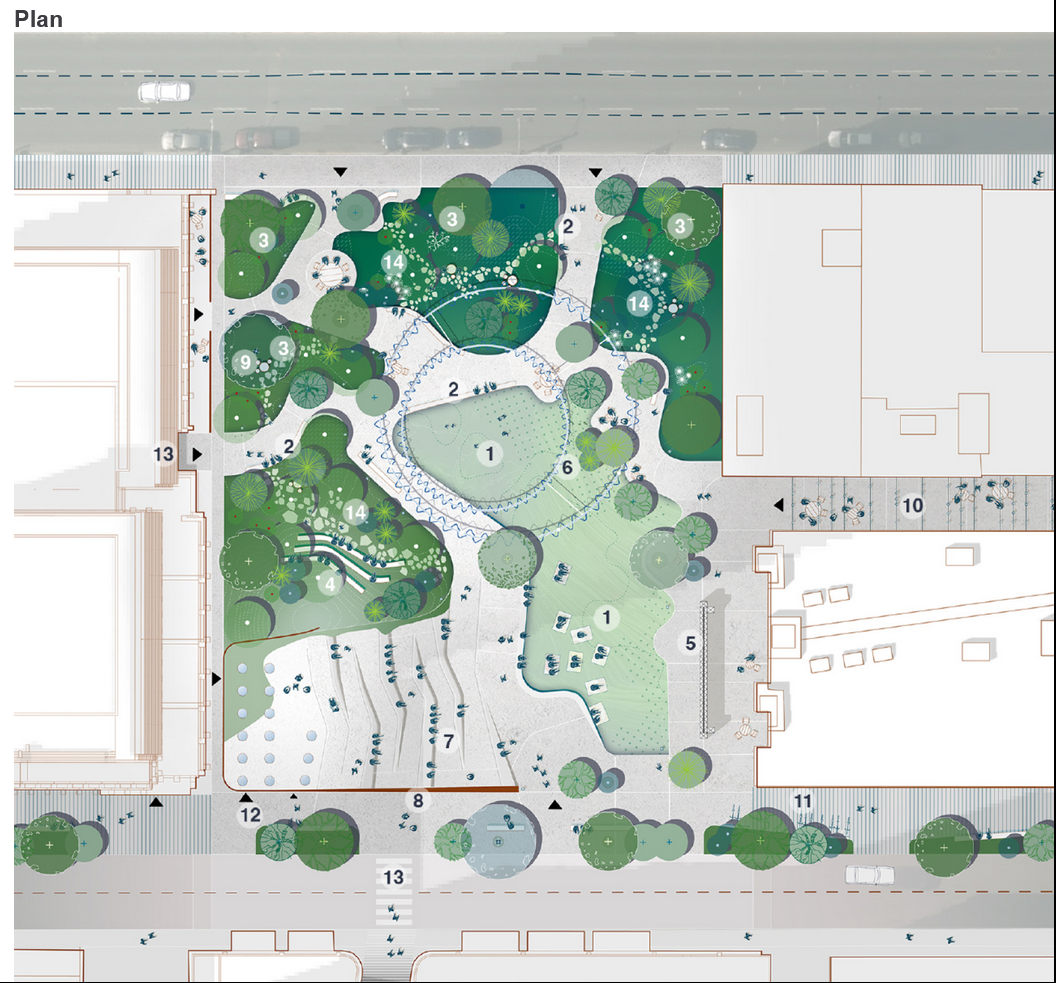
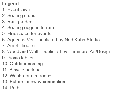
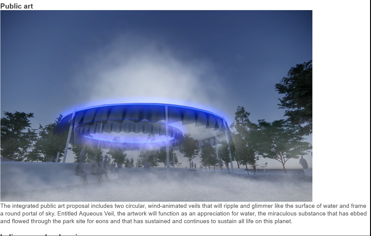
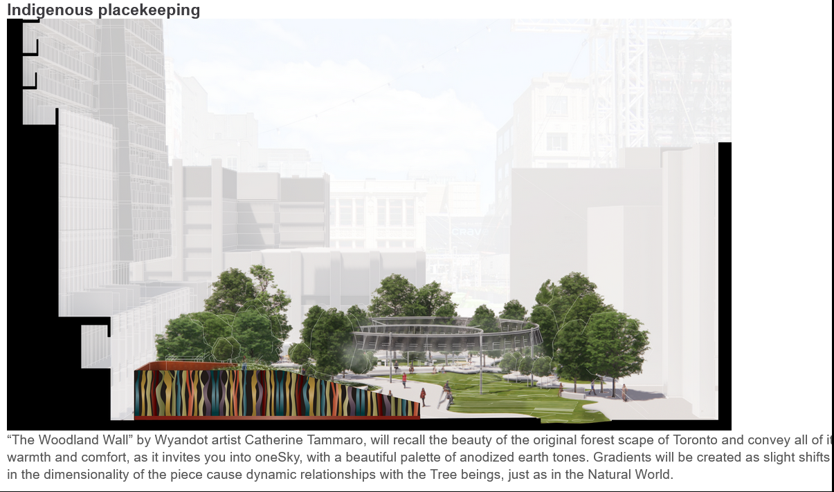
OneSky by PMA Landscape Architects and SLA

1697029235736.png

1697028838955.png


1697028890769.png


1697028917633.png


1697028979838.png


1697029044127.png


1697029067348.png


1697029104987.png


1697029150768.png


1697029182365.png
 

Attachments

  • 1697028814415.png
    1697028814415.png
    15.4 KB · Views: 63
  • 1697029281856.png
    1697029281856.png
    37.4 KB · Views: 114
Last edited:
Why are there no tables with chairs? I've seen my friends and family hanging out in this space all. Why did none of the team see how this space was being used and implemented that in?
 
I find it pretty rich that the River Park "pays homage" to a river buried in the area by... keeping it covered with hardscaping and adding a token trickle through the site.

So far my favourite is Wàwàtesí, if only because it has a large vegetated area as the centerpiece. However, they all kind of stink. They need to be redrawn, and maybe ban the Electric Forest people from submitting designs for two years.
 
I will comment on each design later; but I think we see a clear problem here from too many mandates for a small space; maybe even a large one.

1) Reflect the industrial Heritage of the area
2) Reflect the Club/Entertainment District
3) Reflect Indigenousness
4) Reflect Nature
5) Be a people place
6) Must have washroom (I support this one)

But it's just a lot to get into ~2 acres and I would argue that 1-4 have some inherent conflicts that are almost impossible to reconcile. This is how you get goofy 'electric trees' which are in directly conflict w/the program for native forest. We've got to do something 'clubby'.

All that and a public art mandate (I support public art) but it's just too many mandates.

***

For all that is here, not all designs have a drinking fountain...........sigh.
 
Last edited:
I will now offer my comments:

One Sky by PMA:

The nicest, greenest proposal.

What I referred to initially as the bottle cap rim is the public art piece; I don't think it adds value, frankly, but its not the end of the world either.

I don't believe the lawn is likely to be sustainable, as they are encouraging people to use it, and I think the density of use to area is a problem here, equally, it may function as a desire line given the pathway arrangements.

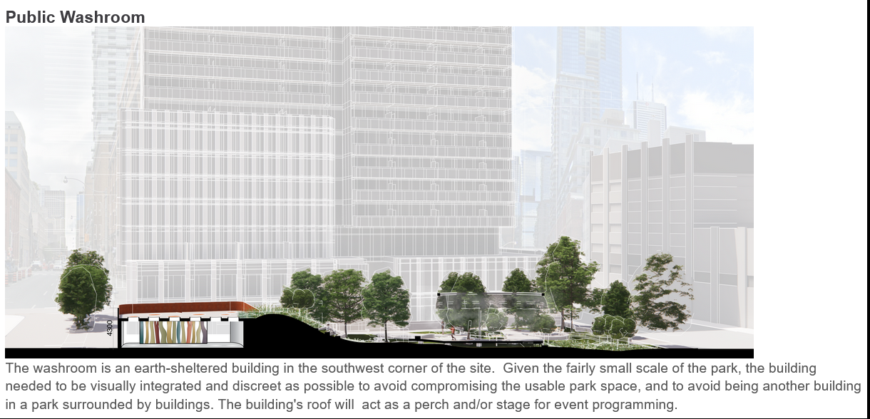
I'm not sure about hiding the washrooms under the structural seating.

Finally, needs a drinking fountain.

*****

Electric Forest by Public City:

- Hate it. Passionately.

- The electric light-up faux trees are in directly conflict with the nature/native forest component.

- The arrangement of the landscape like an English Garden/Orchard into rows is a design that never works out well. In Toronto we've seen this before in June Callwood and in Town Square park in Yorkville.

- The people flow is completely unnatural, and it reads as a maze that's meant to look interesting from above, which is not how the vast majority will experience it. The tables/chairs being stuffed into these narrow rows between plants looks like a real accessibility challenge and not just for those with mobility impairments.

****

Wawatesi by West 8

- Appreciate the idea behind the Birch Tree grove; but White Birch are not a very urban tolerant species; on top of that, so many of any one species is a high-risk planting proposition I would recommend against.

- Not sold on the elevated structure (balcony) or its treatment.

- No drinking fountain

****

River Park by O2:

- Alleyway treatment is kinda cool.

- Way too much Canopy ; a park is meant to be outdoors.

- Way too much hardscape.

- Interlocking pavers in grey do not give the feel of an 'underground' or lost river.

- No drinking fountain

****

Nookomis by DTAH:

- In its favour, a good base idea, a drinking fountain, and the movable seating

- Against, far too much hardscape;

- Landforms for vegetation that are too fragmented and serve only to convolute one's experience of the place and impair vegetative growth.

- A lot of Birch again, and some other plant choices that are suspect. I'm all for giving different things a try, but if you rely heavily species that require great conditions and don't provide those, it probably won't work out.

*****

Not clear at this stage from any proponent:

- Is the vegetation being irrigated?

- Are soil volumes sufficient?

- Most proposals have paths that are a tad convoluted and may be subject to desire line impairment.

- would have liked to see every proposal do a 'winter view' and a 'night time' view.
 
Last edited:
As the final Love Park differs from its plans to a degree, whichever one that's chosen here (OneSky) will surely end up losing something due to rising costs over time (the bottle cap), so temper expectations somewhat?

42
 
DTAH looks good in renders, but there's way too much hardscaping. PMA's submission is by far the best, seems to have a good balance between green space, hardscaping and programmable areas. Would agree with comments by @Northern Light, but it's definitely the most workable. The rest run the gamut from merely ok to awful (the electric trees especially).
 
As the final Love Park differs from its plans to a degree, whichever one that's chosen here (OneSky) will surely end up losing something due to rising costs over time (the bottle cap), so temper expectations somewhat?

42

Now you're getting my hopes up, that's the kind VE'ing I could get behind. LOL

Still needs a drinking fountain! But that's a rounding error in the budget.
 
Honestly I'd be fine if public art budgets went towards more trees, plants and improved planting conditions. Beauty is in the eye of the beholder, but I find a lot of these art installations tacky/ugly/underwhelming and add little value vs. more greenery.

Public Art can be wonderful; but in Toronto we spend too little on each piece, and too much on too many pieces.

I'm not typically a fan of sculpture as an enticing addition to City space; though I've seen some great ones.

But I think water features/fountains could be viewed as public art and are often quite popular; to do properly, they take a lot more budget than what is typically allocated.

I think in addition to budget, there's often this tendency to cram art into every space whether there's any rhyme or reason or not; and whether there is sufficient space. Such that public art often feels like a forlorn appendage just tacked onto a project, instead of being an integral part of same.

I think some of the best public art we've seen in the City was some of what was integrated into the architecture of the original Spadina Line.

Some of the worst is some of the random art tacked on accessibility projects in stations.

Example, Coxwell Station:

1697051586210.png

Taken from: https://upload.wikimedia.org/wikipe...ll_station_-_art_-_Forwards_and_Backwards.jpg
 

Back
Top