neuhaus
Senior Member
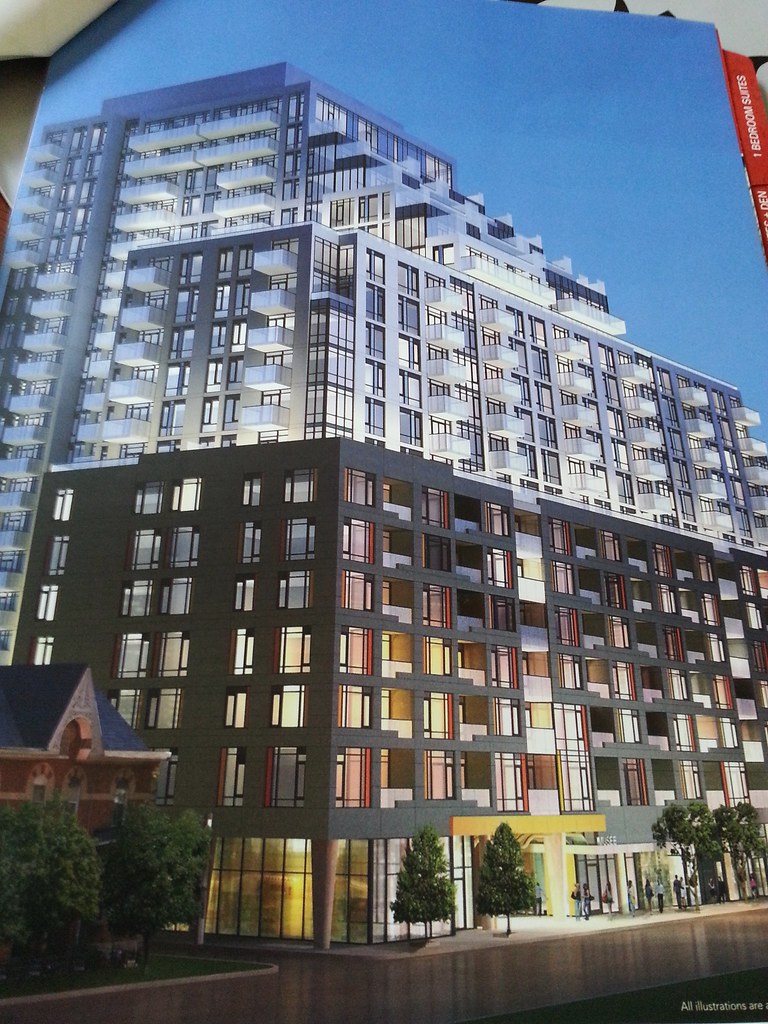
As for the revised design: Very King West Life Plazacorp massing meets questionable aesthetic judgement.
Isn't that some sort of engineered wood panels not orange metal accents?
I was thinking exactly the same thing. It looked like Quadrangle took King West Life and lopped off the tower portions on both ends. Instead of King West Life's incredibly busy and dizzying heavy grid patterning there is a more subdued loose grid of window and balcony openings. Unfortunately Quadrangle hasn't learned the art of making a building less bulky and more elegant. It still looks extremely busy and hulkingly massive.
Adam Vaughan shouldn't have allowed the extra height as it really amplifies the design faults of this building.
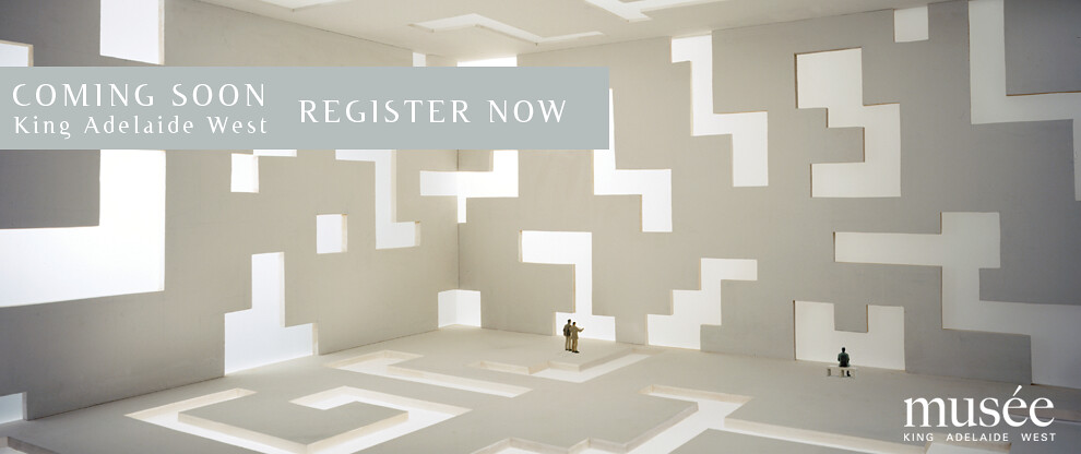
Neighbouring buildings 650King has 16- and 10-stories, and upcoming oneeleven will be 17-stories however these buildings are much more design sensitive and has some interesting elements to break up the facade, something Musée could use more of. The punched openings for the windows should have been ganged together to make it look more cleaner and give the illusion of less levels -- there is may too much going on. I was hoping Plazacorp would present an artful play of Tetris-like forms like in their teaser image presented last year:

I have a feeling because this is Plazacorp, those orange panels will most likely be metal panels.
Last edited by a moderator:


