Toronto Murano | ?m | 45s | Lanterra | a—A

This project is growing on me. And the glass is definelty better than expected, but of course no where close to the rendering.

The streetwall shown in those pictures is pure Manhattan !!!

woohoo!!
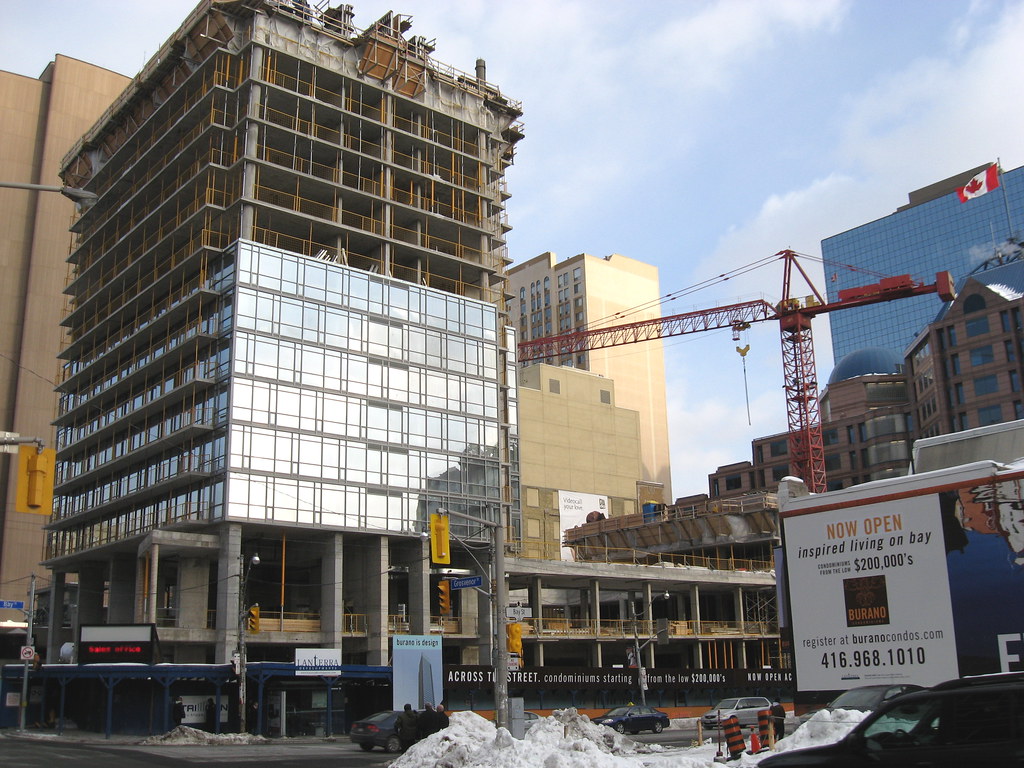
 
This project is growing on me. And the glass is definelty better than expected, but of course no where close to the rendering.

I agree. The more glass that goes up, the better the glass looks.


Toronto's light and utility poles continue to look unbelievably ugly, though.
 
The exhaust vents are necessary but unfortunate. That aside, this is looking promising but I'm really starting to overdose on glass condos. There is a lot of space for retail opportunities here too.
 
I'm also starting to wonder about all the glass going up everywhere. But for downtown Toronto, which can seem overly grey and concrete-laden, I would err on the side of more glass. I hope the use of brick will become fashionable again by next wave of development.
 
glass is needed downtown more so on podiums.
 
Photos taken February 11, looking east.
2267988136_a62488ea59_b.jpg


From Queen's Park looking east.
2267988122_5009ca3e1f_b.jpg
 
man, that second pic feels like we are in North Korea, although the statue needs to be 10 times as tall.... previous one looks great though!
 
I also think the glass looks great, and if you check the rendering the use of mullions to add to the effect was not disquised.
 
Definitely a thumbs up on this project -- in a way this is a complimentary project to the nearby Met/Encore, angular vs curvy, but with the same attention to detail and finish. Too bad about RoCP. Although the first two towers are not as bad as some make them out to be, they could have been a lot better.

Still this whole area is turning out well, if CityPlace had been done as well as the whole Murano/Burano/RoCP/Met complex, we would surely all be happier.

Bill
 

Back
Top