You are using an out of date browser. It may not display this or other websites correctly.
You should upgrade or use an alternative browser.
You should upgrade or use an alternative browser.
Toronto Minto30Roe Condos | 113.08m | 34s | Minto Group | Wallman Architects
- Thread starter Observer Walt
- Start date
Roundabout
Senior Member
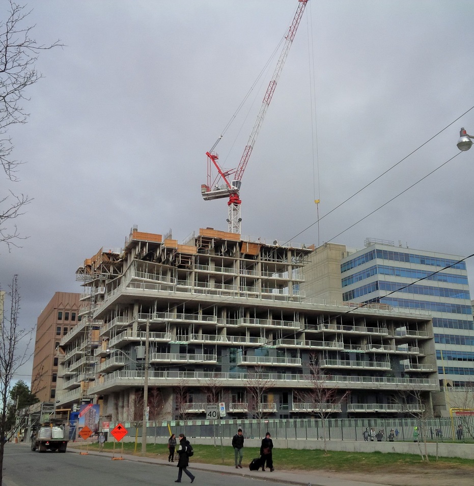
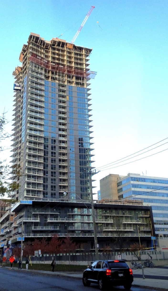
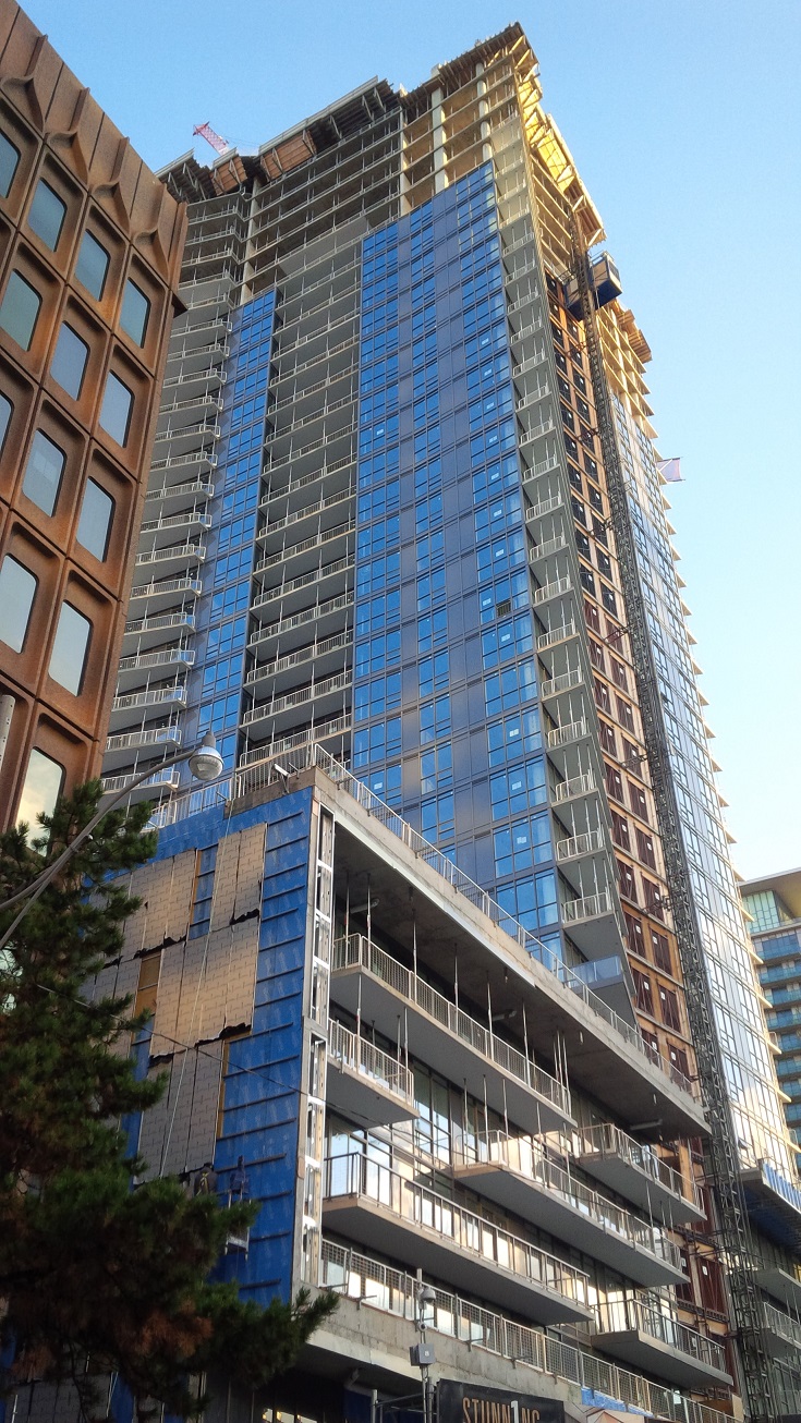
October 29th (and for comparison, a photo from April 24th, 2015):


Attachments
salsa
Senior Member
Roundabout
Senior Member
cruzin4u
Senior Member
Horrendous.
stjames2queenwest
Senior Member
The colour is pretty blah. But I like the floor plate, boxes with slight adjustments can be interesting. But yea just too monotonous and grey.
Midtown Urbanist
Superstar
What were Wallman thinking?
Even if Minto Group constrained them heavily, surely they could have figured out a different colour scheme or something?
E Condos needs to rise quickly to block out the view from this.
Even if Minto Group constrained them heavily, surely they could have figured out a different colour scheme or something?
E Condos needs to rise quickly to block out the view from this.
urbandreamer
recession proof
OMG it's hideous


Roundabout
Senior Member
Midtown Urbanist
Superstar
I like the corner balconies on this.
salsa
Senior Member
Hard to decide which of the three highrises look the worst.
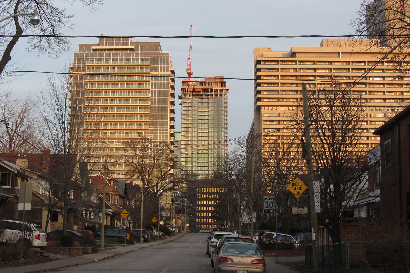

Not for me. I'm normally a fan of Wallman Architects' buildings, but this one's even worse than Neon (to the left), and while I don't think a comparison to the 1970s rental on the right is particularly useful, I prefer it to 30Roe too.
42
42
Roundabout
Senior Member
ProjectEnd
Superstar
Not for me. I'm normally a fan of Wallman Architects' buildings, but this one's even worse than Neon (to the left), and while I don't think a comparison to the 1970s rental on the right is particularly useful, I prefer it to 30Roe too.
42
I'd say Neon is easily the worst out of that trio. This hulking battleship is hardly svelte but it is better than that G+C garbage. The clear winner for me is the 70's brute.


