Toronto LTD Condos | ?m | 15s | Malibu Investments | RAW Design

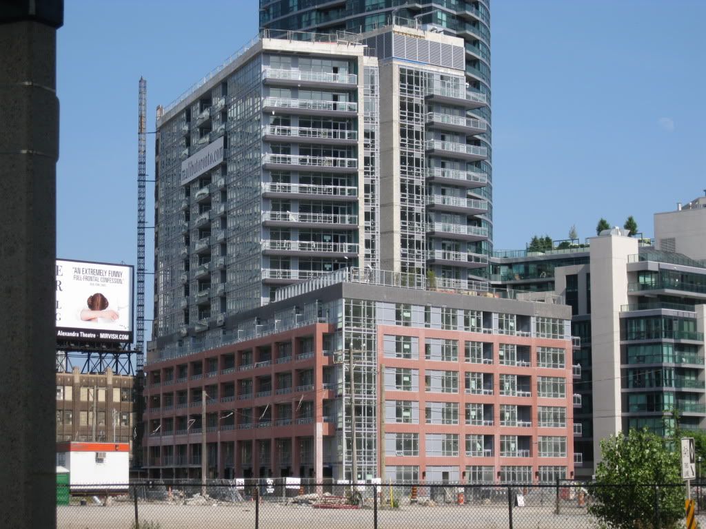
God, look at all that grey spandrel. That just ruins it for me. Why do we need grey spandrel and grey metal on almost every new building in Toronto? I think the red brick and the grey panels look terrible together. One day, we are going to look back on this city and wonder why we were so obsessed with the colour grey. It's not even an attractive colour. It's just an easy way to avoid using real colour. I hate it, especially on this building. The red brick is so nice, why not use black or while trim instead?
 
Black window trim would have been nicer perhaps.

I like the red brick panels a lot but the cap of black brick makes it look too heavy or weighed down.
 
from sat
20110423101.jpg
 
blue glass is better then green, and bricks are better then precast concrete, but the podium design and detailing should have been done to match Malibu better. It seems they both have rectangular boxes of the same size, but LTD's are horizontal. If they were vertical and the podium was the same height as it's neighbors then I think it would look much better. Then again if the podium was higher the tower would look too stubby. Ah well. Not too bad, and the garrison future phases should look good beside LTD.
 
I agree with TorontoVibe... for me that west facing side looks like it could have been great, kind of old warehouse inspired with large loft style windows but then they go and ruin it with the crappy gray spandrel! (as seen below in this pic by Drum118) And not only that but so much of the spandrel placement is random from one section to the next.

5624492003_46ede3f1ba_b.jpg
 
From my understanding there is provisions for a ground level retail unit facing Bathurst (at the right):

LTD_ground-1.jpg
 
Power-washing the facade.

Pics taken August 17, 2011


xUmck.jpg


ydDKH.jpg
 

Back
Top