Toronto L-Tower | 204.82m | 58s | Cityzen | Daniel Libeskind

Ltower2009.jpg


Paging Spine3D... I can tell that you designed this render -- based on your interpretation of the CN Tower. Is there any chance you could upload a hi-res version of this for us skyscraper geeks?

I think that after the revision was made, we continued looking at the tower from the West, when clearly, the best and most interesting view is now from the North and North East.
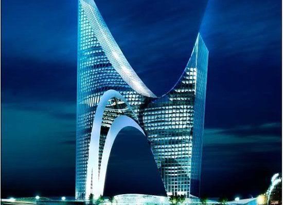
 
It does look quite nice from that angle. I'm still a little disappointed the original design was compromised, but it should still be an interesting addition to the city.

I'd like to see Liebskind commissioned for another tower in the city. I'd love to see what he could do for Yonge & Bloor.
 
Last edited:
Ltower2009.jpg


Paging Spine3D... I can tell that you designed this render -- based on your interpretation of the CN Tower. Is there any chance you could upload a hi-res version of this for us skyscraper geeks?

I think that after the revision was made, we continued looking at the tower from the West, when clearly, the best and most interesting view is now from the North and North East.

I'm curious...what exactly is in that back section running along the Sony Centre? Would it not have been possible to reduce/eliminate that and retain the boot?
 
L's curve makes no sense without the toe of the boot...it's *not* a full half a swoopful. It's now just some silly bulbous shape, like a thumb (or a middle finger) sticking out of O'Keefe Centre.
 
L's curve makes no sense without the toe of the boot...it's *not* a full half a swoopful. It's now just some silly bulbous shape, like a thumb (or a middle finger) sticking out of O'Keefe Centre.

I agree completely, the tower looks retarded without the balance of the lower part. Why the heck dont they just redesign it?? They seem to think its a good idea for 1BE.
 
I'm curious...what exactly is in that back section running along the Sony Centre? Would it not have been possible to reduce/eliminate that and retain the boot?

That is actually glass. If you're talking about the south portion running east and west.
 
What is it with him, does he have some sort of shoe fetish? This looks like a rather odd stiletto...

From this thread:

slide_3215_46107_large.jpg


I call it the "N" Tower ;)


Also, looking at the latest render it dawns on me that the tower is a sort of softer-curved echo of the Ritz, the one tapering out and this one tapering in. Not bad. The plaza's good. Just wish beyond wishing they'd redesign that podium.
 
just wondering why the boot was canceled
wasn't around when they took it out of the proposal

Senior level government for an art centre / museum called AHA never materialized and that portion of the structure was removed to allow for financing and negotiations with the city for the residential portion of the project to proceed.

Why the heck dont they just redesign it?? They seem to think its a good idea for 1BE.

Depends who you ask. The initial developer for 1BE certainly didn't want what happened to happen, nor did most of the original purchasers and investors and it seems a lot of people on this board aren’t too happy 1BE didn’t go forward. That was a failed project and a new developer acquired the land to start from scratch.

This project on the other hand was saved from the scrap heap with the initial investors and purchasers retaining their units (it is my understanding a very small number of people backed out of their deals following the re-design, however the vast majority stuck with the project). A complete redesign starting from scratch would have cost many millions more than have already been spent on the project and delays. The developer has tried to make the best of a bad situation through some changes to one component of the project (the 'boot' / AHA Centre) without starting all over again - which would have led to more delays, more costs and approximately 500 purchasers just being handed their deposit back with a ‘thanks, but no thanks’ and the future of the O'Keefe centre left in limbo yet again.

The current situation seems to be favoured by some that want to protect and retain as much character as possible of the O'Keefe without the tower podium hanging over it, while a redesign seems to be favoured by other voices. The only caution I'd suggest on a complete redesign is that it would be a much riskier route for all players involved without any results, let alone good results guaranteed (e.g. would units sell? How much more expensive would the units have to sell for not only to pay for the new project, but to cover all the loses on the initial proposal? What risks are involved in the planning process? Where is the condo market going to be at when the project eventually comes to market again? What would the financing situation be? What would happen to O'Keefe if the new project was not viable or hit new road-blocks? Etc – the list goes on). From a development perspective, years and millions of dollars and a lot of people have sunk considerable time and resources into moving this project along – there isn’t much appetite for starting all over again.
 
Last edited:
Thanks for that perspective Mike in Toronto. You're right, we tend to lose sight that these are huge projects with lots of dollars involved.

Ultimately I think everybody wants to be excited about this and honestly I think the design is really almost there. Rome wasn't built in a day and nor should a project of this magnitude (mixed use, heritage component, skyscraper, public space etc). For me a better retooling of the podium that abuts the Sony would probably cinch it.
 

Back
Top