You are using an out of date browser. It may not display this or other websites correctly.
You should upgrade or use an alternative browser.
You should upgrade or use an alternative browser.
Toronto Kingsway by the River | 78.17m | 21s | Urban Capital | Wallman Architects
- Thread starter interchange42
- Start date
DavidCapizzano
Senior Member
I think this is looking alright - I am anxious to see the mid rise component go up. Most of the buildings in the area have the signature faux historic wedding cake look to them, so I appreciate that this will add a bit of diversity.
tml34
New Member
I really like the balcony frosted glass finish, looks great
Calvin
Active Member
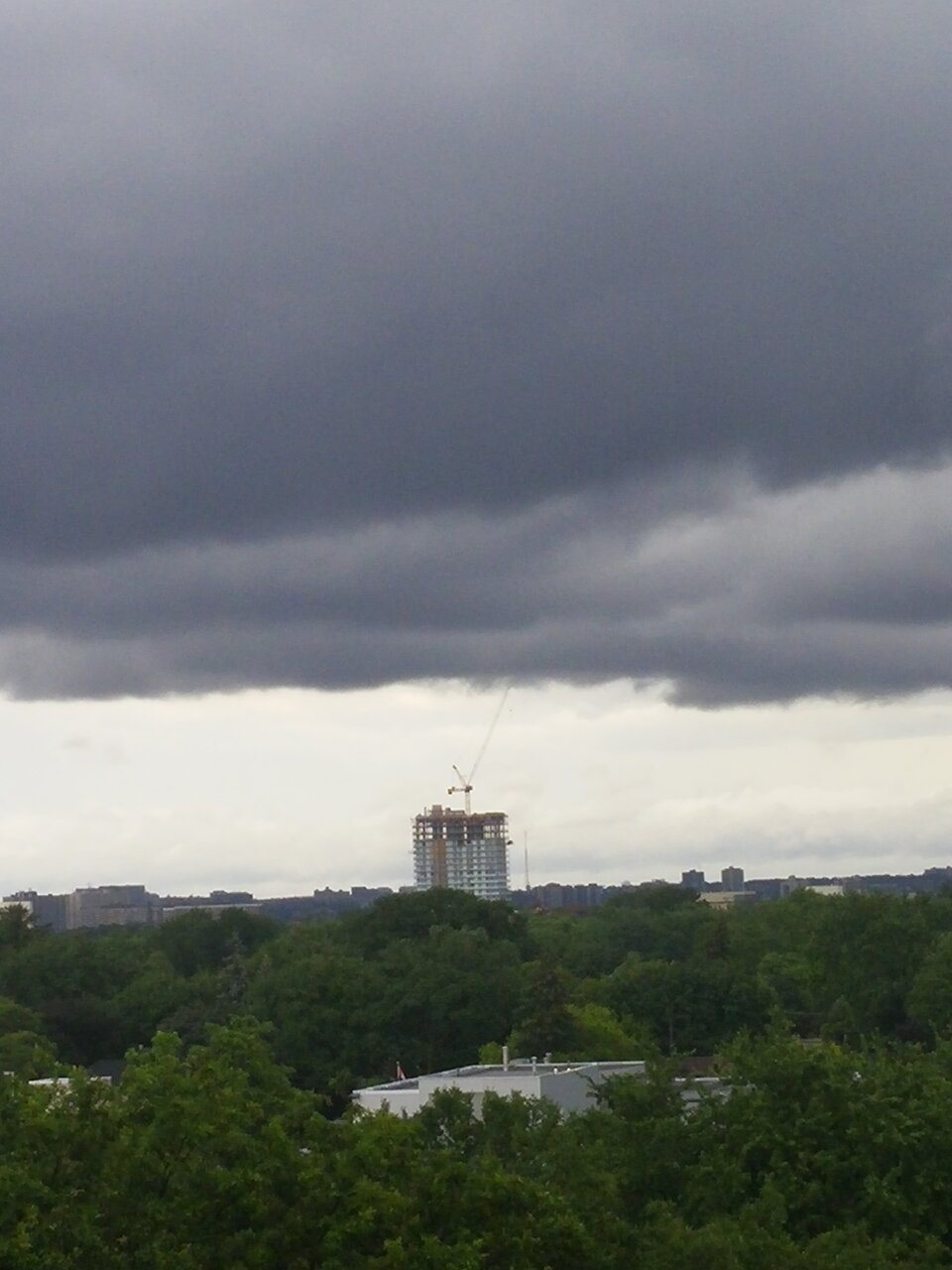
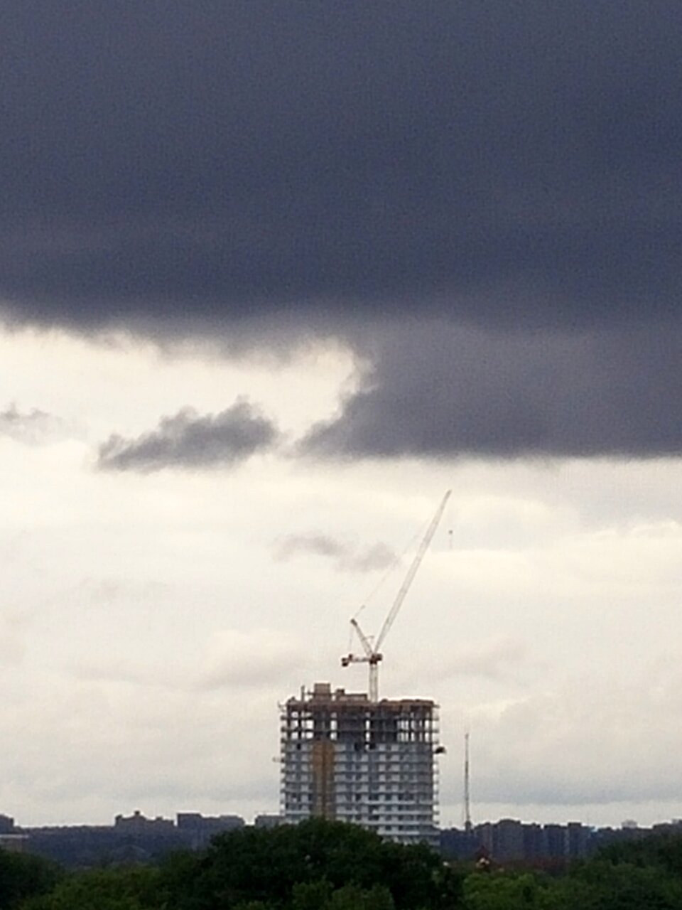
As seen from Bloor and Islington on Saturday
Dumpling
New Member
Does anyone know when the townhomes will be done?
tml34
New Member
They look like they're getting really close. I would guess the townhomes would be ready first, on time for Jan 2021Does anyone know when the townhomes will be done?
Rascacielo
Senior Member
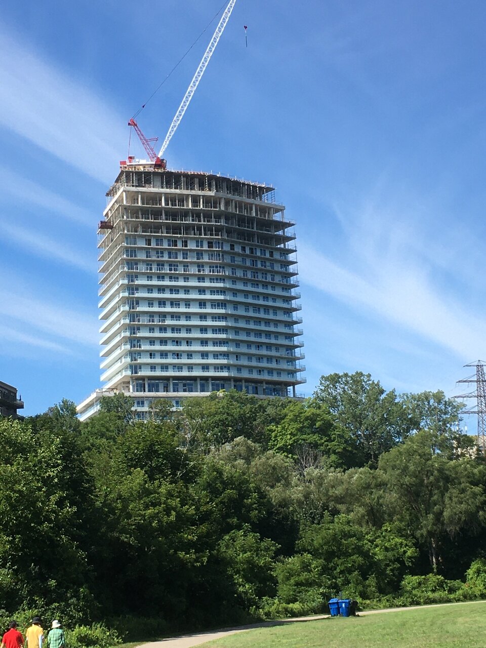
From yesterday
tml34
New Member
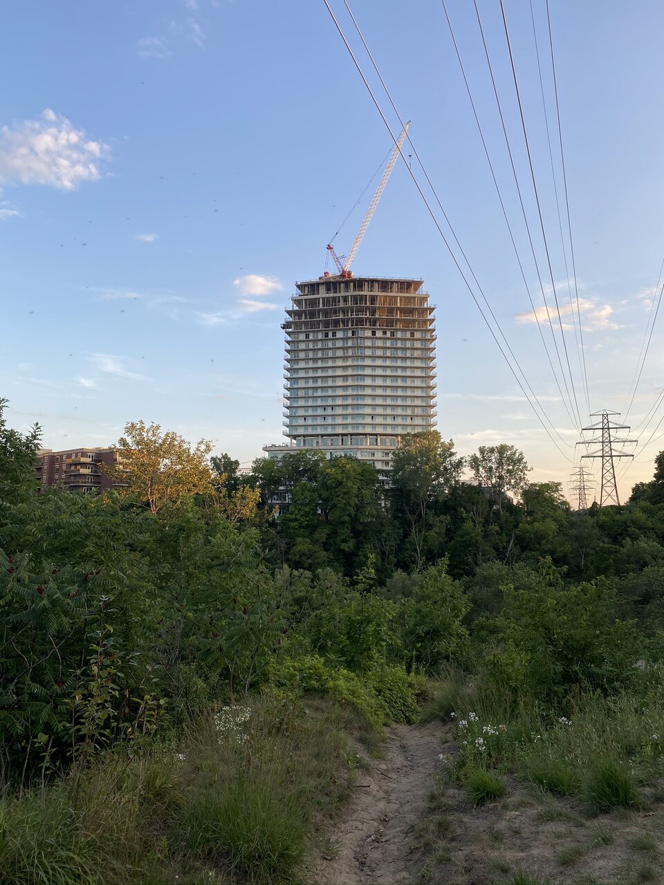
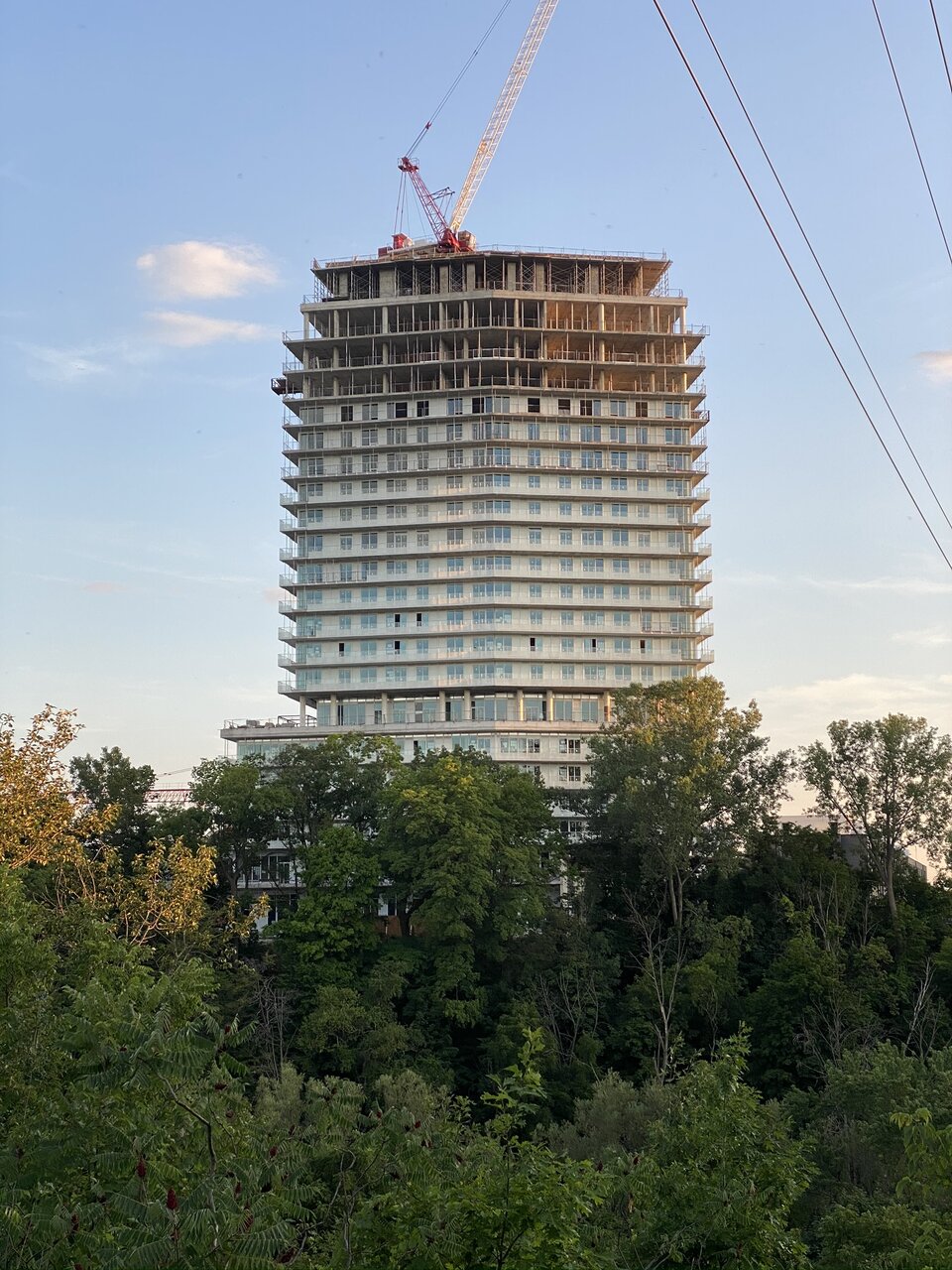
08/01/2020
inoneearandoutyourmother
New Member
taken Mon Aug 3rd
My son bought in the 8 storey unit
nice to see it get started
Last edited by a moderator:
junctionist
Senior Member
It looks extremely sterile and unimaginative, which is too bad given that it's in a nice neighbourhood and visible from a ravine.
inoneearandoutyourmother
New Member
I like the look .... and it's much better than the design back on page one .... that's hideous
white buildings don't age well, so it remains to be seen if the wraparound balconies with opaque glass make or break the building. I think it's those two things that make the overall look
white buildings don't age well, so it remains to be seen if the wraparound balconies with opaque glass make or break the building. I think it's those two things that make the overall look
kweku
Active Member
This must be the ugliest building in the area
The winning concept for art that will go into the park dedication area at this project was announced yesterday… and I pretty much love everything behind this design:
Meet the artist from Etobicoke behind the winning design for the Joshua Glover memorial
42
Meet the artist from Etobicoke behind the winning design for the Joshua Glover memorial
42
Sept 17
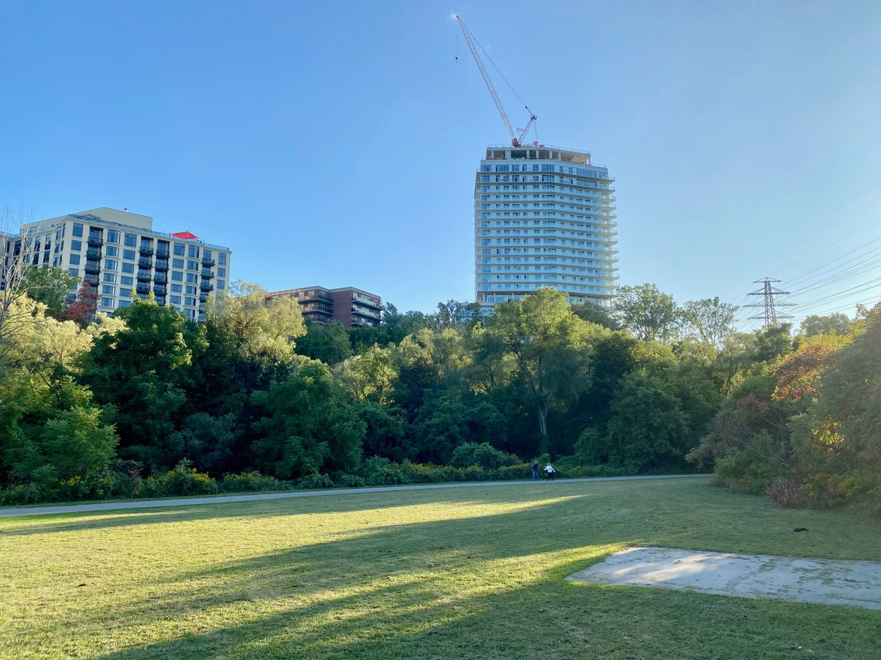
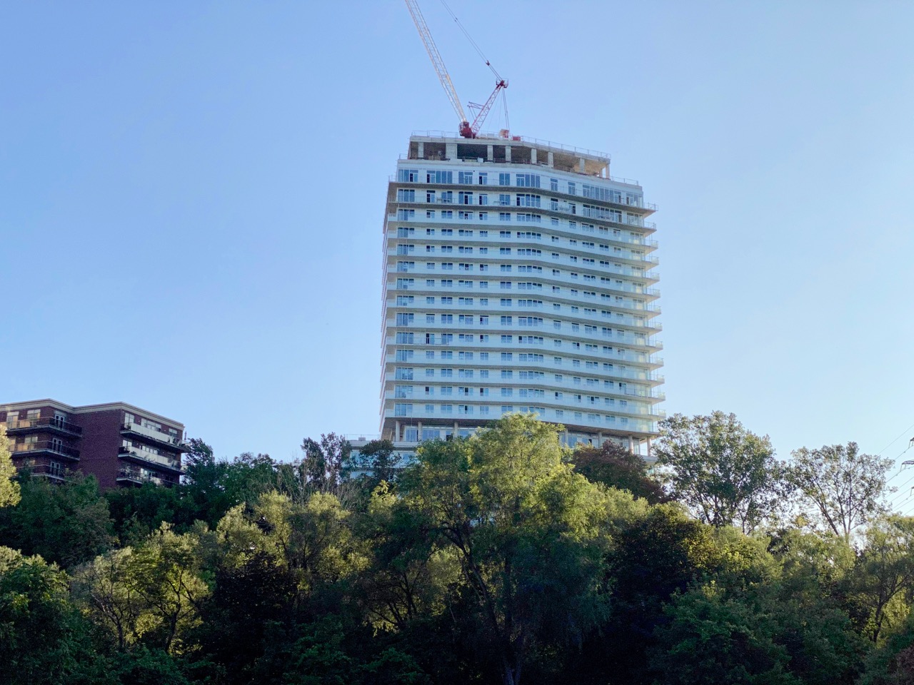
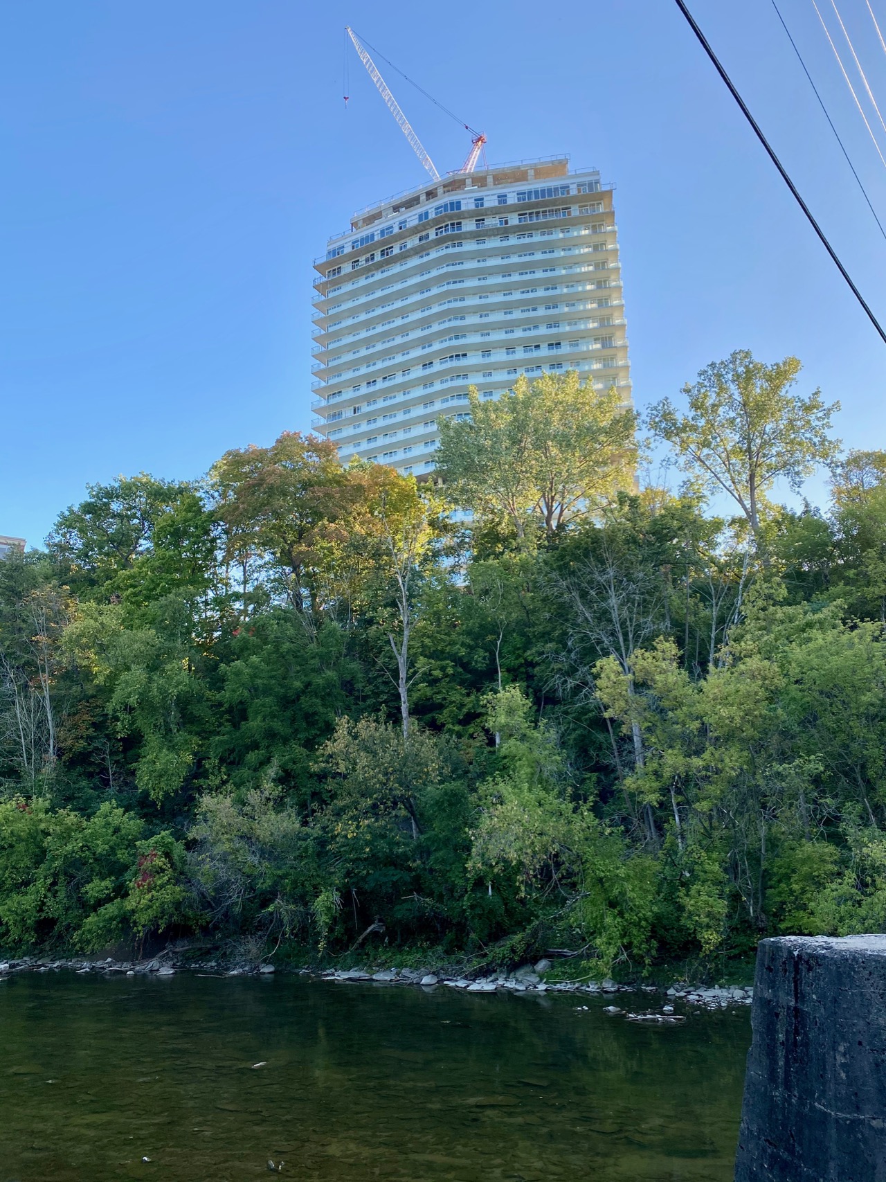
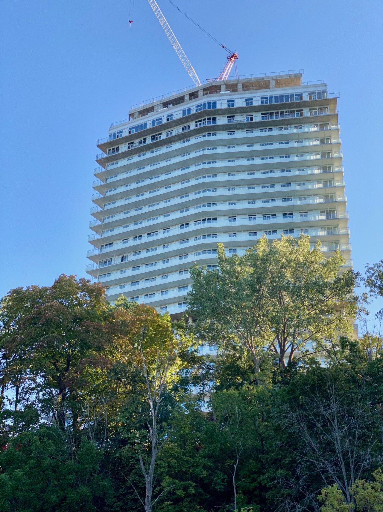
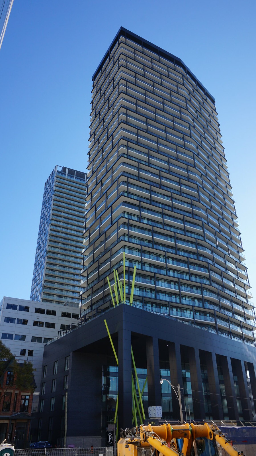
Now that the balcony is glass has been installed on all but the uppermost floors of the tower and we can grasp the final overall look, the lesson here is that white spandrel panels and mullions do not make a satisfactory frame around the windows. Those floors, which are essentially complete on the exterior now, look just as raw as when they were under construction. There aren't that many differences on the exterior treatment here from how Tableau was designed, other than a switch from black frames to white, spandrels instead of all glass, and no staggered frames spread across the balcony edges. The wraparound balconies and shallow chevron shape are the same. Here's a shot by @TheKingEast to compare:
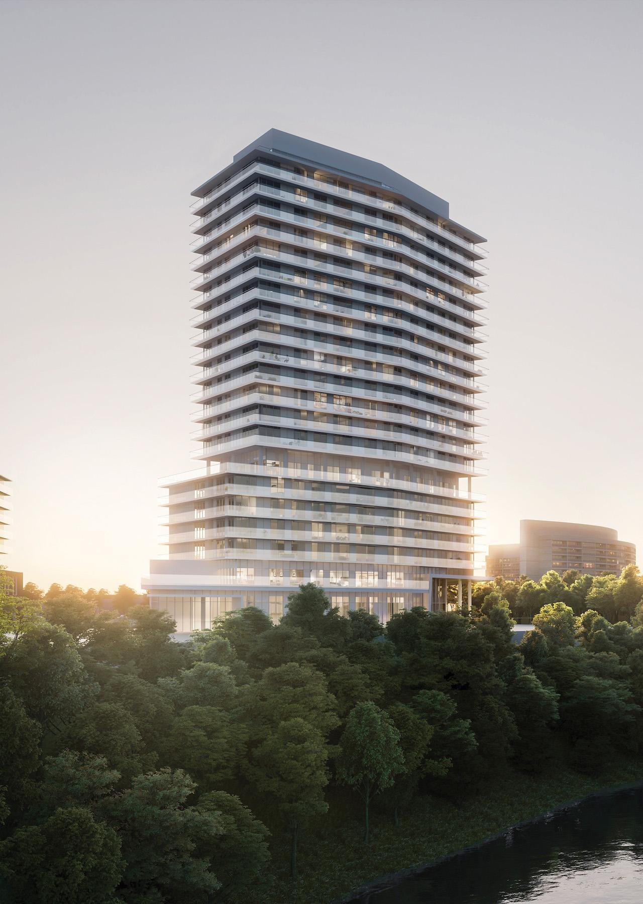
Meanwhile, when you compare what we're getting up top with the hero rendering (below), it would seem that the slab extension over the uppermost balconies has been value engineered out of the design. That's a shame. That improved the look.
42
Now that the balcony is glass has been installed on all but the uppermost floors of the tower and we can grasp the final overall look, the lesson here is that white spandrel panels and mullions do not make a satisfactory frame around the windows. Those floors, which are essentially complete on the exterior now, look just as raw as when they were under construction. There aren't that many differences on the exterior treatment here from how Tableau was designed, other than a switch from black frames to white, spandrels instead of all glass, and no staggered frames spread across the balcony edges. The wraparound balconies and shallow chevron shape are the same. Here's a shot by @TheKingEast to compare:

Meanwhile, when you compare what we're getting up top with the hero rendering (below), it would seem that the slab extension over the uppermost balconies has been value engineered out of the design. That's a shame. That improved the look.

42
TheKingEast
Senior Member
Complete swing and a miss here. Yikes, this turned out worse than I thought it would.