Toronto King West Life Condominiums | ?m | 25s | Plaza | Gabriel Bodor

Feb 02
6812632245_6593c79941_b.jpg


6812633113_7a41ec656c_b.jpg


6812633983_4e388bfbbe_b.jpg


6812634865_dc6604ed5c_b.jpg
 
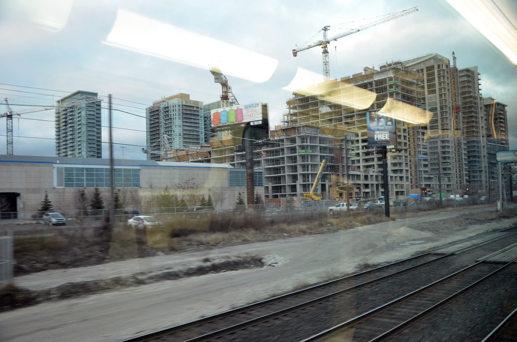
Is it just me or does anyone else see the problem with the below pictures?

I appreciate high density downtown living, but the 3 KWL towers plus the 2 LVT towers (all with rectangular building footprints) sited parallel to each other so close together is very claustrophobic is it not? The location of these 5 towers seem really poorly laid out, whatever happened to the concept of privacy in residential units :(


I find it troubling too.
It's a dense wall of highrise slab buildings -- not very friendly looking or feeling.
Liberty Village suffers from poor city planning. Everything is very tightly clustered together, not just the condo towers, but also the townhouses and retail. It seems too segregated.
I would like to see the condos spread out more in the area with townhouses and retail scattered throughout, rather than having all of the condos concentrated on the southeast corner of the neighbourhood.
 
The wall of condo's might be a little unappealing. I wouldn't call it claustrophobic. The KWL towers are 100 feet apart. If you look at 90% of downtown condo's, Trump, Charlie, and lots others, you can practically touch the next building from your balcony. That's claustrophobic!!
 
Those window frames are a nice colour with that brick.

There, I said something positive about this project. :D
 
I'm sure this is a pretty stupid question, but why are they painting the bricks instead of using red bricks? No doubt, the answer will be cost, but how long is it going to take before this paint fades off and the owner of the units have to pay some ridiculous amount of money to have it repainted?
 
^^^
I wondered the same thing. Why paint it instead of using red brick. I doubt it is cheaper since you not only buy the brick but you pay the labour to paint it. And as brought up, how long before it needs repainting.

Regarding the colour; I first hoped that they not paint it and leave it white. However seeing it now, I think it actually looks quite good with the red colour.
 
This one really is shaping up to be a shame. For those who haven't seen the site in person...don't. Those north facing balconies look like such an afterthought. Tiny and completely surrounded by thick walls, so much for some natural light in your unit. As for the painted brick, well that just goes without saying.

I live in an older Plazacorp building. By older I mean almost 8 years old now, and it has held up well, though it is nowhere near the size of this one. Hopefully beneath this pretty poor exterior there is some build quality.
 

Back
Top