You are using an out of date browser. It may not display this or other websites correctly.
You should upgrade or use an alternative browser.
You should upgrade or use an alternative browser.
Toronto KING Toronto | 57.6m | 16s | Westbank | Bjarke Ingels Group
- Thread starter Ziggy
- Start date
AlvinofDiaspar
Moderator
Heliostat...that sounded like something Transsolar would come up with.
AoD
AoD
karledice
Senior Member
That's your biggest gripe with the whole thing? Not the kitchen??
View attachment 520078
If I purchased a unit in one of these posh swanky places, I'd even sit through one of these "meet your neighbors" community outreach presentations. Just to make sure that the photo of the kitchen is just a bad photo. That in real life the kitchen doesn't look like an ikea set wrapped in reflective mylar and scratched up for good measure.
All I could think about when I see that picture is finger smudges on those surfaces. Not sure what it's made out of but looks like a smudge magnet.
neuhaus
Senior Member
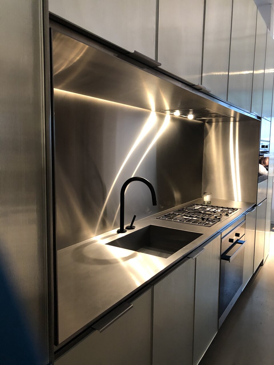
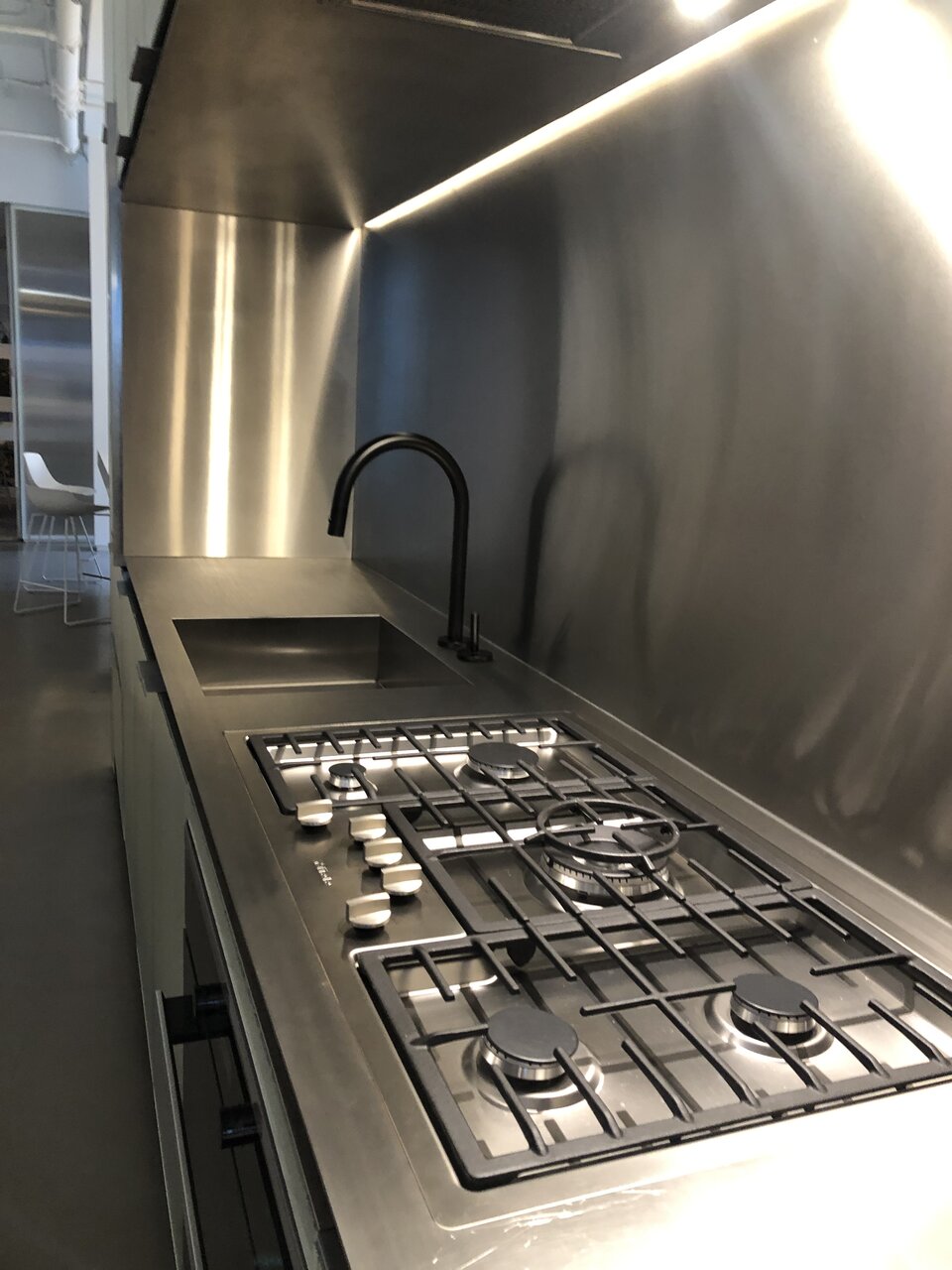
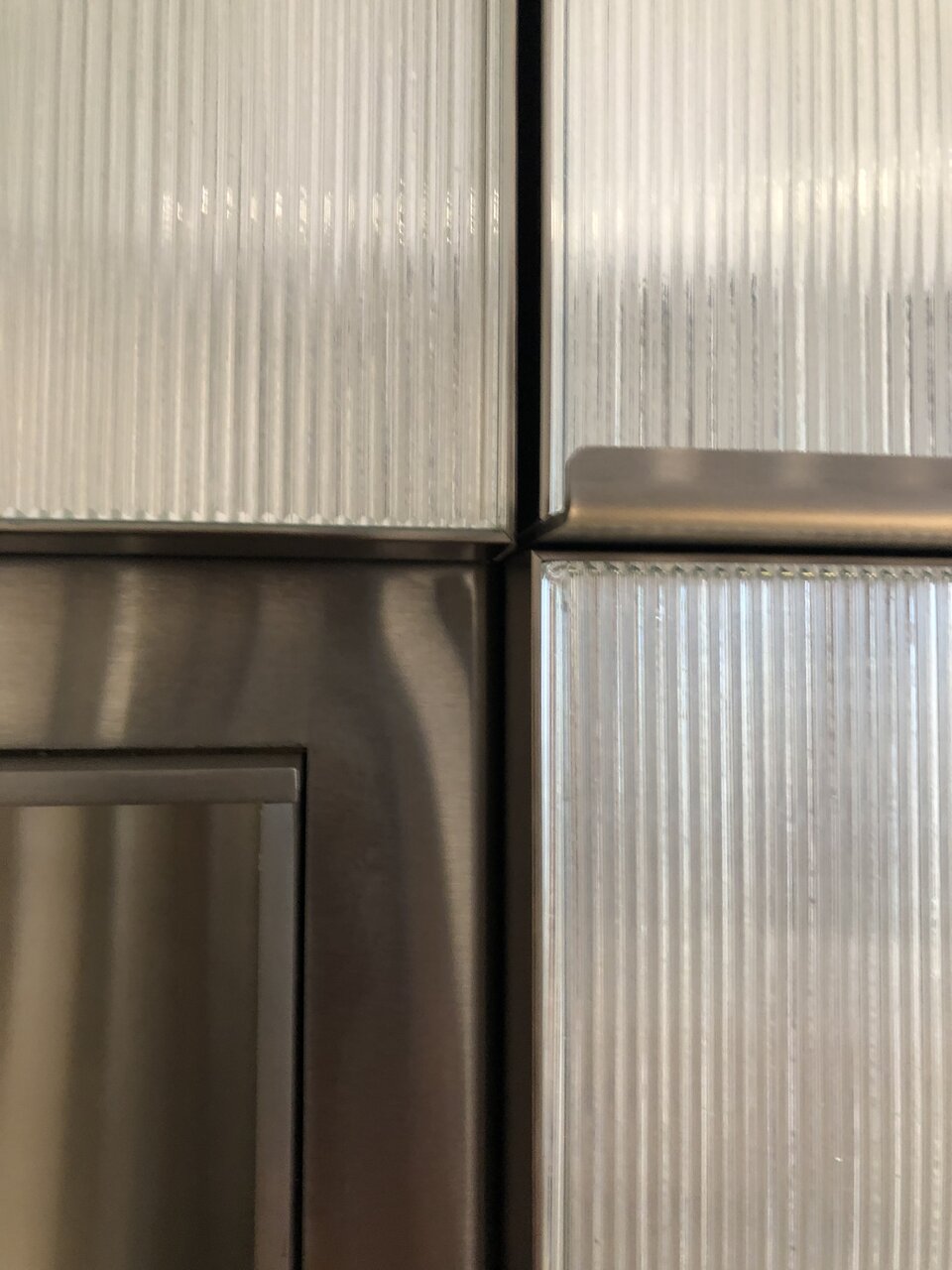
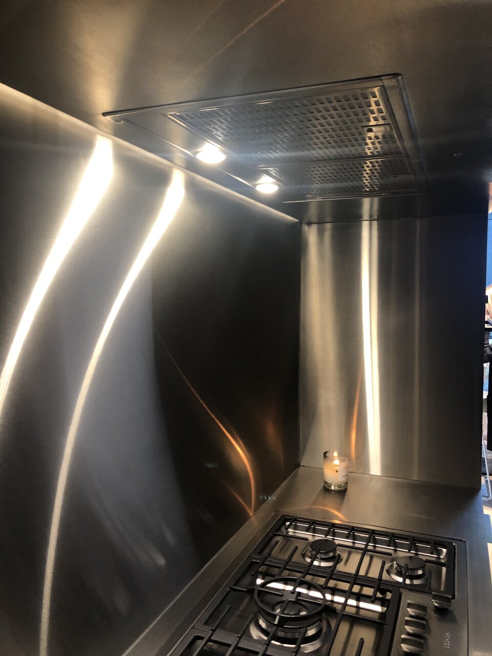
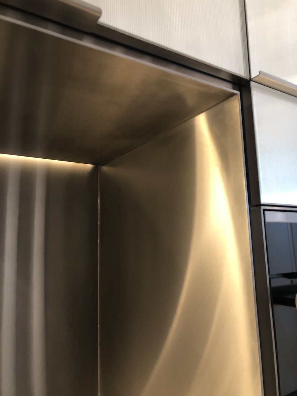
The upgrade kitchen is all stainless steel clad with a stainless steel framed ribbed mirrored glass for the cabinet doors and drawer fronts. Options for the backsplash and counter are either all-stainless steel with integrated sink or white terrazzo.
The standard kitchen is either a matte black painted or natural white oak veneer with a light grey or dark grey terrazzo counter and backsplash.
I went with the all-stainless steel option for my unit. I know the finish will show scratches and fingerprints easily but I always wanted an industrial-looking or commercial-styled kitchen and stainless steel restaurant kitchens develop a nicely worn patina after a ton of use and abuse they get put through so I’m not worried about having such a high maintenance material for my kitchen.
These are the photos from the sales centre a while ago, the stainless steel cabinets look stunning in person. The craftsmanship and level of detail is amazing. The way the light reflects off of the ribbed mirrored glass is beautiful and a subtle design nod to the glass block facade.
Last edited:
Full Metal Junkie
Active Member
The upgrade kitchen is all stainless steel clad with a stainless steel framed ribbed mirrored glass for the cabinet doors and drawer fronts. Options for the backsplash and counter are either all-stainless steel with integrated sink or white terrazzo.
The standard kitchen is either a matte black painted or natural white oak veneer with a light grey or dark grey terrazzo counter and backsplash.
I went with the all-stainless steel option for my unit. I know the finish will show scratches and fingerprints easily but I always wanted an industrial looking kitchen and a stainless steel restaurant kitchens develop a nicely worn patina after a ton of use and abuse they get put through so I’m not worried about having such a high maintenance material for my kitchen.
These are the photos from the sales centre a while ago, the stainless steel cabinets look stunning in person. The craftsmanship and level of detail is amazing. The way the light reflects off of the ribbed mirrored glass is beautiful and a subtle design nod to the glass block facade.
View attachment 520169View attachment 520170View attachment 520171View attachment 520172View attachment 520173
Now that is an awesome looking kitchen. I can't believe how terrible it looks in the promo photo.
neuhaus
Senior Member
Stainless steel is hard to photograph/film well especially when there’s so much harsh stage lighting on the promo.
Though a bad example, the Tesla Cybertruck is also another stainless steel object that doesn’t look the best in certain light/settings.
The public artwork for the courtyard is not that far off from the suspended polished mirrored spheres used as a placeholder in their earlier marketing renderings. I hope the fog/mist generator will make the cut as well.
UtakataNoAnnex
Senior Member
Fair enough! But my only quip here is that I prefer halogen rings...not something I can blow myself up with if I want to boil some eggs. >.<
Dr. Snoot
Active Member
The upgrade kitchen is all stainless steel clad with a stainless steel framed ribbed mirrored glass for the cabinet doors and drawer fronts. Options for the backsplash and counter are either all-stainless steel with integrated sink or white terrazzo.
The standard kitchen is either a matte black painted or natural white oak veneer with a light grey or dark grey terrazzo counter and backsplash.
I went with the all-stainless steel option for my unit. I know the finish will show scratches and fingerprints easily but I always wanted an industrial-looking or commercial-styled kitchen and stainless steel restaurant kitchens develop a nicely worn patina after a ton of use and abuse they get put through so I’m not worried about having such a high maintenance material for my kitchen.
These are the photos from the sales centre a while ago, the stainless steel cabinets look stunning in person. The craftsmanship and level of detail is amazing. The way the light reflects off of the ribbed mirrored glass is beautiful and a subtle design nod to the glass block facade.
View attachment 520169View attachment 520170View attachment 520171View attachment 520172View attachment 520173
Awesome kitchen, but I'm surprised they are putting in gas stoves. They are bad for the environment and terrible for indoor air quality. I'd expect induction in a luxury new build in 2023.
maestro
Senior Member
Induction would double the counter space
evandyk
Senior Member
That's a pretty massive stove for a small counter. But yeah, putting gas in 2023 is really not great.
neuhaus
Senior Member
That kitchen mock-up is showing the full-sized 5-burner cooktop from penthouse kitchen. Studio and 1-bedroom units will have a compact 24” appliances while the 2- and 3-bedroom units will have 30” appliances. Units larger than a 1-bedroom will have an over-sized 36” hood fan (vs. 24”) regardless of cooktop size. The appliances are Miele PureLine.
I currently have a huge wood cutting board that’s almost the same depth of my counter, I would slide it over my sink or on top of my cooktop (and very careful it’s not on or hot) to gain more counter/prep space. It’s really handy.
I love to cook and I would easily take gas over an electric cooktop any day, but I would be ok with induction. Homes built in the last 15-years or so are required to have kitchen venting to the exterior if there is a gas cooktop due to building codes, but I have seen older condos with gas cooking and no exterior venting at all (I can’t imagine not having ventilation at all, gas or electric). The plus with new condos with gas is that a gas line to the balcony is often an included feature — otherwise any kind of gas BBQs would be prohibited on balconies as gas tanks are prohibited to be transported in elevators or through interior common areas due to fire codes.
Full Metal Junkie
Active Member
The appliances are Miele PureLine.
Nice to see that this posh swanky place is getting proper posh swanky appliances.
When I first visited a unit at Eau du Soleil, I was shocked to see the cheapest Whirlpool appliances installed by the builder. Sure, they were 'stainless', but only if your idea of stainless is 20% of the surface area finished in the cheapest black plastic:
And sure, the dishwasher washed dishes, but only if you didn't mind evacuating the apartment any time it did, because the noise level was unbearable. And yes, the countertop was definitely made from the cheap MDF of the Home Depot variety.
And sure, Eau du Soleil is not a swanky posh condo in the middle of Fashion District, but that sure as heck didn't stop Empire from marketing it as 'luxury waterfront living'. And they sure did charge luxury prices for it. Eau du Soleil went onto market at the same-ish time as, for example, Westlake Encore across the road, but Empire charged about 1.5X higher prices for their 'luxury' Eau du Soleil apartments. And for comparison, Westlake Encore ended up with GE Profile Series appliances (i.e. top-of-the-line at GE). And the countertops at Westlake were quartz.
Anyway, the point of my rant was that I'm glad the builder here treats their customers with respect when they market their project as 'luxury'.
Which also reminds me: I really ought to write up a review of Eau du Soleil in the real estate thread.
Last edited:
Northern Light
Superstar
Wellington side this week; photos taken November 15th, 2023:
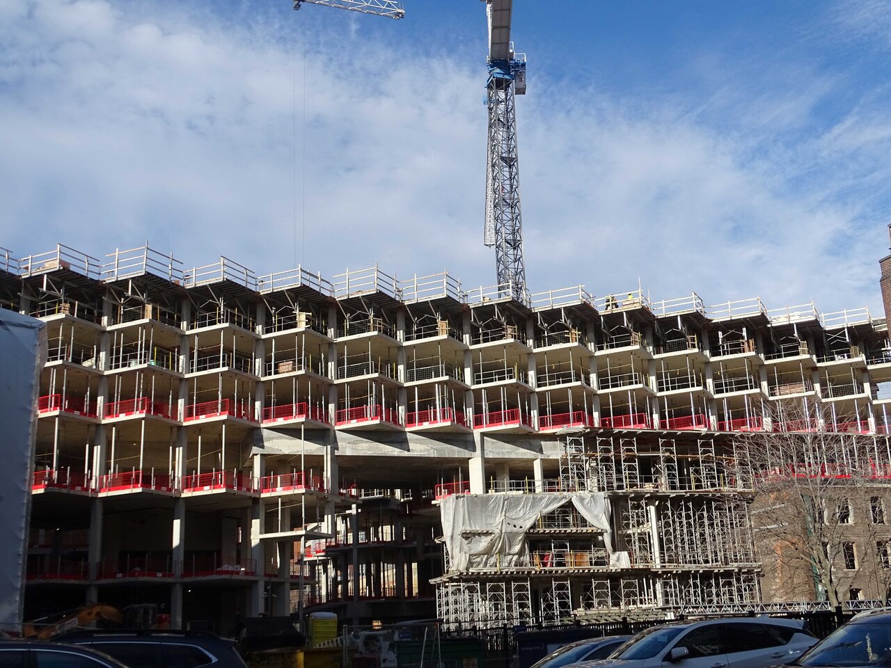
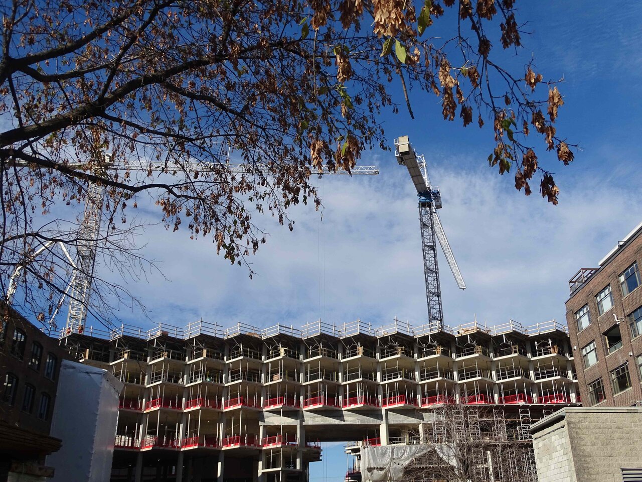
Clear evidence that work is indeed ongoing here:
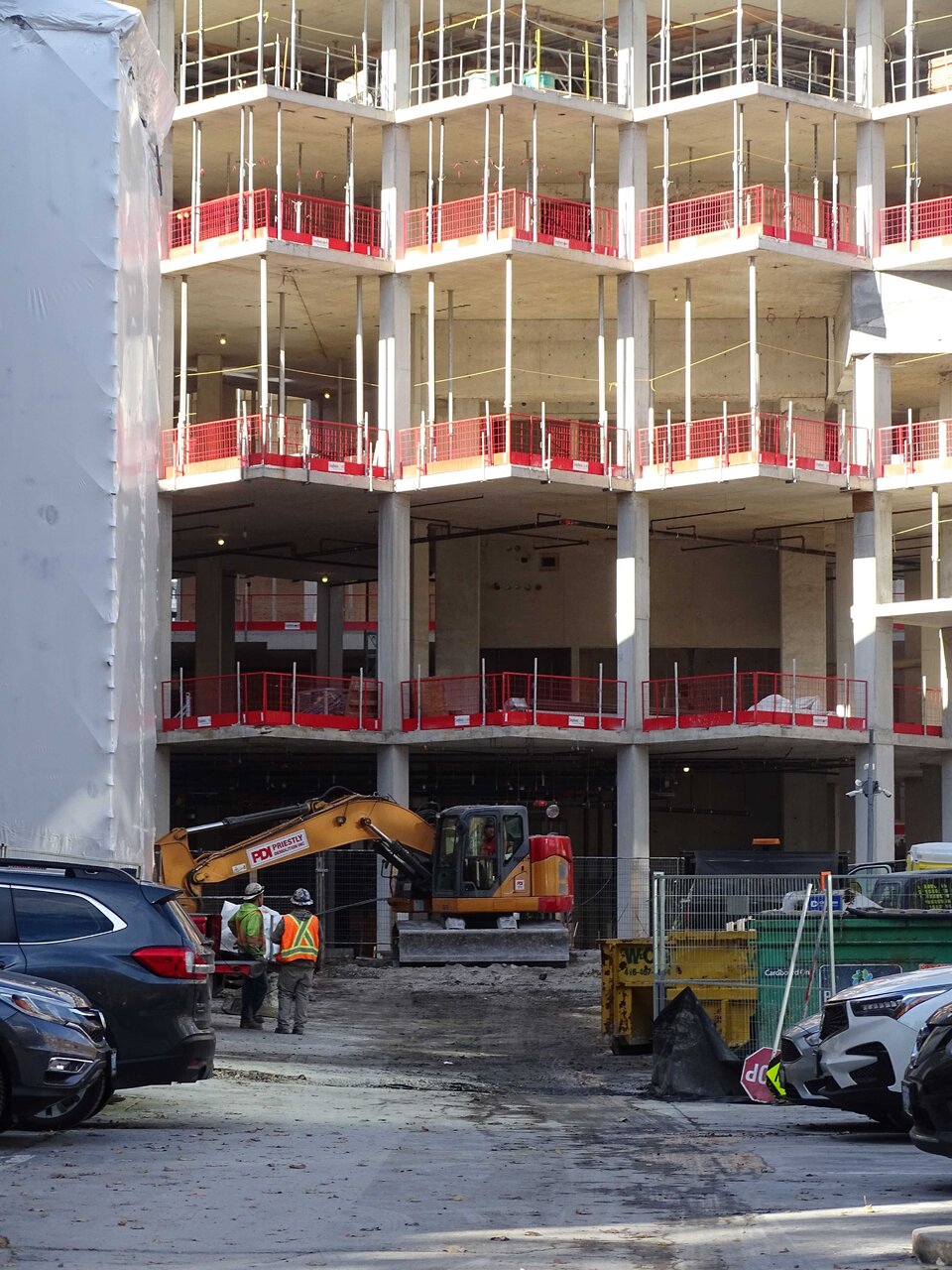
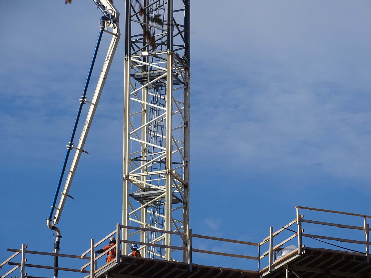
Clear evidence that work is indeed ongoing here:
TheKingEast
Senior Member
Nice to see that this posh swanky place is getting proper posh swanky appliances.
When I first visited a unit at Eau du Soleil, I was shocked to see the cheapest Whirlpool appliances installed by the builder. Sure, they were 'stainless', but only if your idea of stainless is 20% of the surface area finished in the cheapest black plastic:
View attachment 520399
And sure, the dishwasher washed dishes, but only if you didn't mind evacuating the apartment any time it did, because the noise level was unbearable. And yes, the countertop was definitely made from the cheap MDF of the Home Depot variety.
And sure, Eau du Soleil is not a swanky posh condo in the middle of Fashion District, but that sure as heck didn't stop Empire from marketing it as 'luxury waterfront living'. And they sure did charge luxury prices for it. Eau du Soleil went onto market at the same-ish time as, for example, Westlake Encore across the road, but Empire charged about 1.5X higher prices for their 'luxury' Eau du Soleil apartments. And for comparison, Westlake Encore ended up with GE Profile Series appliances (i.e. top-of-the-line at GE). And the countertops at Westlake were quartz.
Anyway, the point of my rant was that I'm glad the builder here treats their customers with respect when they market their project as 'luxury'.
Which also reminds me: I really ought to write up a review of Eau du Soleil in the real estate thread.
Builders love pulling bait and switch. Read the marketing material and it’s luxe this, luxe that then thry put some cheapo generic appliances in.
pajaro
New Member
"Luxury"... what an overused word in the real estate market at the moment.
