Toronto Jade Waterfront | 138.37m | 41s | Phantom | BDP Quadrangle

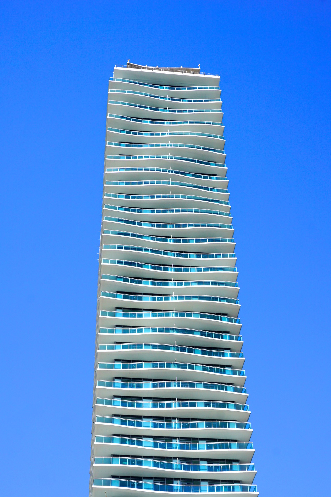
From the north this afternoon, in relation to the buildings around it, and really showing off those curves.

IMG_0540.jpg
IMG_0564.jpg


Oops, no, unless you're up close, you just can't see them.

42
 

Attachments

  • IMG_0540.jpg
    IMG_0540.jpg
    325.3 KB · Views: 1,597
  • IMG_0564.jpg
    IMG_0564.jpg
    576 KB · Views: 1,581
From yesterday:

IMG_9375.jpg

IMG_9426.jpg

IMG_9431.jpg


Still assuming this crane is only for building a parking garage under the parkette which will be out front of this, and nothing more:

IMG_9432.jpg


42
 

Attachments

  • IMG_9375.jpg
    IMG_9375.jpg
    501.1 KB · Views: 1,836
  • IMG_9426.jpg
    IMG_9426.jpg
    429.7 KB · Views: 1,470
  • IMG_9431.jpg
    IMG_9431.jpg
    743.5 KB · Views: 1,439
  • IMG_9432.jpg
    IMG_9432.jpg
    475.8 KB · Views: 1,491
That first shot is a wicked angle. This is how it should be viewed. I need to check it out in person, but I still think that balcony glass should be a jade colour.
 
The balcony glass was a poor choice. If they would have put fritted glass, even if it only went half way up the glass, it would have been a much better looking building. Right now, it just looks so basic to me. All these glass boxes clumped together is not attractive.
 
From earlier today:

DSC01313.jpg


42
 

Attachments

  • DSC01313.jpg
    DSC01313.jpg
    467.8 KB · Views: 1,327
From yesterday:

DSC01442.jpg
DSC01491.jpg


42
 

Attachments

  • DSC01442.jpg
    DSC01442.jpg
    452.9 KB · Views: 1,119
  • DSC01491.jpg
    DSC01491.jpg
    682.8 KB · Views: 1,111
Viewed from certain angles—mostly acute ones on the short ends—the wave pattern on Jade Waterfront looks fantastic. Overall, though, this building is an aesthetic failure, one that might have been avoided by a more complementary or exciting choice of spandrel panelling, and/or by fritted balconies, which tend to mitigate the visual jumble behind them.

It makes me think of another building (which I think is already more successful architecturally) where I mentioned to the architect that I wish it had had fritted balconies to make its architectural statement more pronounced, and the response was that they had designed it that way, but the frit was deleted to bring the cost of the building down. I wonder if that might have been the case here too… but I would not expect an answer on that.

42
 
Lake Shore Blvd view. Little difficult to notice the waves unless your close which is disappointing
image.jpeg
image.jpeg
 

Attachments

  • image.jpeg
    image.jpeg
    1.9 MB · Views: 918
  • image.jpeg
    image.jpeg
    1.5 MB · Views: 912

Back
Top