Toronto J. Davis House | ?m | 9s | Mattamy Homes | Graziani + Corazza

August 17
0B1B99E9-3DF6-4ADC-8118-701DC713C0AC.jpeg
64C5AA62-A191-4EAF-BD58-FEB38949DDB0.jpeg
AB3FF18D-F232-45ED-BAAD-4952740D9902.jpeg
 
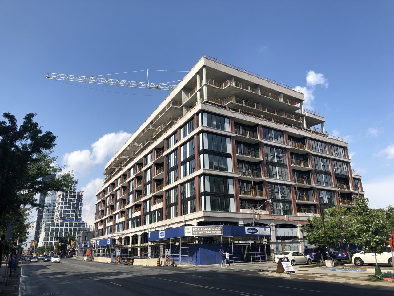
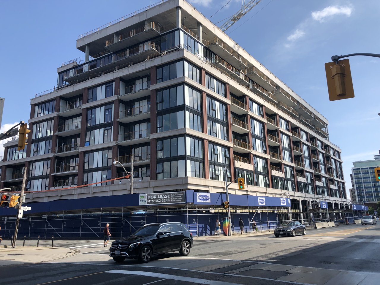
This one went up fast.

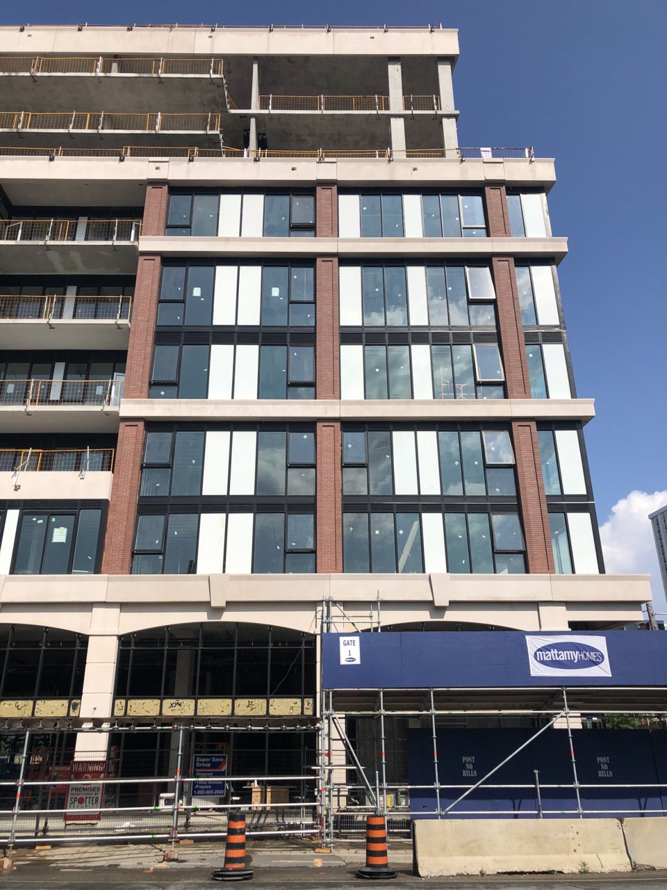
Spandrel colour could have been interesting as white accents, but in true G+C fashion, the panels are inconsistent.
 
the white spandrel is way too jarring and essentially negates the warmth provided by the brick. Black spandrel would have worked better, especially considering the mullion colour.
 
One thing I took note of yesterday: with their vertical incisions, are the brick piers meant to "reference" the bank which this project replaced?
 
I don’t understand how a client can order a traditionally styled building and manage to overlook or not mind the misaligned spandrel panels. It’s pretty shameless and I’m kind of amazed both developers and architects seem to be ok with it.
 

Back
Top