Toronto i2 Stack | 16.13m | 3s | OHP | WilliamsonWilliamson

PMT

Senior Member
Member Bio
Joined
Jul 13, 2016
Messages
4,076
Reaction score
8,988
Location
Turanna
170 PERTH AVE
Ward 18 - Tor & E.York District

►View All Properties

Site Plan Control applicaiton for a 3-storey mixed use building.

Proposed Use --- # of Storeys 3 # of Units 0


Applications:
Type Number Date Submitted Status
Site Plan Approval 17 181102 STE 18 SA Jun 15, 2017 Under Review
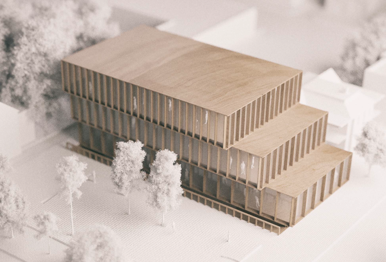
upload_2018-1-19_20-25-37.png


More renderings here: https://www.williamsonwilliamson.com/arch/projects/i2-stack/
 

Attachments

  • upload_2018-1-19_20-25-37.png
    upload_2018-1-19_20-25-37.png
    1.4 MB · Views: 2,028
So good to see wood used on the exterior. Toronto could use more wood, glass and stone exterior mixes to break up the over use of gray glass. A lot more warmth and color would be nice to see. This is a good looking proposal.
 
So good to see wood used on the exterior. Toronto could use more wood, glass and stone exterior mixes to break up the over use of gray glass. A lot more warmth and color would be nice to see. This is a good looking proposal.

It's Ontario Hardwood after all..... :)
 
Wood on the exterior is generally a no-no in the OBC, and it's incredibly high-maintenance.
 
Wood on the exterior is generally a no-no in the OBC, and it's incredibly high-maintenance.
And the wood building's been rejected and replaced with this by Ferdinand Wagner Architect:

Hardwood.jpg


Front page story here.

42
 
Perhaps there's something to this that is not being revealed in these diagrams — but from those alone this looks... honestly I kinda can't believe how mediocre this looks. It seems like no effort put into making a building with any sort of personality or even aesthetic and geometric coherence. I hope I'm wrong and this will be revealed to be better than it looks like it will be once built or once we get some other angles on this but it's really not looking promising.
 
The net impact for the area remains generally a positive as it repurposes an underutilized site for employment spaces. But yeah, it's a definite downgrade from the original proposal. Although the location is fairly obscure, the south elevation still has a large exposure as it faces onto the corner parkette.
 
Wood on the exterior is generally a no-no in the OBC, and it's incredibly high-maintenance.
We have been informed that the wood was not rejected for code reasons, but we were not told why the design was replaced, so I am guessing that the client wanted 1) to appease adjacent homeowners who thought the first plan didn't blend well enough with their homes across the street, so they needed to slap some brick on the exterior, and 2) that the building to be less expensive to build.

42
 
The net impact for the area remains generally a positive as it repurposes an underutilized site for employment spaces. But yeah, it's a definite downgrade from the original proposal. Although the location is fairly obscure, the south elevation still has a large exposure as it faces onto the corner parkette.

Yup good to emphasize this. I live in the area and despite my misgivings about how it looks, I'm very happy to see more employment space built in the Junction Triangle and along the Railpath.
 
I live a short walk away from this development and I have to say this is rather disappointing. I was really excited to see the first design built and I am a little upset at the ridiculous reason they cited for the changes: "The site's unique conditions place it at the meeting point between industrial and residential land uses, which were a factor in the redesign. The building's mix of brick and glazing has been designed to acknowledge both the residential and industrial character of the surrounding streets."... give me a break. The owner got sticker shock at the first design and opted for the cheapest alternative. If the developer cared at all about the surrounding neighborhood, why is spandrel glass even part of the design? That's the stuff you see on cheap corporate offices in Mississauga, not a mixed-use neighborhood with an industrial past.

If they actually wanted to match the neighborhood they should go for something like this (and yes I did this on MS paint :p):

170 perth what they should build.png
 
Last edited:

Back
Top