Toronto Four Seasons Hotel and Private Residences Toronto | 203.9m | 52s | Lifetime | a—A

The south patio is actually quite nice. It gets great sunlight and the wind is limited to gusts every now and then. However I completely agree the patio on the west side is practically unusable due to poor sunlight and high winds.

Funny, I was there the other day and noticed the same thing. A respectable number of people at the south patio but no one on the west, for those reasons stated above.
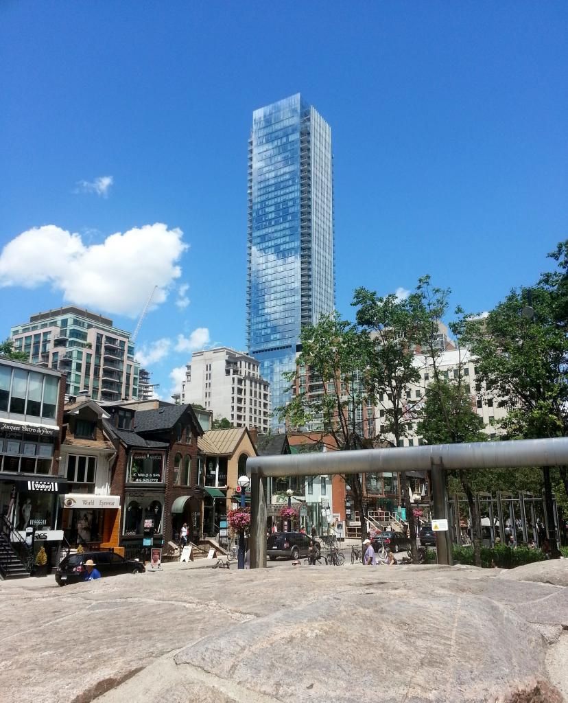
 
agreed. it's such a shame that the beautiful glass curtain wall ends so abruptly at street level and is replaced by that grey-stoneish material. the randomly placed window slits also make little sense with the simplistic box above it. All in all this is still a beautiful (amazingly beautiful) building, but not the most inviting to pedestrians.

Why should the lobby of a residential condo be inviting to pedestrians?
 
Why would a layby on Bay be any better? Especially considering Pusatieri's just lost theirs for sidewalk widening a block south. I see nothing suburban here. Internalizing car access and moving it off the main street is one of the best moves made.
 
Hotels must have vehicular access. You either put that on the main street and likely create conflict with more pedestrians while also likely congesting the street, or you move the vehicular access to another location which can absorb the extra vehicles more easily. Here we have a driveway that's elegantly paved with several tones of granite, all of which which bleeds into a park and has the giant Victorian "birdbath" as a focal point. Remember that prior to the park on Yorkville Avenue, there was a supremely ugly car dealership which blocked views of the Yorkville fore hall from the west. This is not bad urbanism, this is a major win.

42
 
There's nothing wrong having a driveway, but there should always be a prominent entrance with a sense of grandeur to a landmark hotel from a main street. In reality, the design seems distinctly secondary to the back driveway and dulls Bay Street.
 
There's nothing wrong having a driveway, but there should always be a prominent entrance with a sense of grandeur to a landmark hotel from a main street. In reality, the design seems distinctly secondary to the back driveway and dulls Bay Street.


I agree.

It's why I've always felt the bottom of Trump Toronto is really ugly.
 
I agree.

It's why I've always felt the bottom of Trump Toronto is really ugly.

I wouldn't exactly call it ugly, but it's definitely awkward. It's also not entirely the buildings fault, considering how small a footprint the site has to begin with. They can't really have a big driveway or courtyard like the Four Seasons does.
One thing I dislike about Trump is how the main entrance is tucked away inside the driveway of the building, with no main entrance facing bay or adelaide. It's all really SUITS fault for occupying that space, they shoulda scrapped it all together (or relocated it to a higher floor) to make way for a bigger lobby. Though I will say the smaller more private lobby is a nice change of pace from the grand lobbies other competing hotels have.
 

Back
Top