Toronto Fort York Visitor Centre | ?m | 2s | Fort York Foundation | Patkau

I chose C. It seems to improve its environs the most transforming the underbelly of the Gardiner into a much nicer place to be and the Gardiner run-off water cleaning feature it nice as well. The Gardiner is noisy and in the winter slush spray comes down near its periphery so designs A and B don't seem to deal with that as well. I do like the water feature of design D and it would be nice if that could be incorporated into design C.

I think design A, by running parallel to the Gardiner and not creating a passageway under it will make the underside of the Gardiner less inviting. It will reduce the natural light coming under the Gardiner because the building will block it and will not provide a clean escape from under the Gardiner during the winter months because it does not provide a shelter extending beyond the Gardiner. The walls which look like cannon bay doors are visually interesting and provide a look which suggests what is inside in a way that the other designs do not.

Design B suggests people want to go up a grass slope to an elevation closer to the Gardiner at a location right next to the Gardiner. Bad idea. It will be noisier and dirtier up there. The projection window is a nice element but the overall design doesn't seem as interesting to me.

I really don't like any of the elements of design D besides the water feature. Walking through a deep trench and the disorganized look from the street don't appeal to me.
 
I chose C. It seems to improve its environs the most transforming the underbelly of the Gardiner into a much nicer place to be and the Gardiner run-off water cleaning feature it nice as well[...]

I think design A, by running parallel to the Gardiner and not creating a passageway under it will make the underside of the Gardiner less inviting.

Interesting points but I think they judge the proposal more for how the plan interacts with the highway than how it interacts with the fort. Not wrong, but not the aspect that is the most important to me. I think 'A' will look quite striking from under and beyond the highway, drawing people to it whereas the less contrasting designs might prove less compelling.

As US suggests 'A' is powerful in its ability to evoke so much more in its design.
 
Last edited:
Interesting points but I think they judge the proposal more for how the plan interacts with the highway than how it interacts with the fort.

They didn't provide a single rendering of a view from the fort towards this building so it would seem the people behind design A don't find the fit with Fort York to be that high a priority. The other proposals do provide that perspective. The best way to interact with the fort in my opinion is not to create an artificial representation of a fort like building but instead to either imitate the natural environs of the early 1800s or be a building clearly not a part of that era, or both. A design which places this building below ground from a Fort perspective, includes a water feature along Fort York Blvd, provides shelter extending beyond both sides of the Gardiner, and is clearly modern but related to Fort York from a street view is what would appeal to me most.
 
They all have their merits but I think A and D are the finalists for me. The only problem with D is that it seems to detract a little too much from the heritage buildings. I think it does a very good job of interfacing with the street and utilizing the Gardiner.

I love the use of materials in A.
 
Last edited:
B was a close second choice for me. There's an audacity in being that understated, and a quiet confidence in the rightness of it, that matches the audacity of A 's bold assertiveness. B is the only design that uses materials and forms derived from military fortifications to drag the literal essence of the historical site south and use it as an introduction, whereas A does so on a symbolic level. There's nothing in the designs of either C or D that presages the Fort that lies beyond. A reminds me of good exhibition design - specifically the historical pods in Ontario Place when it first opened that created a sense of the War of 1812 without using lots of artifacts. It's an analogue.
 
They didn't provide a single rendering of a view from the fort towards this building so it would seem the people behind design A don't find the fit with Fort York to be that high a priority. The other proposals do provide that perspective. The best way to interact with the fort in my opinion is not to create an artificial representation of a fort like building but instead to either imitate the natural environs of the early 1800s or be a building clearly not a part of that era, or both. A design which places this building below ground from a Fort perspective, includes a water feature along Fort York Blvd, provides shelter extending beyond both sides of the Gardiner, and is clearly modern but related to Fort York from a street view is what would appeal to me most.

Plan A does state that the ghost screen and viewing platform will form a background to the commons, which would create a subtle visual link with the fort...

I don't feel it tries to artificially represent the fort at all. It takes design cues from the history of the site and presents them in very powerful symbolic ways. It is dramatic and experiential in a way that the others are not. I also like the sense of transitioning from the modern world through the 'time tunnel' into the historic enclave of the fort. They do this at St. Marie Among the Hurans in Midland and it is very effective (You enter a visitor centre to watch an orientation movie and as the film ends the screen rolls up to a portal that leads you directly into the site.) I think this will also have great appeal for the legions of school kids that will likely be visiting the place in droves.
 
If design A had the armoured wall on the street side of the Gardiner rather than holding short of the Gardiner and had a rendering of the view from the fort towards the building then maybe I could support it. I admit that it is the only one which from street view has visual clues to what lies beyond... it just doesn't do so in a way that deals with the uninviting Gardiner expressway. To me the biggest issue with Fort York is it is sequestered away behind an elevated expressway and a railway corridor and that is the biggest obstacle which should be overcome in this design. While I hear the arguments of design A's visual cues and design B's use of materials of wood and earthen berm similar to the materials of a fort wall, neither of those designs fix the issue of the Fort hidden behind the Gardiner. At least design B shows that the designer saw the issue the Gardiner presented and installed a projection window to address it. Design A uses the Gardiner as one more level of fortification beyond an armoured wall... it really couldn't be less inviting from the street.
 
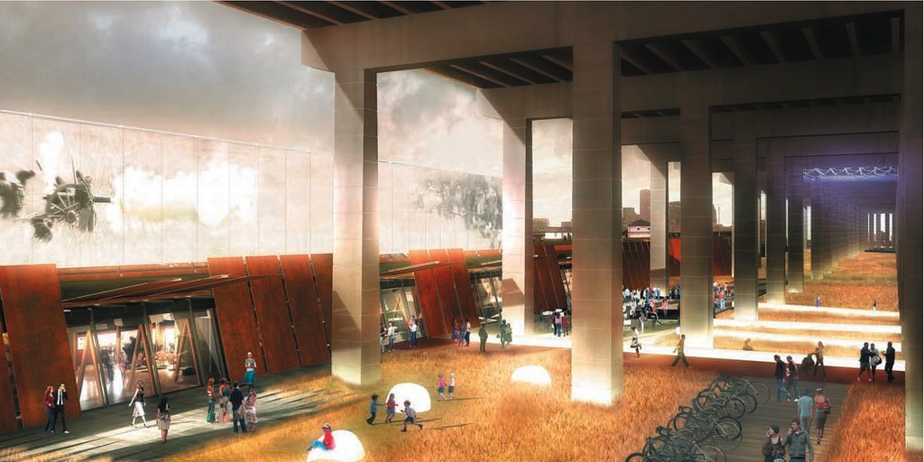
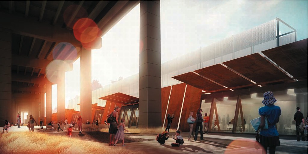
I wish I had an ability to post images from the pdf but the views of Plan A from under the highway are quite striking in my opinion, and definitely more attractive and interesting than the other options.
 
I wish I had an ability to post images from the pdf but the views of Plan A from under the highway are quite striking in my opinion, and definitely more attractive and interesting than the other options.

I believe you were looking for this image, Tewder:

4176046558_ac62a90deb_b.jpg


42
 
A is certainly Patkau and is the best of this group by a long shot in my opinion. I liked the ideas of excavating that D was going for but it wasn't well resolved and ultimately the thing looks like a train wreck...or a car wreck. Any the other two look like student work...fine but half baked.
 
This is exactly why I was excited to see that Patkau was shortlisted, and I'll eat my hat if Scheme A is not by them.

I'm feeling generous. Here are two more under-the-Gardiner pics:

The first prominently features the Ghost Screen:

4175364873_a217ae30db_b.jpg


The second prominently features the Corten Steel blinds:

4175365111_15fce4e921_b.jpg


I hope this one wins!

42
 
^ Regarding the numeber of people in the render, don't forget a whole new neighbourhood is being developed immediately south of this site and in the surrounding vicinity. As for light, they did choose the best time of day and of year when the most light reaches the often dark spaces beneath the expressway.

I hope the plan to beautify the Gardiner, however, doesn't remain with the terrain under it but with the structure itself. A "ceiling" of some sort needs to be built along the length of the Gardiner to disguise and soften the underbelly of the beast. The pillars also need to be addressed.

Placing buildings of this sort in a position that directly engages the space beneath the Gardiner is a great start however.
 
Last edited:
Thanks for posting those shots Interchange. They are indeed the ones I would have shown to illustrate the presence and impact of plan A.

As for whether there's enough light, well there's the QEW bridge to contend with. Why not work with it rather than fight it? Plan A has an eerie moodiness to it that fits the history of the site (ghost screen etc). Also, I believe they have incorporated a pretty interesting lighting display for the evening.
 

Back
Top